[FEATURED] Whatever you think about pink, Dulux’s Colour of the Year for 2018, the rosy Pictured Rocks, is a shade that can enhance your home in a number of ways
A home is an expression of individuality; make it match your personality. Dulux’s Colour of the Year for 2018, Pictured Rocks (also referred to as Nordic Sails 2), is described as a grown-up pink. The warm tones draw from the tactile qualities of natural wood and leather to convey the kind of comfort that welcomes you home.
See it:
“Colour can play a significant role in addressing the balance between outside clamour and inner calm,” says Dulux Colour Consultant Palesa Ramaisa. “We lead such busy lives and sometimes we just need to press pause, relax and recharge. Our homes need to provide that kind of environment for us.”
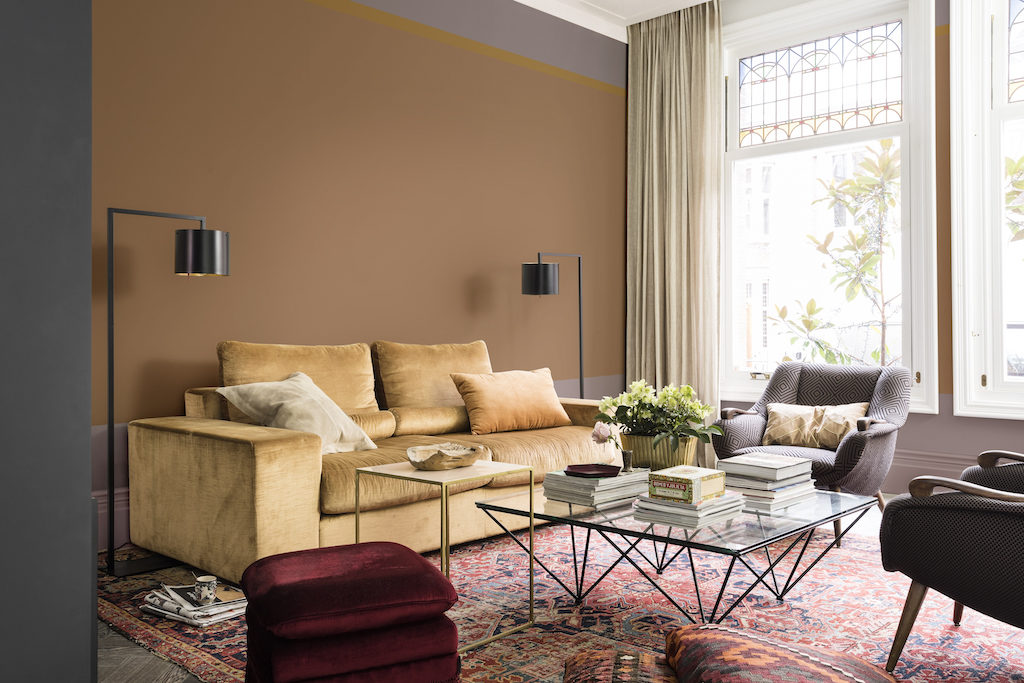
Ramaisa explains that Pictured Rocks and its three complementary colour palettes all manifest a feeling of safety and reassurance in a home. Collectively referred to as the “Welcome Home palette”, this colour range combines gentle shades of grey-pink, blues and soft cocoa, flowing into bolder shades of ink blue and purple, providing a sense of connection between a home’s interiors and the outside world.
Create a haven to match any personality
The Comforting Home creates an environment in which to recharge. It is a restorative space. Warm earth tones permeate this home, bringing together clay and blush pink tones to calm the mind, soothe the senses and shut out the noise. Rich, welcoming textures, such as silk and velvet, create a highly tactile space.
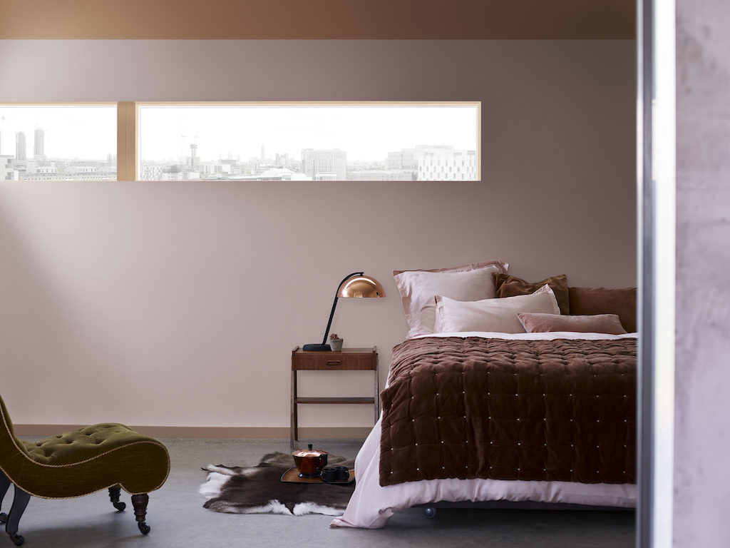
Personality: This home is perfect for a warm-hearted person seeking to reconnect with themselves. Using minimal technology, this type brings nature into their home and balances aesthetics with function in their interior design choices. Comforting hardwoods and tactile textures are staples for them.
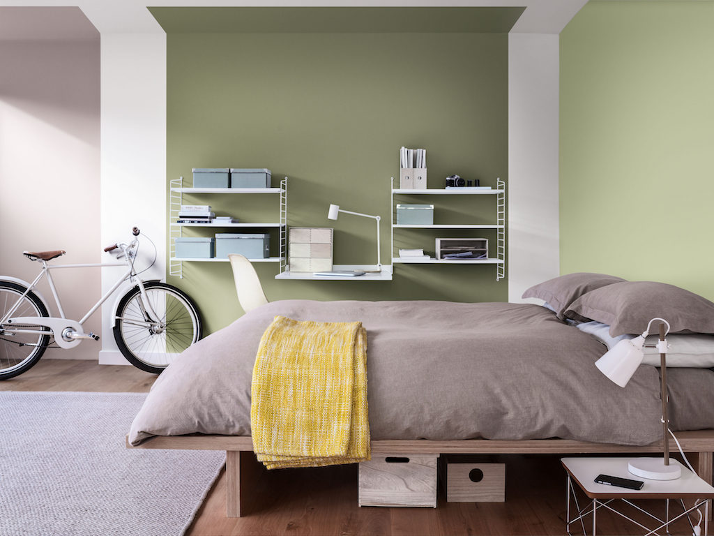
The Inviting Home brings comfort and convenience to life for those seeking to strengthen familial bonds. Cool shades of blue encourage a clear-headed approach to life, while neutrals and fresh green support the need for connection with the outside world. Softer pastel shades are enhanced by coal and ink blue.

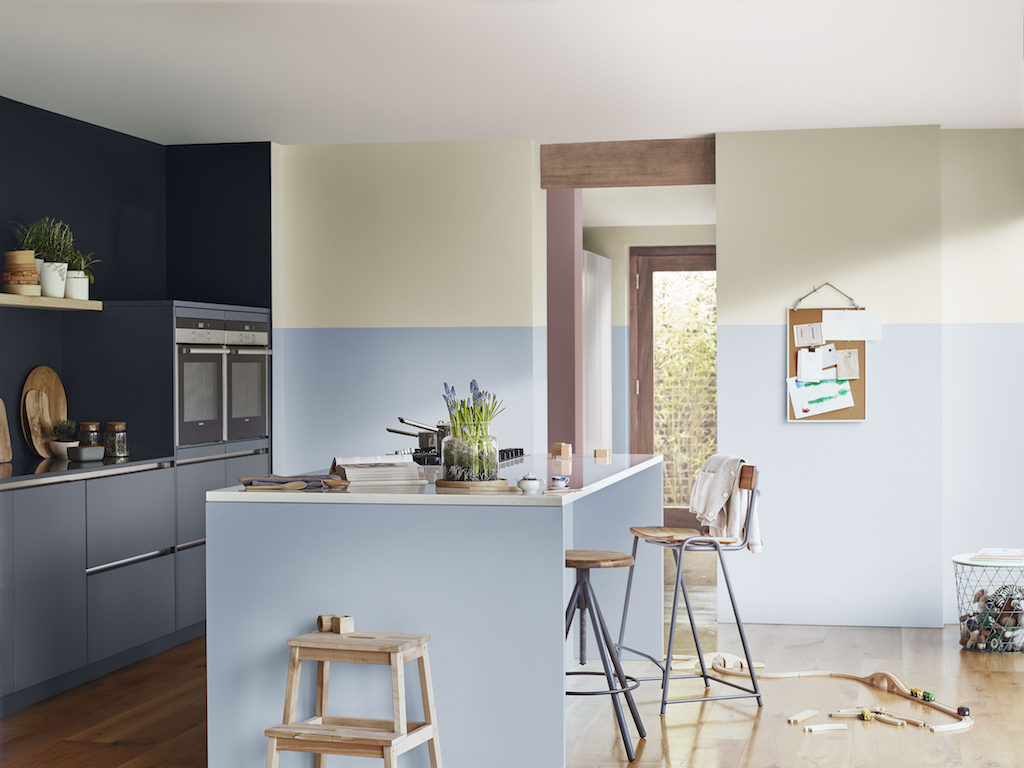
Personality: The space is usually used for shared quality time. Inclusive, optimistic and collaborative, it’s a space where friends and family come together. Open-plan living is at the heart of this home, where gentle, hard-wearing natural fabrics that feel safe are preferred.
The Playful Home creates a space to prompt inspiration and invigorate the senses. Yellow-toned green and gold help spark the synapses and encourage creativity. Pops of colour add a sense of fun and energy, while clever use of colour can help create different zones within smaller spaces.
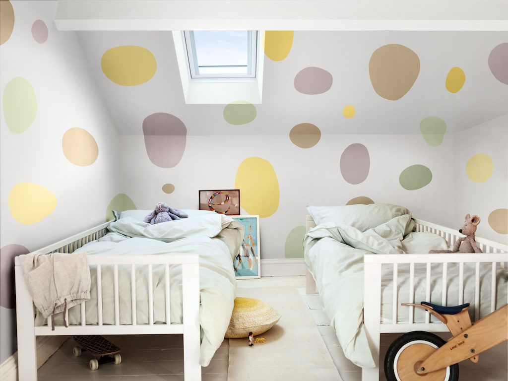
Personality: This home is for a light-hearted personality, curious, adventurous and adaptable. During times of unpredictability, this person looks outwards rather than shutting off, facing the outside world head-on. This type includes early adopters of technology that is seamlessly integrated into their home. They seek energy, experience and creativity, supplemented by the time they spend outdoors. Multifunctional, smaller spaces work with natural textures and fun patterns.
More DIY Home Decor Ideas and Resources
Article source: http://elledecoration.co.za/in-the-pink/