Sometimes you don’t want to build a whole “fire pit” adventure in your backyard, but you still want that fire factor. No problem, we found some easy DIY tabletop fire bowls (sometimes called tabletop fire pits) for you that fit perfectly in any garden space! Whether you don’t want to smoke out the neighbors, or…
How to Shop the knot too shabby BAZAAR Like a Pro

This is the week where I lose sleep just thinking about the knot too shabby BAZAAR! I’m in good company too! I’d venture to guess that a number of the vendors experience the loss of sleep making last minute booth preparations and mental to-do lists when they should be catching some much needed zzz’s!
As a knot too shabby BAZAAR shopper, you probably aren’t losing much sleep over this event! But, that doesn’t mean that you can’t make plans and preparations. Here’s all you need to know about how to make the most of your shopping experience at this week’s MAIN EVENT in the Glendora Village!
WHAT (is the event): The Annual knot too shabby BAZAAR is happening this Saturday rain or shine.
WHO (is participating): Local artisans selling refinished furnishings, vintage finds, and handmade goods. All are welcome to attend–admission is free!
WHERE (is it happening): In the Glendora Village on the vacant lot at the corner of Glendora Ave. and Bennett Ave.
WHEN (is it taking place): 9:00am – 4:00pm this Saturday, April 9th, 2016.
Arrive early to:
- Score the best finds.
- Enter in the #knottooshabbyBAZAAR Furniture Makeover Competition for a chance to win a $100 gift certificate

Looking to have fun with friends? Shop mid-day to:
- Participate in free painting demos
- Vote on the #knottooshabbyBAZAAR Furniture Makeover Competition
- Enjoy “Comfort food with a conscience” from The Lobos Truck
- Take a selfie in the #knottooshabbyBAZAAR Lemonade Stand photo op

Bargain-hunter? Shop the final hour to:
- Score the best discounts
- Learn the winner of the #knottooshabbyBAZAAR Furniture Makeover Competition and recipient of a $100 gift certificate
HOW (to shop the event):
- Bring cash. Most vendors will be able to accept credit cards, but as they say, “cash is king!” You’ll have more negotiating power with cash. And, if you find that you don’t have quite enough, knot too shabby will serve as ATM…so-to-speak. You can bring your credit or debit card to the shop and we’ll offer a credit to cash transaction.
- Wear comfortable shoes.
- Bring your dogs!

WHY (should you come):
- It’s free to attend! We’re skipping ticket sales to you can save your money for shopping.
- We’ll be giving away #knottooshabbyBAZAAR Bucks in mystery amounts all day while supplies last–everyone’s a winner! Just find us at the knot too shabby booth to pick up your bucks in amounts from $3 all the way to $25.
- It’s fun for the whole family!

4 Miss Mustard Seed’s Milk Paint Tips for Busy Moms

School has started. Fall sports are starting within weeks. Homework. Orthodontic appointments. Piano Lessons. Awana. Sunday School. More homework. Chores. That’s just what my kids are committed to during the week. How in blazes does any mom find the time to finish their own projects amidst a busy life?
I can’t even pretend to know what you’re schedules look like, but I can offer a few bits of advice on how you can manage to find the time to work in a little Miss Mustard Seed’s Milk Paint DIY amidst your busy schedules.

1. Have an idea of what you want your project to look like BEFORE you come shop for supplies

Let me start by saying that I love engaging with customers about their projects. We explore colors, fabric swatches, iPhone photos of their rooms and pieces (and occasionally photos of other…how should I say it…things…which is why I will NEVER look at your phone while you scroll through photos. It just saves us both from a potentially embarrassing moment).
45-60 minutes later, after waffling over this color and that color, they leave with a few bags of supplies and a heap of information (and I have the picture of you know who’s you know what forever burned into my memory…sobs).
If you are a busy mom and you only have 30-45 minutes to stop by and pick up your project supplies, know before you head on over what it is you want your project to look like. Believe me…I’m not that interesting and you don’t want to be spending your morning or afternoon with me talking your ear off about the finer subtleties of light vs. medium distressing, color theory or the differences between antiquing finishes and industrial finishes.
Bring photos of the piece(s) that you are painting along with your Pinterest images of the inspiration pieces you are trying to replicate. If I can see what you are painting and what you want it to look like, it is super easy and quick for me to point you to the right color, determine whether you need bonding primer, should seal it with wax or hemp oil or may achieve a sweet look with a wax puck. You’ll be in and out in a jiffy and on to the next errand!
2. Understand your substrate
Substrate generally describes the base material that you are painting. For example, most furniture substrates are either waxed wood, varnished wood or raw wood. Knowing the difference will help you to determine not only the best product to use, but the best process. When using MMSMP, understanding the different substrates may be the difference between a project that takes a couple of hours or one that ends up taking a couple of days because you didn’t understand the type of surface you were painting, therefore requiring a total project redo.
When I teach MMSMP Workshops, I use the phrase, “more shine, more prime.” In a nutshell, the shinier your substrate is, the more bonding primer you’ll need to add to your paint for good adhesion. The less shiny…or the more raw or worn the substrate is, the less likely you will need any bonding primer. This is a really simplistic way of looking at it and there are a dozen and one variables that may need to be considered, but it’s a good rule of thumb to start with if you are new to milk paint.
3. Organize your project into smaller and manageable chunks of time
I know that I could never get my own kids to leave me alone for the solid 3-4 hours that it takes to see a project to completion…at least not without duct taping them to a chair and sticking them three feet from cartoons. But, that’s not how I roll (or is it….mwahahahah).
But, I usually can count on them being occupied by a task for at least 45 minutes. That’s all I need to get a decent start! And, if you’re kids don’t absolutely drive you batty when they try to “help,” give them a simple task that will assist you with the project. For example, mine were satisfied with taking off knobs and handles. They thought they were cool stuff getting to use high tech equipment like a screwdriver.
So, here’s how I divide my project into mini-tasks that each take about 30-45 minutes each (depending on the size of the piece you are tackling):
Prep Time
-Set up your designated work station, preferably someplace that can keep your piece of furniture and supplies handy for a day or two.
-Clean your piece well to remove any grease and grime
-Lightly sand the surface to give your piece more tooth for the milk paint to grab on (if you are painting raw wood, you won’t need to sand at all).
-Rinse off any residual cleaner and sanding dust with a damp cloth.
-If you need to tape off any areas like glass doors or mirrors, do that step now
-Remove hardware (set aside in a small bowl to keep them together…says every person who has ever lost the last knob or it’s screw…mmmhmm…it happens!)
-Clean up the prep mess
-Set aside all of the supplies needed for the actual painting (i.e., paint, pitcher of water, mini whisk or mixer, clean brushes, paper towels or rags, spoon to scoop paint, and container to mix paint).
Paint Time
-Mix up your batch of paint (about equal parts powder to water)
-Go fold a load of laundry or empty the dishwasher, take out the trash…something that will take you about 15-20 minutes. You want that time set aside for the powder to dissolve into the water. If you neglect to let your paint “set-up,” you’ll be painting with a chunky batch and likely to see color variation throughout your piece of furniture.
-Paint your piece. Milk Paint dries quickly. Chances are, by the time you are finished with your first coat, you’ll be ready to start the second coat if needed.
-Don’t forget to mix your paint as you go to keep all of the ingredients equally distributed throughout your mixture.
Finishing Details and Clean Up
-Once the paint is dry, lightly sand to add light distressing, remove any chippng paint and to smooth the paint finish.
-Add your top coat; if your substrate was a more worn or dry finish, hemp oil is an ideal top coat. If you were painting over a shinier surface, then I recommend sealing with beeswax or Tough Coat (as a reminder, you never wanted to put Tough Coat over a wax finish).
-Let the wax harden for about 30 minutes, or allow the oil to soak in or the Tough Coat to dry. While that is happening, begin cleaning your work space and supplies.
-When your space is clean, lightly buff your piece with a soft cloth…old t-shirts and socks work well.
4. Give your freshly painted piece time and space to fully cure
In simple terms, curing is a chemical process that the paint and wax undergo over a period of about 21-30 days. During that time, the various ingredients and vapors or being released and the paint finish is becoming more durable. That being said, you want to be gentle while it’s curing. There is no top coat that is impenetrable to the goings on of rough kids, sloppy spouses, house pets and day to day life. BUT, if you allow your piece to fully cure before you use it regularly, the chances of it withstanding all that life throws its way increases dramatically.

Painting is fun and seeing transformation in your house is rewarding. But, it can be stressful amidst the craziness of day-to-day life. Hopefully, these simple tips help you to organize your projects to make the most of your time!
Now, go out and have some fun with the kids! 

Distressing then Waxing OR Waxing then Distressing?
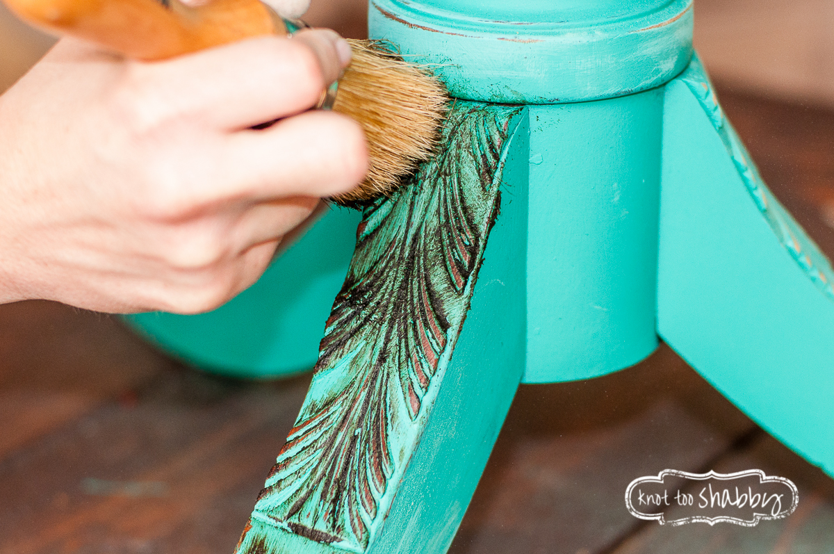
Waxing and distressing question. I normally paint, distressed then wax. I noticed many people say they distress and sand after waxing. So last night I waxed, buffed this morning and I am now distressing. The paint is already really hard and I find it harder to sand and distress but there is much less dust which I think is why people do this. Thoughts? Do you distress before or after waxing? -Jacqueline from Chicago
This is a great question and one that comes up often enough.
Let’s start by defining furniture distressing because it often gets confused with “antiquing” or “dark-waxing.”
Both distressing and waxing are techniques that can be used to replicate the patina of old furniture. Distressing is the act of wearing down the paint finish so that the substrate of the original finish peeks through. Typically, you would use sandpaper to distress a piece.
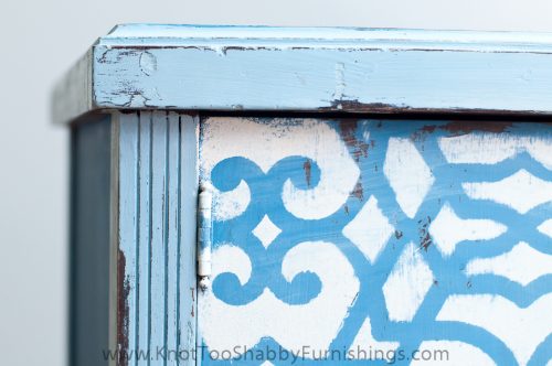
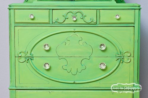
Louis Blue, Greek Blue and Pure White Chalk Paint® with the edges lightly distressed
When someone wishes to “antique,” a piece they are typically looking to add dark wax to give an aged patina that has a rich depth of color among the finish.
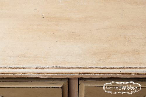
Lightly distressed edges WITH a dark wax finish to add an antiqued patina
So, do you distress BEFORE OR AFTER you wax?
Let’s review the Annie Sloan method!
Annie paints.
Annie waxes.
THEN Annie distresses.
Finally Annie re-waxes where she distressed.
How do I know this, you ask? First of all, I’ve been trained in the Annie Sloan method. Second of all, it’s in her book!!!
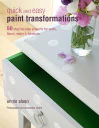
You can read all about how Annie distresses on pages 12-50 using a variety of methods
So, let’s talk about the advantages of distressing after you wax.
- It is a much cleaner process! Wax tends to hold in the dust from the sanding itself keeping an extremely limited amount of free-floating particulates in the air that would otherwise be all over the place if you distressed before you waxed.
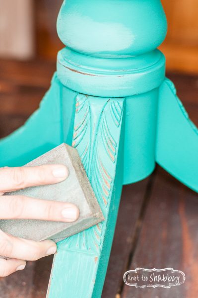
- You have much more control over your distressing by doing it after you wax. Annie Sloan Paint is VERY EASY to work off. I’ve seen and heard of people who have distressed their pieces before they waxed and lamented that “too much paint came off.” When distressing after you wax, you can be much more intentional about taking off just the right amount of paint in the right places without over-doing it.
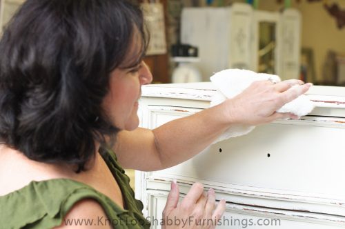
- You have a consistent finish when distressing after you wax. Meaning, when you distress before you apply the wax, the sand paper is not only removing paint along the edges, but also smoothing out the paint finish around the distressed area. The result is an irregular paint finish that is smooth in some places and more textured in others (as a result of brush strokes). When the wax is applied and then polished off, those distressed edges will have a higher sheen than the rest of the piece. Whereas, if you distress after you wax, the end result will be less varied.

When you distress your furniture after you apply your initial coat of wax, you don’t want to wait a day or two to do so. You will have an easier time of it if you distress immediately after you paint and wax…before the paint has had a chance to thoroughly dry and begin its curing process. Distressing AFTER you wax doesn’t have to be cumbersome or “hard.” If you wait too long to distress your piece, you will have to work much harder to remove the paint.
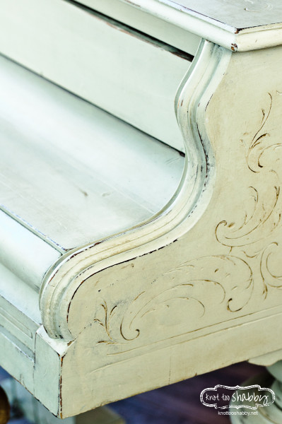
Now…of course, there are other ways to do it! When I teach a workshop, we talk about wet distressing, how to distress using nothing more than a wax brush and some water, the benefits of distressing with an electric sander, course sandpaper versus fine sandpaper…and so on. You will gain an appreciation for the many varied techniques simply by playing with the paint and wax and exploring the variations of how to create a multitude of looks! And, of course invest in Annie Sloan’s amazing books. I’ll tell you a secret…you can learn EVERYTHING we teach in a workshop just by reading her books. No Joke! I hold nothing back! Hit up your local thrift store, start stocking up on cheap chairs and side tables and become your own expert in the how’s and why’s of Annie Sloan Paint!
The Wonders of Wax

If you have spent any amount of time with me talking topcoats, you will know within 30 seconds that I am a wax girl.
I have written blog posts and gotten on my soap box during workshops and demos listing the benefits of wax. So, I don’t feel the need to rehash much of what I’ve stated so frequently (If you are interested you can read about my wax tips here, here and here).
Instead, I thought I’d talk a bit more about the differences between the colored waxes and variations in the application process now that I’ve had a chance to work with all the different shades of the new Annie Sloan waxes.
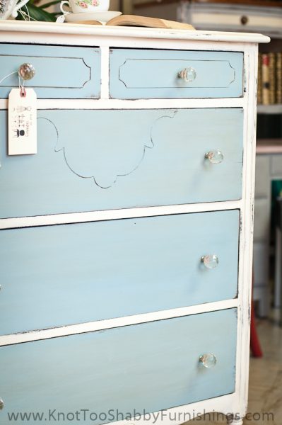
Louis Blue and Old White Chalk Paint® with a clear and dark wax finish
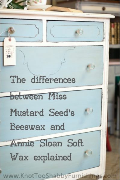
We sell and regularly work with two different wax products. The first is a beeswax that we carry as part of the Miss Mustard Seed’s Milk Paint line. The second is the Annie Sloan Soft Waxes. Although they are both wax topcoats, the application and finished result is quite different. Here’s how I break it down:
Miss Mustard Seed’s Wax
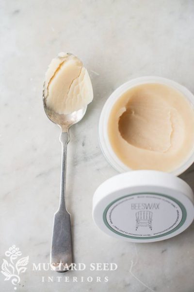
- MMS Wax has the consistency of very soft butter which makes the application process incredibly easy.
- It comes in four different formulas; a clear furniture wax, a lavender scented furniture wax (that is also clear), white wax and an antiquing wax. MMS Beeswax is applied in what I typically refer to as a more traditional wax application…meaning, that you brush it on and massage it into the paint finish, allow it to set up for about 20-30 minutes and then buff it off. I make an exception when using white wax and antiquing wax and typically wipe it off right after applying it so that I can exercise more control over the color saturation.
- There are very, VERY few circumstances that I will use a rag over a brush to apply wax. But, one of those is when I’m using MMS White Wax. I have found that there is something in the formula of the White Wax that causes it to stick in my wax brushes, even when I clean them with my awesome brush soap. I will usually opt for a disposable rag to apply white wax so that I don’t have to mess with cleaning a messy wax brush when I’m finished.
- White Wax is pretty dramatic. If you are going for a very heavy white-washed look, it’s the way to go. But, if you want a more subtle finish with the white wax, you need to use some of the clear furniture wax to soften the look.
- The same point holds true when using Antiquing Wax. As a stand alone wax, it will dramatically richen the look of your paint finish, but if you want a more subtle antiqued patina, a little bit of the clear furniture wax allows you to move the dark antiquing wax with more control and ease.
- I’ve also noticed that over the years, the batches of Miss Mustard Seed’s Antiquing Wax likely use different color pigments from one batch to another so there are subtle color differences. One batch may be a bit more on the dark brown side while a previous batch may have had more grey tones.
When it’s all said and done, Miss Mustard Seed’s Wax offers a wonderfully protective finish that is very easy to apply and it has a matte look and feel.
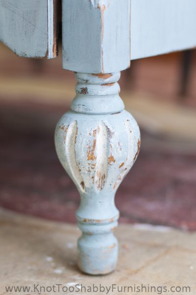
Miss Mustard Seed’s Milk Paint in Shutter Gray and Ironstone with clear furniture wax
Annie Sloan Soft Wax
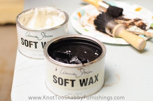
- Annie Sloan Soft Wax has the consistency (and even the look) of Crisco. It’s nice and smooth to apply, but not as soft and creamy as MMS Beeswax.
- Annie Sloan Soft Wax has a different application process from any other furniture wax that I’ve ever used. The Soft Wax is applied in sections and then immediately wiped off. You want to allow the wax to harden for several hours (I usually wait overnight) then polish it with a soft cloth.
- The new White Wax offers a very soft and subtle white wash effect. It is not nearly as pronounced as Miss Mustard Seed’s White Wax, therefore a bit easier to manipulate as a stand alone product (meaning, you don’t need clear wax to move the white wax around or help it to blend). I love how the White Wax settles into carved details of wood furniture without being overly dramatic on the flatter surfaces. And, Annie’s White Wax is much easier to clean out of the wax brush than MMS White Wax.
- Both Annie Sloan Dark Wax and Black Wax must be used with Clear Wax in order to prevent it from staining the paint finish (Of course, Graphite is the paint color that serves as the exception to that rule). I like to mix the Dark and Black Wax with Clear Wax when applying it, although on certain occasions I’ll put a layer of clear wax and then a layer of either dark or black. It just depends what look I’m going for and how much time I have to work on a piece. You can go for a much more subtle dark or black wax effect by using more clear with it, or vice versa.
Your furniture painted with Annie Sloan Paint and paired with her Soft Wax will have beautiful and lustrous sheen to them that can only be achieved when you pair her products together.
Clear wax mixed with paint to create a colored wax finish
Which begs the question, can you mix the product lines?
Yes…and, no.
Anytime you start mixing different product lines, you always want to test an area of what you are painting to make sure that the two products will be symbiotic. You just never know what may be in one product that compromises the integrity or finish of another product. So, as a general rule of thumb I recommend that you stick with products in the same line (On a side note, I strongly discourage using Briwax or Minwax Finishing Paste as a top coat on either of these product lines as I’ve seen some pretty dramatic negative results).
That being said, I can sometimes be a bit of rule breaker!
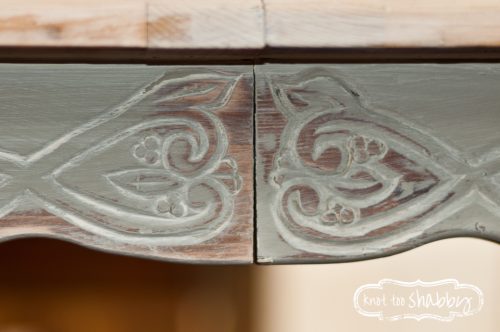
French Linen Chalk Paint® with Miss Mustard Seed’s White Wax
I have paired Annie Sloan Soft Wax as a top coat to Miss Mustard Seed’s Milk Paint and vice versa. In doing so, I was hoping to achieve a similar sheen on MMSMP as I get with Annie Sloan Paint. That wasn’t the case and I have since learned that the ONLY WAY to achieve the characteristic “Annie Sloan Look” is to pair her products.
Unlike any other product on the market, wax has the capability of not only serving a functional purpose in protecting your piece of furniture, but also as a very decorative and artistic element. So, the next time you are working on a piece of furniture, I challenge you to stretch your artistic abilities and find new ways to use the wax decoratively….whether you incorporate some shading, add color or mix waxes. And, if you are so inclined, we offer a two hour waxing workshop dedicated to the many finishes you can achieve using both wax products!
When Hand Painting Meets Stencils
The world of furniture painting is small. Close knit. In constant communication! It seems weird, but one of my favorite things about carrying both Annie Sloan Paint and Miss Mustard Seed’s Milk Paint is this tight community that is fostered through the product. Not just the community of customers, but that of retailers as well. We’re like a big family of furniture painters. I bring that up because months and months ago, our Milk Paint family participated in a survey and informal discussion about some desired new products. There were so, so many great ideas. One that kept popping up, though was the desire for a new line of stencils. Really, it made perfect sense. Miss Mustard Seed is an avid free-hand painter. Creating stencils that are inspired by her free-hand painting is the perfect pairing to MMS Milk Paint!
I am NOT a free-hand painter. Let’s just say, I know where my talents lay and that is not one of them. I happily volunteered to be among the first to try out the new stencils and photograph our projects!
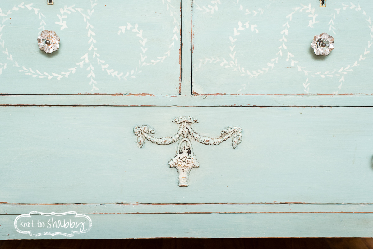
My first piece is an antique dresser that I base coated in white and then added a custom mix of Kitchen Scale and Linen MMS Milk Paint.
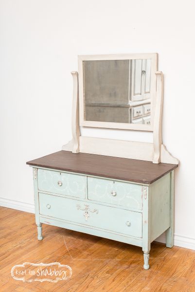
I used Linen for the stencil and mixed a much thicker than usual batch to minimize the paint bleeding beneath the stencil.
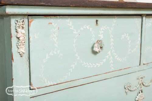
This particular stencil design is very simple, so to add a bit more complexity and give the more free-hand painted look, I had pattern shoot off in a variety of directions all over the drawers. As a result, it looks much more free-hand painted than stenciled (enough so that all of my employees were fooled).
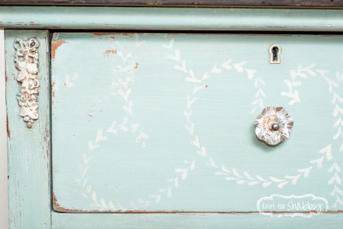
And, of course I love the minimal chipping on the drawers and front.
What sets the new Miss Mustard Seed stencils apart from other stencil lines is the simplicity of the designs and the ability to layer multiple stencils and create a unique pattern that doesn’t fit into a more rigid design formula.
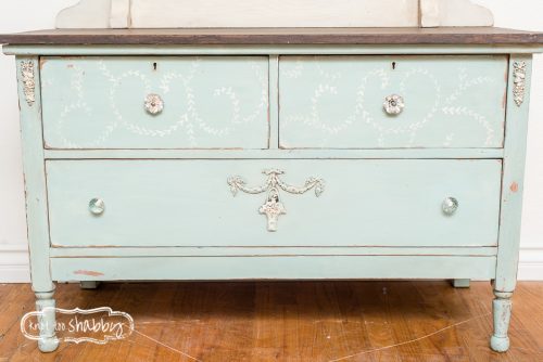
As soon as I find out more about the availability of the stencils, we will post it on our instagram feed and facebook page! In the meantime, keep your eyes peeled for those perfect stencil projects!
5 Ways to Make Your Vendor Application Stand Out

While these tips are specifically intended for applicants hoping to become vendors at the knot too shabby BAZAAR, you’re likely to find that this is a secret recipe to getting accepted at any craft fair or vintage market.

Here is a preview of the vendor application for the knot too shabby BAZAAR that you can print out and use to refine your responses before submitting the official vendor application on the knot too shabby website. Once you’ve filled it out, made revisions, and have a final draft that you’re proud of, make backup copies and save them somewhere so you’ll be able to use it again as a reference for future festival applications.
Selection for the #knottooshabbyBAZAAR is a juried process. To impress the selection committee, you need to show that you have quality merchandise that fits in with the festival’s guidelines and that you are prepared to act as an ambassador both online and in-person at the event. We’re looking for artisans with products we can get excited about and who will make customers excited to shop at the fair.
I’ve read a lot of applications in my five years coordinating the knot too shabby BAZAAR so I’m sharing with you 5 of the biggest mistakes applicants make and how to not only fix them, but how to make your application stand out no matter what the competition!
- Quality photos
- BAD:

Cluttered background, dim fluorescent lighting, crooked perspective, dusty product with the price tag still on, & unimaginative presentation.
- GOOD:

Uncluttered background, bright natural window light, level perspective, clean product, & visually interesting presentation.
Don’t take your photos on your kitchen counter, on your couch, in your dirty garage, at night, or in direct noontime sunlight that you try to hide with a filter (it will look like it’s waiting for an old west duel with the sheriff). Please don’t. I’m begging you.

Sorry pardner, this filter won’t hide your high noon photo shoot
I get the feeling–it’s late, you’ve just finished that project you’ve been working on, the kids are finally asleep, and you’re in a hurry to snap a photo on your phone and instantly share it with the world. But with a few simple steps, you can make a photo that actually draws viewers in and entices them to buy your product–even if you don’t have a fancy camera.

Behind the scenes: No expensive lighting equipment, just a large window letting plenty of natural light shine through.
Lighting: Near a large window or in open shade is often best. Avoid your living room’s tungsten lamps or your kitchen’s florescent lights–these could make your product seem discolored and they never provide enough light. Natural daylight is ideal, but pay attention to shadows–direct sunlight can create harsh unflattering shadows in addition to stark glare, but tree shade can also cast distracting mottled shadows.
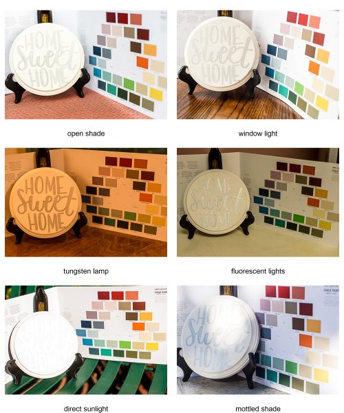
“Home Sweet Home” sign by Maeberry Lane Design
Chalk Paint® color chart by Annie Sloan
Setting: Arrange your merchandise in a way that makes it easier for the viewer to picture it in their home (or even better, their dream home). Stage a vignette that looks inviting by mixing textures. A soft throw blanket and a live plant can add a homey touch to hard wood furniture.
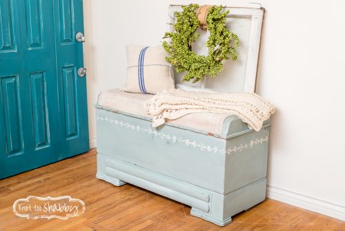
Hope chest painted using Miss Mustard Seed’s Milk Paint & her Linda stencil
If you make apparel, jewelry, or accessories, spend a late afternoon or early morning photographing it on a live person in a setting that matches your style. Rustic? Take a trip to the great outdoors! Coastal? Head to the beach and find a lighthouse! No matter which location you choose, your setting should complement your product; not distract from it.

Model: Claire Max
Mona B apparel: knot too shabby
Jewelry: Fitzydoodles
Flowers: la petite fleur
Photo: Killer Cupcake Event Photography
Alternatively, you can use a minimalist setting to make your product pop. An all-white backdrop means that your merchandise stands out without any other distracting elements in your image.

Whether you use fabric, a painted wall, or a sheet of 8.5×11 printer paper like I did above, make sure your backdrop is completely clean of any scuff marks or lint, and that you have a large, bright light source to keep shadows to a minimum.
Angle: Do you know what your best side is? No, don’t look in the mirror–look at your merchandise. Often one of the best angles to photograph it from is the angle that customers will most frequently see it from. That means taking a moment and thinking about how your product is meant to be used. Sure, you may be on the floor already from painting those table legs, but customers won’t know what the tabletop looks like from that angle.
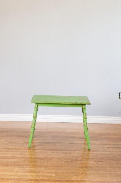
To improve the perspective of this photograph:
1. Turn the table or move your camera to get a 45° angle that shows more of the tabletop and all 4 of the legs.
2. Get closer–most of this image is wasted space.
3. Watch out for a crooked horizon line, it looks sloppy.
4. Remove distractions like that ugly electrical outlet and the funky shadows. To do this you can move in closer or re-position your camera like mentioned above, but sometimes you may need move your product.
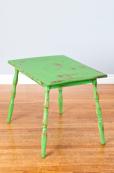
Much better!
- Dynamic descriptions
- BAD:
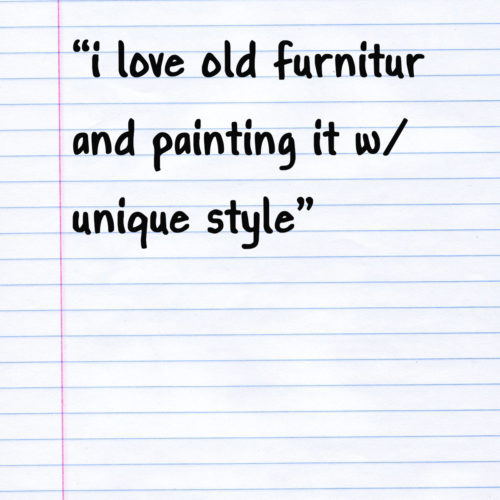
This description is vague with no attention paid to spelling or punctuation.
- GOOD:

This description is much more readable without distracting errors and it conveys vivid imagery.
The first description gets the ballpark idea across, but won’t set you apart from the many, many other furniture painters out there.
Specificity is key. What is it that makes your style unique? What feelings do you want your products to evoke? What is it about your process that no one else could replicate? Those aren’t rhetorical questions–sit down and make some notes about what defines your work and no one else’s. Then take those topics and incorporate it into your new tagline.
Did you notice the second description makes no mention of furniture at all? If you’re pairing it with a quality photograph or a well-designed logo you won’t have to. Some of the most memorable slogans bypass the literal for the emotional: Apple’s “Think Different”, Capital One’s “What’s In Your Wallet?”, and Las Vegas’ “What Happens Here Stays Here” to name a few.
The second description may be slightly cheesy, but from the wording any reader could easily infer that vendor offers casual furniture pieces painted with eclectic patterns. Being vague is like a pair of old sweatpants: it may be comfortable, but if you want to go anywhere exciting, you’re going to have to make decisions and change.
- Active online presence
- BAD:

Social media business DON’T: pushy advertisements or little-to-no activity
- GOOD:
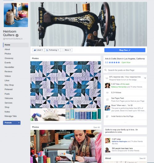
Social media business DO: nuanced advertisements sprinkled in among lots of photo & video posts about how & where your products are made, who makes them, and what inspires you.
- BAD:
The knot too shabby selection committee looks for vendors who can help attract the most customers to our annual shabby chic festival. We want vendors who have vital online followings. Having a large number of followers can be helpful, but having followers who regularly comment on and re-share your posts is even better. Engaged online followers are most likely to become customers who are enthusiastic to visit the knot too shabby BAZAAR and spend money shopping there.
Incomplete or inactive websites and social media accounts discourage would-be customers. In addition to making it harder for them to contact you, it can also hurt your reputation. Especially if you don’t have a brick-&-mortar shop, your online presence is the face of your business. A profile that lacks descriptions, quality photos, and current updates gives the impression that you’re not serious about your customer service or your products.
Building an active online presence is about showing your products in the best light possible while building a relationship with your customer base. When posting photos, include a mix of product photos, work-in-progress pics, and yes, a few photos of yourself. Consumers who appreciate vintage and handmade products want to support small business owners who are authentic and relatable. Be careful not to fall into the trap of spamming your followers with constant self-promotion. No one likes to be bombarded with non-stop advertisements. Interact with your followers and fellow handmade & vintage enthusiasts on a genuine, personal level. Regularly like and comment on their posts. Consistently show quality work and kindness and you’ll go far. It’s as easy and as difficult as that.
- Know your ideal customer
- BAD:

DON’T: try to appeal to every customer that could possibly exist–that would be overwhelming
- GOOD:

DO: focus on appealing to your ideal customer
and you’ll go far
Especially when you’re responding to open-ended questions such as:
- “How would you describe your merchandise?”
- “What materials are used in creating your merchandise?”
- ”Tell us about your booth space”
Write your answers as though you were responding to your ideal customer. Not only will you create more vivid descriptions, you’ll have sales pitches that will be ready for use in conversations with customers at the knot too shabby BAZAAR and beyond.
Who is your ideal customer? If you answered “anyone with cash” then you have some critical thinking to do. You’re never going to please everyone all the time and you’ll spread yourself too thin if you try.
Think about the lifestyle, spending habits, and interests of the ideal customer for your business. Is your customer someone who prefers quality or quantity? Do they appreciate originality or nostalgia more? Would they care about practicality or luxury more? What need does your product fulfill for your ideal customer? What changes in their life would prompt them to want your product? What concerns might they have before buying your product? The more clearly you can define your ideal customer, the better you can market your products to the customer base you’ll have the most success with. Know where they’re coming from, how they like to spend their free time, and which social media platforms they interact on. The more you understand about your ideal customer, the easier you can make it for them to discover your business.
Lots of customers may come and go, but if you can find your ideal customer they’ll shop with you again and again.
- Individual style
- BAD:

Trying to fit in with the crowd is exhausting–and you risk going unnoticed
- GOOD:

Be yourself without worrying what everyone else is doing.
What’s your style? If it’s vintage or shabby chic, perfect! But that’s only a start. Every applicant’s style is vintage or shabby chic–don’t be afraid to stand out!
Use every relevant comment box on the application to your advantage. The multiple choice questions will tell the knot too shabby BAZAAR jury all the necessary basics, so there’s no need to duplicate that information. If you answered the multiple-choice question “What types of merchandise do you offer?” by choosing the option “Live plants” then your response to the short-answer question “How would you describe your merchandise?” should elaborate much more than also typing out “Live plants.” I’m not saying you need to write an essay for each comment box; after all, brevity is the soul of wit. Choose your words carefully to concisely create a vivid image of your business. Give us your best elevator pitch! If you only had 30 seconds to get a complete stranger excited about your business, what would you say?
Be as specific as you possibly can. Odds are, there are plenty of other applicants who share the same category as you. If you sell vintage clothing, what sets you apart from other vintage clothing sellers? Knowing your ideal customer will help you distinguish your individual style (and vice versa). Someone who sells rare items meant for collectors will have a different perspective than someone who’s selling items for everyday use. If you’re making items by hand, do you have a technique or tradition that sets your business apart from other makers? Perhaps you use antique tools to make your jewelry or the stationary paper is made from the flowers of distant lands you’ve traveled to–these are the kinds of details that will get the knot too shabby BAZAAR jury excited about your application!

In a nutshell, be original and go the extra mile to give your words and photos that “Wow!” factor. Whether your application gets approved or not, you will have crafted a portfolio for your pop up shop that will be beneficial for as long as you keep it updated to reflect your growing business.
When you’re ready, submit your application for the knot too shabby BAZAAR. Don’t take too long–the deadline is March 28th!
Save
Save
Save
Updated knot too shabby Painting Tips
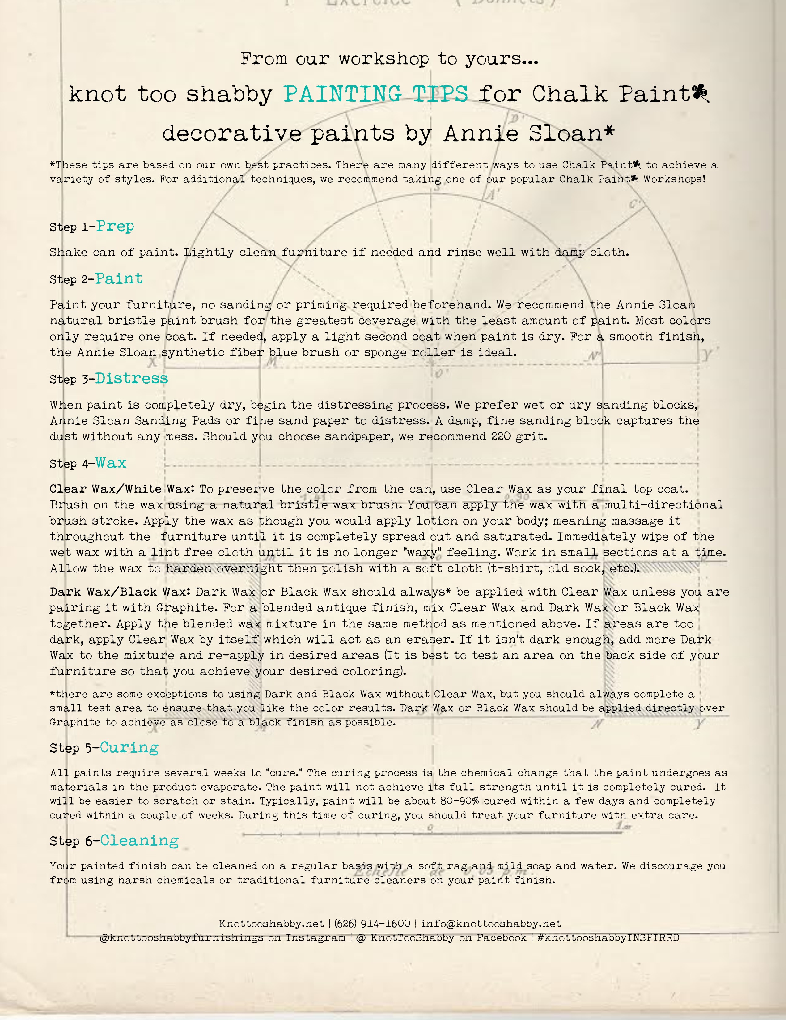
Our best recommendations for using Chalk Paint® decorative paint by Annie Sloan.
Painting with Annie Sloan
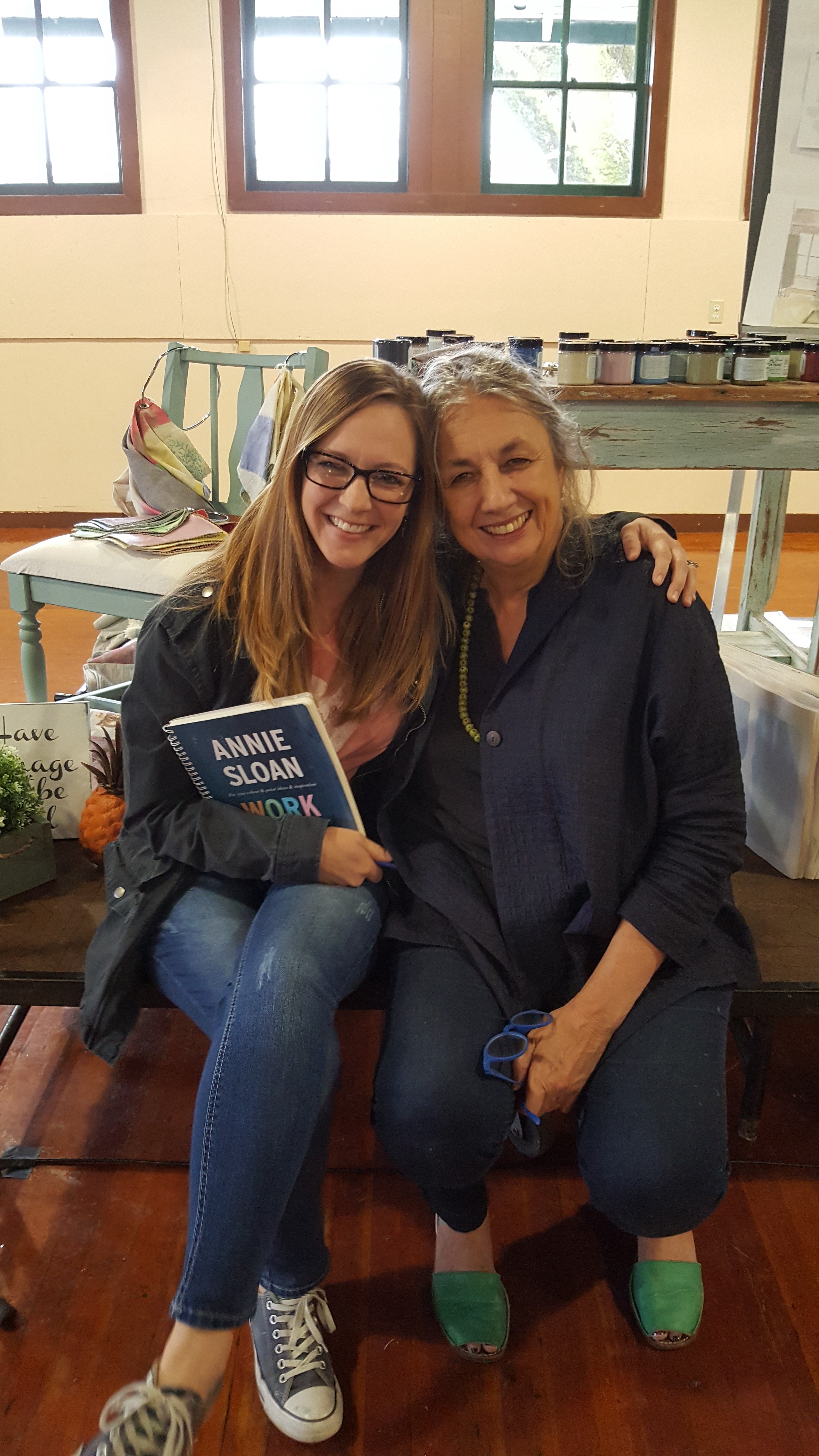
Last month, I went on a whirlwind of a trip to Oregon to take a painting class with Annie Sloan.
By whirlwind, I had to align the sun, moon and stars to pull together childcare, store coverage and the dollars to get myself to Oregon all within an eight to ten day time frame. But, IT WAS COMPLETELY WORTH IT!
I stayed in Oregon City right on one of the many rivers and commuted the short fifteen minutes into Canby where Annie Was teaching her class.

This workshop was like taking Annie’s Color Recipes for Painted Furniture and bringing it to life! Of her books, that one is my favorite and I’ve read it multiple times, sometimes in sections and cover to cover. But, nothing compared to having her teach the content of that book!
It’s entirely impossible to convey in writing the experience I had learning from THE BEST in the industry! But, I’ll try.
This is what I love about Annie Sloan Paint, her products, the person…everything, and I mean EVERYTHING is done with complete intentionality. The colors she has created are made with versatility for mixing and blending and an authenticity for the inspiration in which the color has been named.

The workshop began with tips on curating the design and style of our shops (there were around sixty shop owners taking this workshop with me) and understanding the various definitions of “vintage style.” Oddly enough, I had an e-mail exchange with Annie about five years where she helped me to understand and be able to communicate what my design style is. You can read about that exchange here.
She then, seamlessly transitioned into teaching us how to use color, both within the context of our stores, but also in our homes. For some, pairing colors and/or mixing them together is intuitive. You can see a lime green and just know that English Yellow and Antibes will give you that perfect shade of lime green. Because I’ve been mixing colors for so long, and because I’ve read much on the subject, I’ve become quite good at it. But, that isn’t the case for most people. I learned the “non-intuitive” way of understanding color which will be an amazing tool to have in my pocket both when I teach about color but also when I work with our customers on custom color mixing or pairings.
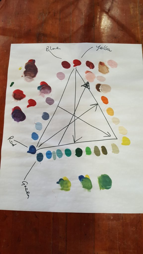
I couldn’t possibly even begin to summarize everything that I learned, but I’ll pass on a couple of fun nuggets of information from Annie Sloan herself.
- When you are working with a lot of color in a space, you should use a lot of white or black to provide balance.
- Take time to curate your home. What you may see as an eclectic gathering of objects in reality is a mis-matched mess that doesn’t work well together.
- When you are working with the neutral shades (Paloma, Paris Grey, Country Grey, etc.), you should understand what colors are used to create those neutrals so that you can pair the same colors in your space. For example, Paris Grey is made by mixing Barcelona Orange, Napoleonic Blue and white together. Therefore, pairing orange and blue into a space dominated by Paris Grey works well together.
If I could pass along one tip, it would be that understanding the neutral colors will completely change how you infuse color into your design!
And People…I’m always here to help inspire confidence in your projects and share tips and tricks. So just come in and ask!!! (Or take a workshop ;))
4th of July Decorating with Miss Mustard Seed’s Milk Paint

Happy Independence Day to all of our American readers!
Today I’d like to feature some patriotic projects by some knot too shabby family members: my dad Bill and his sister, my godmother, Darlene!
My dad volunteers at The Farm at Fairplex where he grows produce, cares for animals, and educates local schools on the value of sustainable urban agriculture. But he’s more than a farmhand, his real specialty: farmhandyman. If something needs fixing or building, he’s the person to ask. And with his perfectionist streak, any broken fixtures are often rebuilt better than they were made originally!
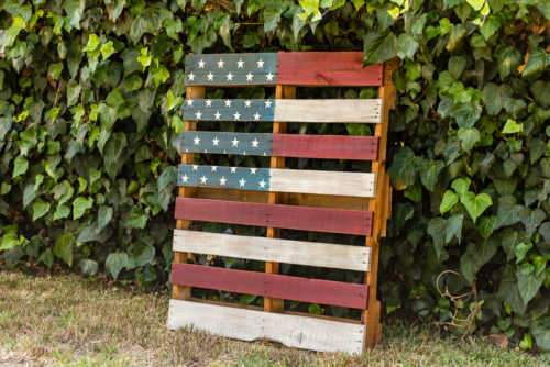
So when he came to me looking for help painting an American flag decoration that would look at home in an antique barn, I knew I had to introduce him to the real deal: Miss Mustard Seed’s Milk Paint.
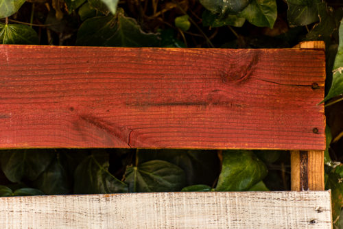
The color will penetrate the wood for a lasting finish that won’t chip or flake.
Milk Paint has been around for thousands of years. It was found in the pyramids in Egypt and on ancient cave paintings. It’s been used in America for years on furniture, walls, barns, etc. It is a versatile paint that can be used to achieve a variety of looks from chippy and distressed to smooth and sleek. Milk paint provides a completely breathable coating and is ideal for painting wood, plaster, drywall and a variety of other surfaces. It is environmentally friendly, non-toxic, contains no VOCs, and is naturally mold resistant–a perfect combination for The Farm’s organic and sustainable culture.

Milk Paint acts like a stain, but looks like a paint.
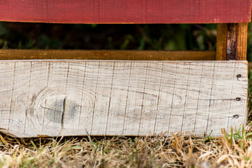
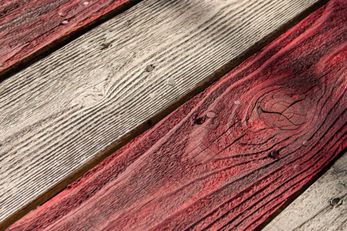
Repurposing a salvaged pallet, my dad took to Milk Paint like a duck to water. With thin coats of Tricycle red, Linen white, and Flow Blue (plus a dash of Artissimo blue for depth) he painted like a pro to achieve rich, natural colors while emphasizing the wood grain. A couple teaspoons added to the Linen white remaining at the bottom of the cup created a thicker, creamy texture that made stenciling the stars a breeze–no bleeding around the edges. Once the paint dried, he took a sanding block to the raised edges to further highlight the texture.
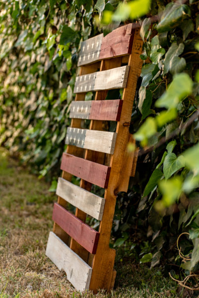
At this point, normally I would recommend finishing with Antiquing Wax, but since this pallet will frequently be displayed outdoors, I blended (but only partially, I wanted to keep a variety of separate hues) a small amount of Curio brown, Trophy grey, and a touch of Typewriter black into a thin, watery mixture. My dad applied this using a light dry brushing technique for added variation in color and texture. Now that we had replaced the wax’s antiquing effect, we still needed something to replace its protective properties. And nothing could be a more perfect fit for this project than Hemp Oil.

American Flag Pallet with Miss Mustard Seed’s Hemp Oil–seen here still absorbing
Hemp Oil is a finish that is a nice alternative to the wax. It is all natural, so it’s great for people who are sensitive to chemicals. Hemp Oil is best when it’s applied to a porous surface (like raw wood, stained wood or Milk Painted raw wood.) It will absorb into the surface, creating a durable finish. It’s a food safe finish that can be used on cutting boards, butcher blog counters and kitchen tables. Hemp Oil is also great for projects that will be used outside. Once it cures (after approximately 30 days), it protects and wears beautifully in the elements.
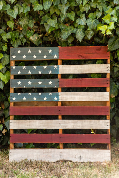
In all, the American flag pallet took less than a day to complete. With time to spare before July 4th, my dad took what he had learned and taught my godmother how to paint too! With strong ties to the military (her husband, father, mother, and grandson have all served) she had been saving a section of 30 year-old fence that had been pulled out two years ago, to create a special testament to her family’s service–so we knew that this flag decoration had high expectations to live up to. I never doubted the quality or ease of Miss Mustard Seed’s Milk Paint to achieve that lofty goal.
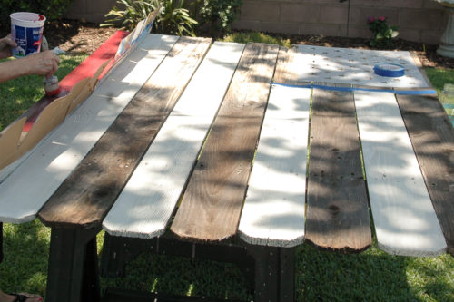
And yes, even in 90°F weather, with a sudden soaking from automatic sprinklers just before painting, lots of spirited debate about exactly where to stencil the stars (what can I say, perfectionism runs in the family), and an old dog who wanted to nap wherever Aunt Darlene needed to stand, she finished her American flag fence in no time at all.

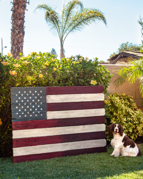
The family that paints together, stays together.
From my family to yours, have a safe & happy 4th of July! -Caitlin
Natural Household Cleaner Recipes
If it’s important to you to use fewer toxic chemicals in your home, then the first place you should look to cut back on them is in your cleaner cabinet. We commonly use some pretty toxic chemicals when cleaning mildew off the grout, or hard water deposits off the faucet, or even just disinfecting the kitchen counters! The good news is, you don’t have to. Not only are natural household cleaners better for the environment and your family, they also are cheap to make! From fabric softener to oven cleaner, we have the best DIY natural household cleaner recipes out there, by great bloggers who care enough to share! So pick one or two you use often, and take a jump on over to their websites to check out the natural cleaner recipes… It only takes making small changes in the beginning to make a complete change in the end!
From the ‘Liz Marie Blog’, I love this recipe for DIY laundry softener for a couple reasons… First, that jar with the chalkboard label is adorable…. Second, the recipe is so easy, and can be customized. You can use either a high end organic conditioner, or one from the dollar store! Check it out at her site!
(adsbygoogle = window.adsbygoogle || []).push({});
Need to tackle that bathroom soap scum? This all in one bathroom cleaner recipe from ‘Riffles and Ruffles” uses just a few things found around the house, but takes the place of several cleaning products.
Try these homemade fizzy toilet bombs from ‘One Good Thing by Jillee’… You can make a big batch, and always have a way to freshen the toilet, without the chemicals…
From ‘Passion for Savings’, try this DIY stainless steel cleaner on those appliance fingerprints!
Try this all natural carpet cleaner that will get out any stain, from ‘Surviving the Stores’!
Cleaning the toilet is not a fun job, and we all know it. Feel a little better about it by using this DIY non toxic toilet bowl cleaner by ‘Live Like You Are Rich’.
‘Mrs Happy Homemaker’ has a DIY carpet powder recipe to freshen those stinky, stale rugs… and she even has a twist that is supposed to repel bugs!
‘365ish Days of Pinterest’ has a DIY grout cleaning recipe for you, and when looking at the before and after, it looks like it really works! No bleach fumes!
‘Joyful Adorations’ shows us how to make DIY dishwasher detergent… Did you know that some commercial detergents contain lye? ICCKKK!
‘Rooted Blessings’ has a DIY oven cleaner that has no toxic chemicals! And it works! You know how bad those commercial ones are, you have to wear thick gloves just to use it!
Try this DIY natural furniture polish by ‘Sweet T Makes Three’! I honestly hate the way “Old English” smells.
Want to take a shot at creating your own natural household cleaner? Use this infographic from ‘Heiton Buckley’ as a guide to creating DIY cleaning products, covering the most popular ingredients and what they do. What kind of natural products do you use? Share with us in comments!
Photo by ‘DIY Network‘.

Image Credits: DIY Network, Liz Marie, Riffles and Ruffles, One Good Thing by Jillee, Passion for Savings, Surviving the Stores, Live Like You Are Rich, Mrs Happy Homemaker, 365 Days of Pinterest, Joyful Adorations, Rooted Blessings, Sweet T Makes Three, Heiton Buckley
(adsbygoogle = window.adsbygoogle || []).push({});
The post Natural Household Cleaner Recipes appeared first on The Budget Decorator.
Summer Home Decorating Ideas
When summer is here, most of us look for a different home decorating look for those warmer months. Using fresh design elements based on nature is the epitome of summer. Here are some great ways to update your entire home for the summer season!
Walls
One of the fastest ways to change out the décor in any room is to change the wall art. Choose artwork with lighter values, and choose frames that are less substantial. You can change out just the matting in photo frames to white. Frame up some garden art to bring in the spirit of the season, or print out some ethereal landscape images of places you would like to go. Take down any heavy wall hangings and store until fall. Photos by BHG.

(adsbygoogle = window.adsbygoogle || []).push({});
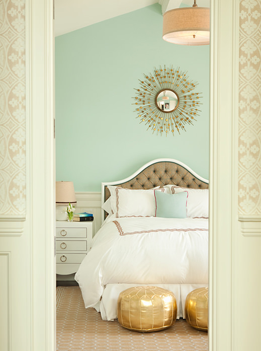
If you really want to add a fresh color shot to your summer home decorating, paint the focal wall in your room a fresh, summer inspired color. Aqua blue, spring green, sunny yellow or french blue are all great choices. Remember, its only paint, you can paint it back in the fall! I LOVE this master bedroom from ‘Lee Ann Thornton Design‘. In fact, it inspired my master bedroom!
Windows
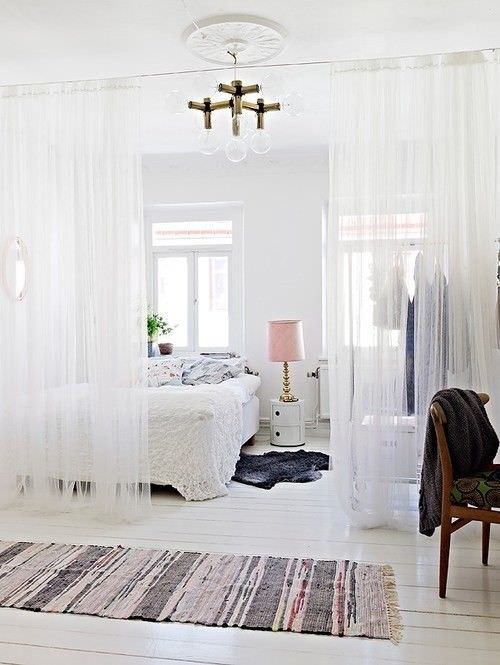
Summer is no time to sit in a dull dark room, so this time of year is a great time for sheer drapes to let in as much light as possible. Take down your layers on your windows and keep it simple. Cotton curtains and drapes are a great choice for this time of year because they are lightweight and casual. Photo via ‘Remodelista‘.
Add insulated drapes to windows that get a hot southern exposure to keep your rooms cooler, and to protect your carpet and furniture from sun damage.
Accessories
When those first summery days give you beach fever, use that energy to de-clutter your rooms. Pack away at least half your accessories to give the room a much cleaner look.
- Replace throw pillows with fresh, striped or floral covers in modern prints.
- Bringing summer decorating inside your home means bringing the outside in, so make sure flowers and plants live in every room.
- When in doubt, white tablecloths and slipcovers transform any room into a summer haven.
Need summer decorating DIY projects? We found you some great ones!
Try these DIY sisal candleholders by Four Generations One Roof! So beachy and easy!
Gotta love these DIY dipped plant pots by ‘HGTV“.

Tricia from ‘Simplicity in the South’ has this driftwood heart tutorial for us… This can be an expensive little buy in a gift shop, and what a fun way to use up all those pieces of pretty wood the kids (or you!) collect from your trips to the beach! I love that you can keep the memories alive just by making this project. Plus, I love things made from nature used in the home.
Keeping on with the beachy theme (what could be more “summer”?), Heather from ‘At the Picket Fence’ made this DIY coastal rope mirror, and shows us how she did this easy project with just rope, some starfish from the craft store, and Mod Podge!
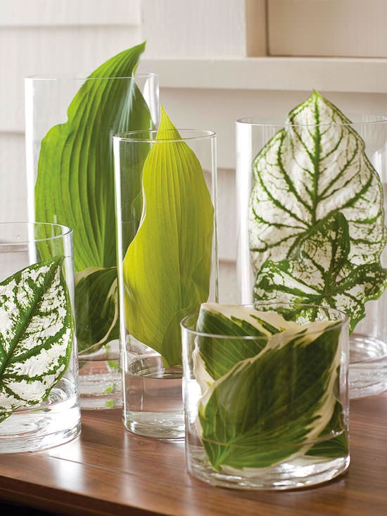
This idea from ‘BHG‘ is as simple as it gets… don’t worry about buying expensive flower bouquets, just use some dollar store vases and some pretty leaves from the yard. These Hosta leaves feel so restful!
Want to brighten up your front door? Cyndy from ‘The Creativity Exchange’ has a tutorial for this DIY easy moss basket that looks amazing. I want this! You could use any color scheme, and any annual flower you choose… Yep, these are real flowers! I am not a big fan of faux blooms, so to have real ones in a front door basket really sets your home apart. Pretty!
From ‘Midwest Living‘, this idea for a summer centerpiece is perfect for the eco-conscious mentality the world is embracing. I happen to love the simple beauty of things that are fresh grown… Using them as decor seems so fitting! Make it look chic by using a large clear glass container, and use distilled water with fresh veggies and greens. The distilled water will keep it looking crystal clear. Love!
Summer home decorating is just as important as any other time of year, and it just takes a little creativity to brighten each and every room.
Image Credits: HGTV, BHG, BHG, Lee Ann Thronton Design, Remodelista, Four Generations One Roof, Simplicity in the South, At the Picket Fence, Midwest Living
(adsbygoogle = window.adsbygoogle || []).push({});
The post Summer Home Decorating Ideas appeared first on The Budget Decorator.
15 Easy Decorating Ideas on a Budget
When money is tight, it can seem impossible to decorate your home. But we found tons of great ideas and DIY tutorials that you can use to transform your space, no matter how tight your purse strings are! Think creatively and put in some elbow grease, and take inspiration from these tips and projects.
Laura from ‘A Beautiful Mess’ created this DIY concrete countertop that goes right over an existing counter. This saved them TONS of money over having a custom concrete counter done. TONS. Oh, and the tutorial is easy!
(adsbygoogle = window.adsbygoogle || []).push({});
‘Young House Love’ created this ceiling light with a diffuser from a scratch and dent lampshade! It looks like a $400 upscale version from a specialty lighting store, and it cost around $30! Oh, and it’s big, so it makes a statement. Click through to see the ordinary light it replaced.
From ‘Sweet Pickens’, these DIY letters from reclaimed wood work so well because they are big and bold… and the texture form the wood is so awesome! She made these in an hour, no power saw required. Oh, and you can buy them from her too!
Liz at ‘Love Grows Wild’ knows how to make the most of repurposing and styling to make a “budget” look really rock it. She made this kitchen display thrifting and upcycling the whole thing, and it cost her less than $10. Love this little vignette!
Wallpaper is back in a big way, but it can be expensive and time consuming. ‘The Painted House’ has the perfect solution… patterned paint rollers! You use regular house paint and one roller to create the feel of wallpaper without the expense, and if you change your mind later, no awful wallpaper removal!
From Katelyn at ‘Learning, Creating, Living’. These DIY concrete planters are fast and easy, and inexpensive! You can use things around the house to create the molds. Love these!

‘Love at First Book’ updated her bathroom counters to a granite look with a peel and stick product from Lowes. Check out how she did this for just a few bucks! This is so cheap and fast, you could easily redo it if it didn’t last as long as a paint finish.
Ok, so this isn’t technically decorating. But look, if you don’t have your place organized and decluttered, all the decorating in the world won’t help! So these closet accessory organizers from ‘The Chic Site’ are so clever, we had to share. Instead of cluttering up your drawers with scarves, bags and belts, make these simple hangers from an old pair of jeans and some simple shower hooks!
More great budget decorating help from Liz at ‘Love Grows Wild’. She created this DIY gallery wall, complete with that repurposed arrow sign for less than $20. And her trick for hanging all this great art? You have to read to find out!
These DIY painted vases from Aniko from ‘Place of My Taste’ look like they were a fancy boutique find. The tutorial for these is easy to follow, and I LOVE the colors! What a simple but elegant project.
Lisa from ‘Grey Luster Girl’ made this wooden sign tutorial for all those who love inspirational sayings as decor. (My hand is up!) You could make this with a vinyl cutting machine, or with pre cut peel and stick letters from the craft store.
This is an easy upcycling idea from ‘Style Me Pretty‘ using things you already own as decor. In this case, this gorgeous green cup and saucer becomes a pretty planted pot! Photography : André Teixeira from Brancoprata.
This copper barn light Ikea hack from ‘Kojo Designs’ takes the ultimate budget resource (Ikea) and turns a simple light fixture into something really warm and inviting. Easy!
‘Oh My Creative’ brings us this DIY rustic shelf project from Mindi at ‘My Love 2 Create‘. I love that she made this from an old fence board and some leftover wire mesh. Oh, and more inspirational sayings!
From ‘House of Smiths’, this mirror framing tutorial will make your bathroom look custom designed, instead of builder boring! Great tutorial with lots of pics. Take note of how she painted the mirror white to match the other woodwork, for instance, the door and door frame.
That’s it for today! 15 budget decorating ideas you can do! Do you have a favorite?
Image Credits: Learning Creating Living, A Beautiful Mess, Young House Love, Sweet Pickens, Love Grows Wild, The Painted House, Love at First Book, The Chic, Love Grows Wild, Place of My Taste, Grey Luster Girl, Style Me Pretty, Kojo Designs, Oh My Creative, House of Smiths
(adsbygoogle = window.adsbygoogle || []).push({});
The post 15 Easy Decorating Ideas on a Budget appeared first on The Budget Decorator.
20 Best Budget Decorating Tips
Home decorating on a budget is totally doable! Get started with The Budget Decorator’s top 20 budget home decorating tips! Feature photo, above, from ‘Good Housekeeping‘.
Paint your world.
Paint is the cheapest, fastest way to dramatically change a room in just hours! This colorful living room by ‘BHG’ is a great example of how they used inexpensive furnishings and lots of paint to make this room shine.
(adsbygoogle = window.adsbygoogle || []).push({});
Use a theme.
Choose a theme for every room, even if it’s a favorite color scheme or one you found in a magazine, it’s a place to start and plan. One that’s really now and easy to do on a budget? Modern farmhouse or vintage themes. See how one of our favorite bloggers ‘Liz Marie‘ does it! Can you just see all the DIY possibilities here?
Change things up.
Rearrange…move things around until you find a pleasing arrangement that works for you, whether it’s your furniture or your bookshelves! Check out our post on furniture arranging tricks! Here is a great arrangement for awkward rooms from ‘Midwest Living‘.
Reflect upon your home.
Use mirrors to reflect light, make a room look larger or just to double a pretty view like ‘BHG’ did with this bathroom. Or go even further, and turn a thrift store dresser into a vanity with this tutorial from ‘HGTV’.
Picture this.
If you can’t afford larger pieces of artwork yet have a lot of wall space to fill, pick up numerous photo frames at the dollar shop and spray paint them all white. Hang them together as a large grouping. Try this DIY fabric in wall frames project by ‘Sincerely, Sara D’.
Decorate with plates.
Hang decorative plates as wall art, from the kitchen backsplash to over the bedroom headboard for texture and interest. This example is by designer Kelly Wearstler at the ‘Viceroy Hotel’ in Santa Monica. The take away? Stay in a small color palette that coordinates with your room, and go big!
Think green.
Bring in live houseplants to any room of the home to add life and style. Learn how to root plants in water from ‘My Domaine’. Love this, it’s easy, inexpensive to add lot’s of greenery to a room, and if you choose a pretty and clear vessel, even the roots are part of the show!
Use the fabric of our lives.
Flat sheets are an inexpensive and easy source of fabric for curtains, slipcovers and pillows. Rachel at ‘Smile and Wave’ shows us how to make these DIY cloth napkins and placemats. I love the fresh, happy colors and patterns!
Use what you have.
There are so many items around the home that can be repurposed…learn to look at things in creative ways and see if they might meet a decorating need.
The art of disguise.
If you can’t afford to replace, disguise! Cover a sofa, lay a rag rug over that stained carpet, or use fabric to screen an unpleasant view.
Be a treasure hunter.
Use fabric from sheets and quilts, use yard sales to locate furniture to be painted to match your décor, and visit your dollar shop on a regular basis for picture frames and candles.
Kitchen creations.
Use paint to transform and customize your kitchen cabinets, knobs, counters and floors. Use good quality primer and sealer to make it last years! Jenna at ‘Jenna Sue Designs’ did an entire budget kitchen makeover! If you scroll down to the bottom of her post, there is a tutorial for all the DIY projects they did. Don’t forget to check out the “before” photos!
K.I.S.S.
Use solid colors for your bedding and window treatments so that you can easily change out accessories to change the mood or style.
Bathing beauty.
Use fabric and your sewing machine to soften your bathroom with coordinating towel edging, shower curtains, throw rugs and window treatments. This pretty bathroom from ‘BHG‘ would be really cold and boring without the sunny curtains and towels.
Make it shine!
A simple tip to make rooms look larger? Keep your windows and slick surfaces sparkling clean!
Style it.
It isn’t what you have, it’s how you use, what you have. Check out our post on how to style bookshelves. It’s easy, relatively fast, and inexpensive. Check out the tutorial on how to style a vignette by Yvonne of ‘Stone Gable Blog’. So pretty!
Family tree.
Print out black and white photos of each member of the family, and then hang them in matching black frames gallery style as a grouping for an unforgettable focal point. ‘Pottery Barn‘ shows us how to do it. Remember, don’t hang the frames too far apart, you want them to feel connected in a grouping. Also, use a few different sizes for interest.
Welcome home.
Place a piece of furniture in the entry, such as a chest or cozy chair so that visitors will feel the welcoming comfort of your home.
Sew not? So what!
If you don’t know how to sew, pick up some iron on hem tape at your local craft store. You can create simple hems and rod pockets easily with your iron!
Get personal!
Inject yourself and your family in to your home with personal items…photos, vacation finds, or ball game tickets in a frame all bring interest and life to your rooms.
Image Credits: BHG, Sincerely Sara D, Designer: Kelly Wearstler, Smile and Wave, Niji, Stone Gable Blog, Pottery Barn
(adsbygoogle = window.adsbygoogle || []).push({});
The post 20 Best Budget Decorating Tips appeared first on The Budget Decorator.
Make a Perfect Boutique Hotel Style Bed
There is nothing that makes a bedroom look more luxurious or high end than a well made bed. It doesn’t take a lot of cash to get a boutique hotel style bed, either. What it takes my friends, are the secrets. No lie, it’s way more than making sharp corners! So we found some great blogs offering their tips for how you can make your bed look amazing every day of the week, every season of the year. And guess what? No one will be able to tell if you get your linens in Paris or at the discount store up the road! (Or better yet, that excellent yard sale on the corner!)

‘Style Me Pretty’ has a great basic guide on how to make the perfect bed. This covers everything to get you started, and has the best tip we have found for finding the best sheet… It’s not all about thread count, although thats how they charge you! Steve and I heard this from an employee at Nordstrom once, and it is 100% true. It’s about the cotton. Not just any old cotton will do, the best is Egyptian or Pima cotton. If you buy sheets with that fabric, you can buy much lower thread count and still have the softest sheets around! Cha-ching! Also great step by steps on the basic bed. Must read for getting it down!
(adsbygoogle = window.adsbygoogle || []).push({});
‘Pottery Barn’ has a quick video on how to fill a duvet (which I didn’t figure out ’till I was in my 30’s!), and a couple of graphics to help you with the basics to remember on how to make a bed look amazing, and also where and how many pillows to use for each size bed. Easy to just glance at these and “get it”!
‘Trulia’ shows us how to buy bed linens so we can have that luxury feel to our bed, without wasting money on poor choices. We agree, cotton, good. Polyester, bad.
From ‘Houzz’ 13 steps to a perfectly made bed has some great tips… including one’s that make all the difference, like ironing your linens, or using corner fasteners to keep the sheets smooth. Photo by ‘Normandy Remodeling‘.
Ok, now that you have the basics all down, how about switch it up a bit? From ‘Style Me Pretty’, how to style a bed, 3 ways! A little glam, a little minimal, and a neutral bed with texture… Yep, they are all the same bed!
Need someone to pull it all together for you? Steven Whitehead at ‘One Kings Lane‘ does a nice video for us, where you can see a professional actually do it, and make it all look amazing! Ok, so ready? Tomorrow morning, it all changes, right?
Image Credits: SLC Interiors, Style Me Pretty, Pottery Barn, Trulia, Normandy Remodeling, Style Me Pretty
(adsbygoogle = window.adsbygoogle || []).push({});
The post Make a Perfect Boutique Hotel Style Bed appeared first on The Budget Decorator.


