Sometimes, even when you follow the fundamental interior design principles to the letter, your project doesn’t come out quite right. It’s not that there’s anything truly wrong, it’s just that something feels a little off about the whole room. If you’ve ever been in this situation, you know how frustrating it can be. After all, how do you even know where to start looking for a solution?
Well, we’ve been there before and come out on the other side. Below are three interior design tweaks that can make a huge difference in how a space looks and feels. Try them out in your own home. We’re willing to bet they can help you feel at peace with your interiors.
Refresh the layout
Let’s face it, regardless of which room of your home you’re dealing with, the layout needs to take center stage. Not only is a workable layout crucial in making the function of the space clear, but it also determines how well your design flows from one room to the next. That’s why, when a space feels awkward, tweaking the layout is your secret weapon.
Every layout is different so there’s no hard-and-fast rule on exactly which changes will work for you. However, the following are a few tried-and-true adjustments that will help a layout feel more harmonious.
- Clarify the focal point: Remember that the focal point should immediately catch your eye when you enter the room. If it’s not immediately apparent, consider rearranging the furniture so it draws the eye toward that spot.
- Create angled seating areas: While some people love the look of identical symmetry, for others it can come off as harsh. If your furniture is laid out like a mirror image, you may want to add a few angles to warm up the space.
- Move away from the walls: Some people assume that lining the furniture up against the walls will help the room seem larger. That may be true, but this maneuver also has a tendency to leave an unpleasant amount of dead space in the center. Try leaving a border around the outline of the room instead.
- Rethink your pathways: You should never feel trapped in the room. There should be a clear pathway to every entry and around all the furniture. Make sure your layout checks all those boxes.
- Declutter: Sometimes too much furniture can muddle a room’s purpose. If that’s the case in your home, remove pieces that aren’t geared toward the room’s primary function to see if the added negative space helps clear things up.
Ground your focal point
Sometimes, even the perfect layout is not enough to help your focal point shine. You’ll know that this is your crux if the room feels a little boring, if it seems as though there’s too much function and not enough visual interest. In this case, your solution is in adding an aesthetic element around the focal point to add emphasis.
If your focal point is furniture-based — for example, a seating area, dining table or bed frame — a great area rug is probably all that’s needed. Use our sizing guide to help you determine the dimensions your room needs, then focus on aesthetics. Obviously, you’ll want one that coordinates well with your color palette. That said, since it’s for emphasis, you want to make sure it’s appropriately eye-catching.
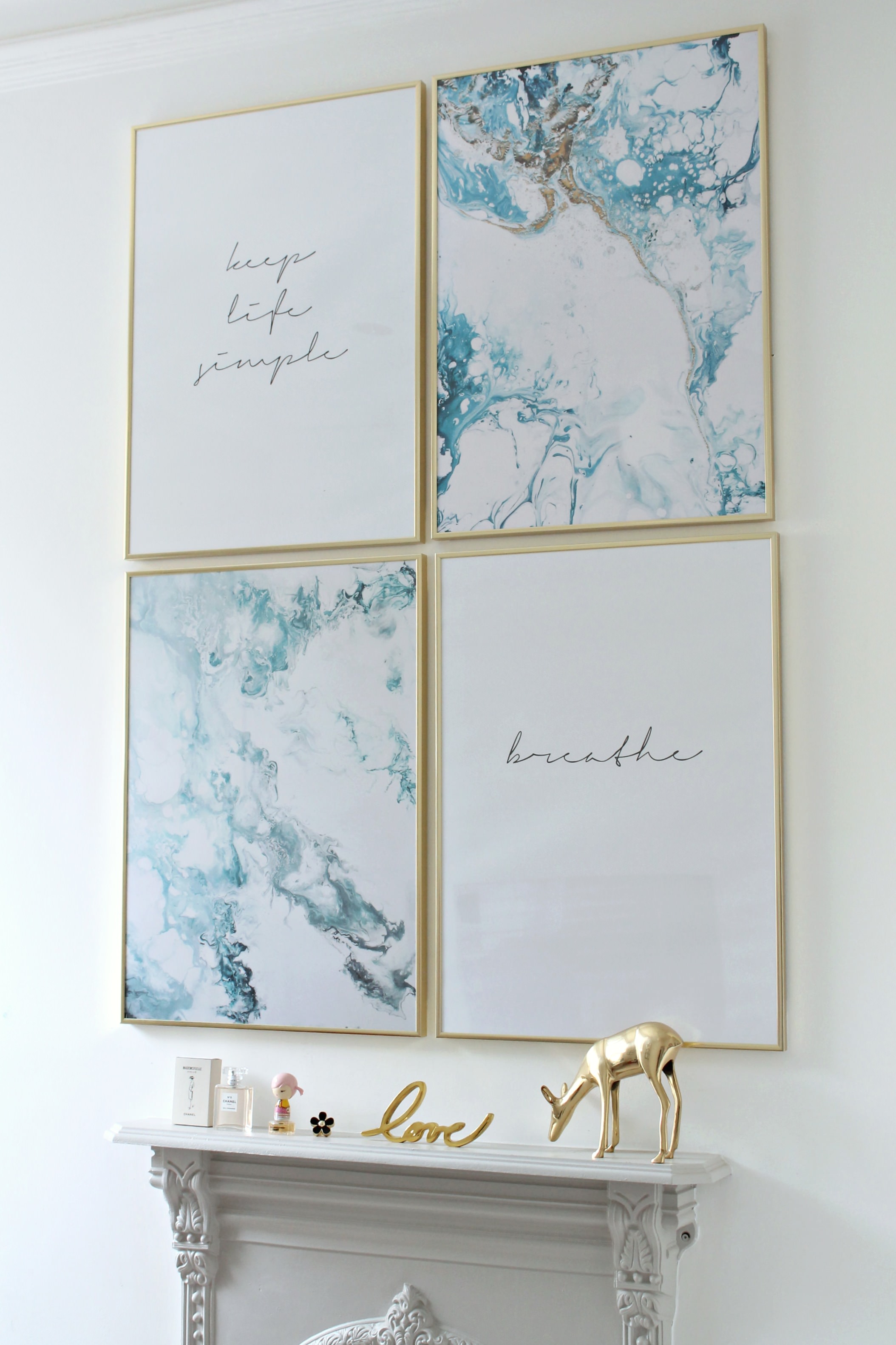
However, if your focal point is an architectural detail like a fireplace or set of built-ins, things are a bit more complicated. In this case, you can either use one larger item like a mirror or piece of wall art to draw the eye or you can use a couple smaller décor items. In either case, your goal is to use interesting colors and shapes to create that much-needed visual interest.
Think vertically
Occasionally, a room can come off feeling a little too bottom-heavy. This can happen if you have a lot of shorter furniture and not too much else in the upper quadrant of the room. Here, adding some vertical height to the space can open up the room dramatically and make it feel that much larger.
If that’s your issue, all you need to do is add a few vertical pieces that draw eyes upward so viewers can get a feel for the room as a whole. Consider adding things like vertical artwork, shelving units and long mirrors to give extra height. Even tall plants will work.
One thing to keep in mind: Where height is concerned, variation is key. Adding only similarly sized pieces may end up making the room feel too stark. Be sure to include a mix to give you more visual interest and the biggest bang for your buck.
Every once in a while, even though a design seems perfect on paper, it just doesn’t come out exactly the way you were envisioning. Despite your best efforts, something about the space feels off. Before you scrap the whole thing and start from scratch, consider trying one of these interior design tweaks. You never know when one small change will save the day.
Article source: https://freshome.com/interior-design-tweaks


