24 Living Room Color Schemes That Actually Work Together in Real Homes
Choosing a living room color scheme is harder than it looks because the room is the most used and most seen space in most homes. The wrong colors make the room feel cold, cramped, dated, or simply off in a way that is difficult to pinpoint but impossible to ignore. The right colors make the room feel like a place you actually want to spend time in. The difference is usually not about picking one perfect color. It is about choosing a combination of colors that work together at the right ratios, in the right locations, under the actual light your specific room gets. These 24 color schemes are organized as complete palettes with specific guidance on where each color goes and in what proportion, so the result in a real home looks like the result in the inspiration photograph.
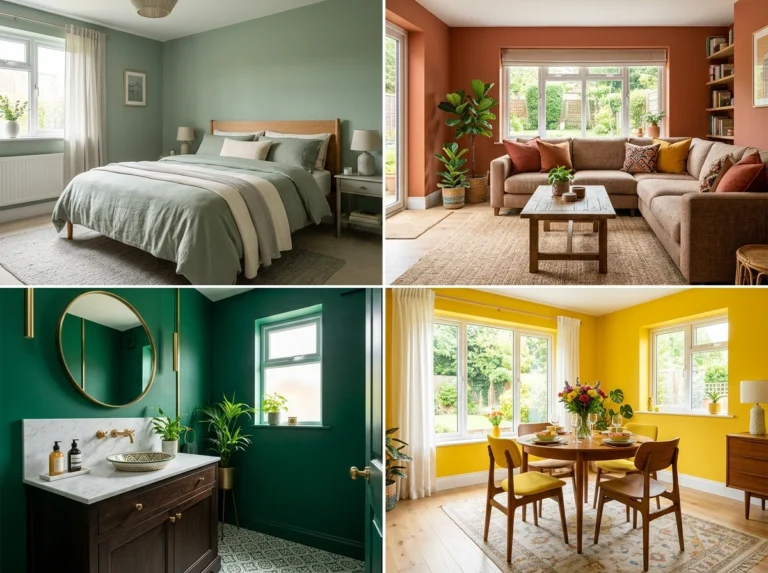
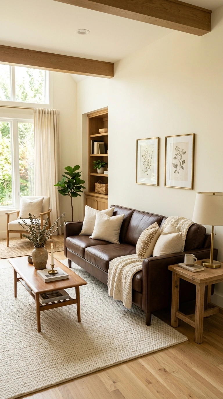
1. Warm Cream and Soft Sage
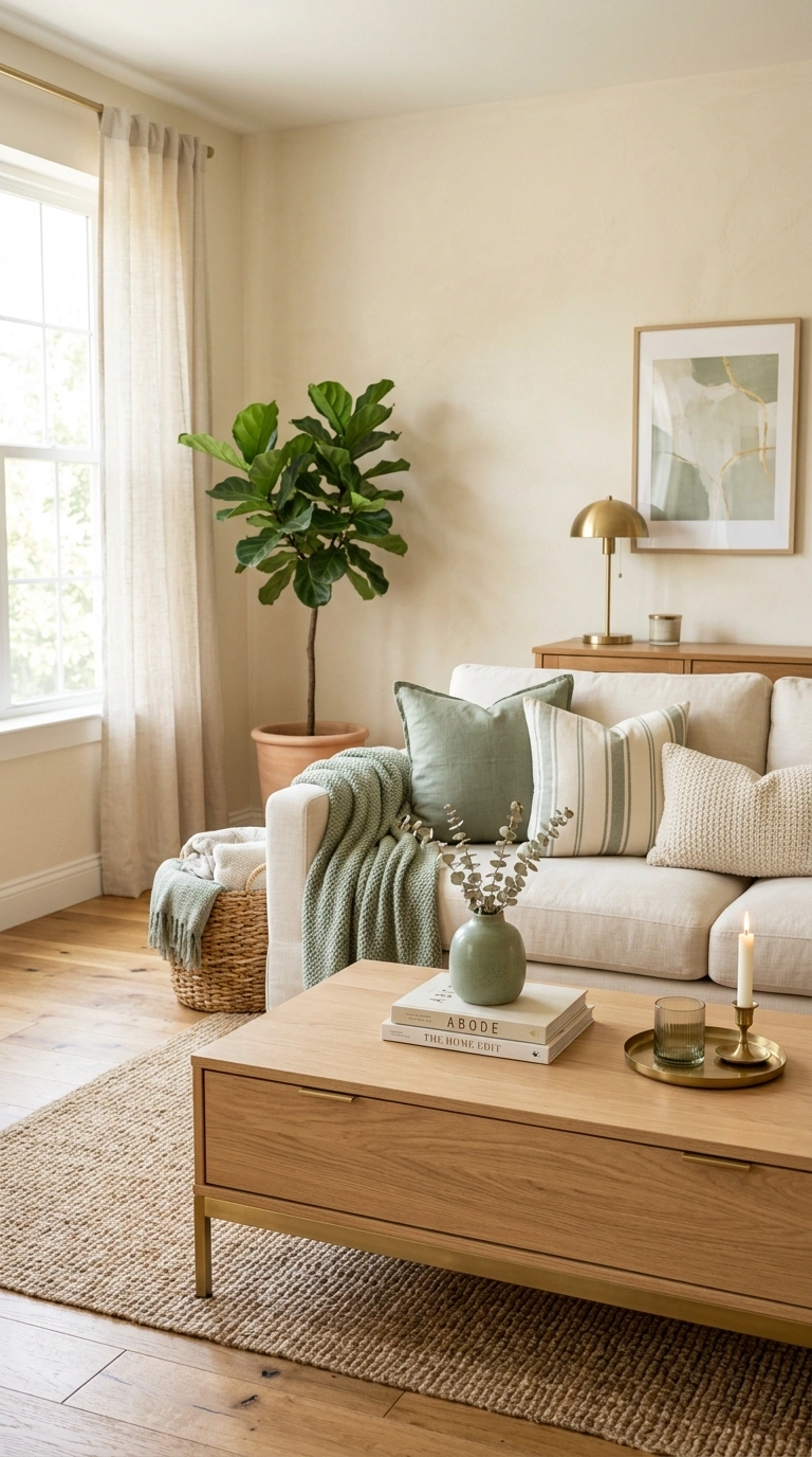
This is one of the most universally flattering living room palettes because both colors read as natural, calm, and warm in almost any light condition. Paint the walls in warm cream with a slight yellow base rather than a cool stark white. Use soft sage green in the accent pillows, a throw blanket, and one or two small accessories. A natural wood coffee table and warm brass hardware tie the two tones together. The ratio is roughly seventy percent warm cream, twenty percent sage green, and ten percent warm wood and brass accents. This palette works in north-facing rooms where cool light would flatten pure white walls, and in south-facing rooms where the warm cream glows gently in the afternoon sun.
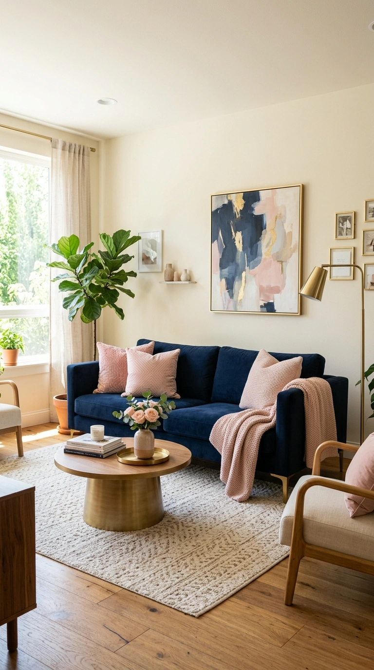
2. Navy Blue and Warm Mustard
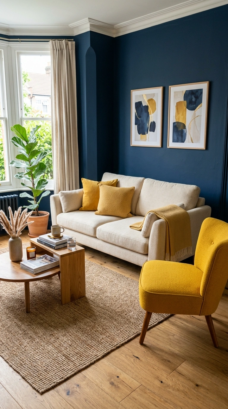
Navy and mustard create a high-contrast combination that feels both sophisticated and warm. Paint the main walls in a deep navy blue or use navy as the sofa color against warm cream walls. Introduce mustard yellow through accent pillows, a throw blanket, a piece of art, or a single upholstered accent chair. The contrast between the deep cool navy and the warm bright mustard creates visual energy without feeling chaotic. Keep the ratio at roughly sixty percent navy, twenty percent mustard, and twenty percent neutral cream or warm white as breathing room between the two strong tones. Add warm wood and aged brass accents to complete the palette.
3. Warm White Monochrome
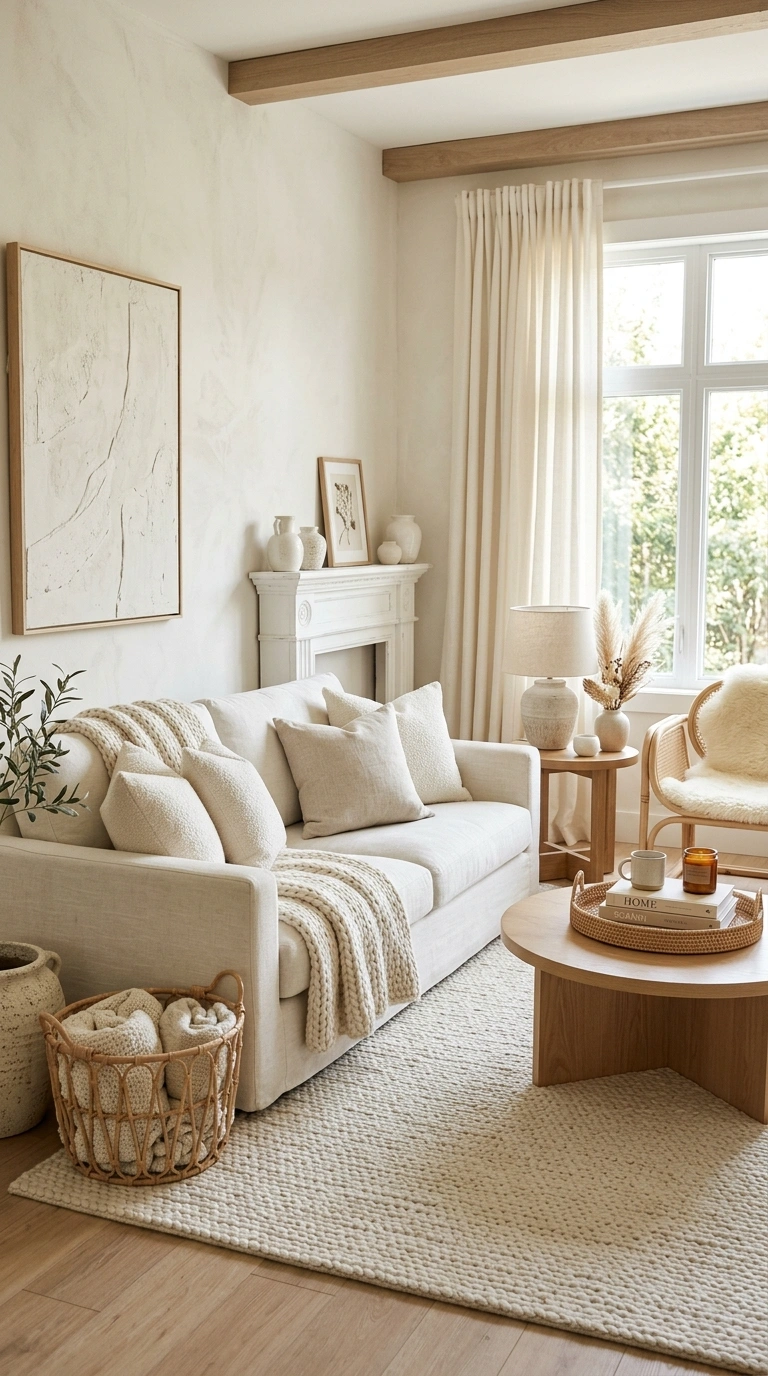
An all-warm-white living room works only when the whites are varied in texture and slightly different in tone rather than a single flat white across everything. Use a warm slightly creamy white on the walls, a slightly cooler white on the trim, an off-white linen on the sofa, a natural cream wool on the throw blanket, and warm ivory on the curtains. The variation in white tones creates subtle visual interest that a single flat white cannot achieve. Add warm natural wood, woven rattan, and green plants to prevent the room from feeling clinical. The monochrome white palette depends entirely on texture variation and natural material warmth for its visual content.
4. Terracotta and Warm Cream
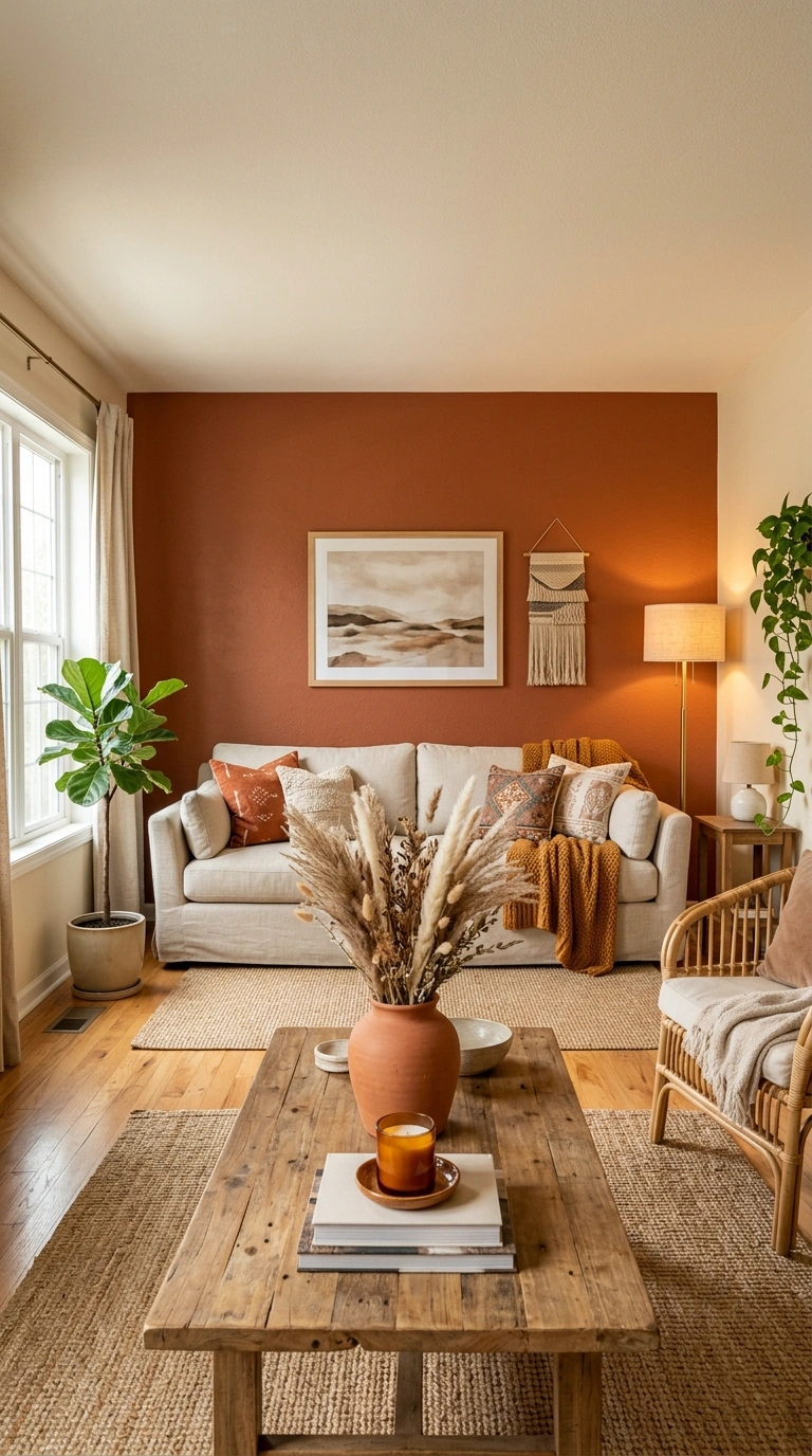
Terracotta is one of the most current and most reliably warm living room colors. Use it as an accent wall behind the sofa, as a sofa color against cream walls, or through terracotta accessories like pottery, pillows, and a rug. The warm orange-red of terracotta against soft warm cream creates an enveloping quality that feels like a Mediterranean afternoon. Keep most of the room in warm cream and introduce terracotta at roughly twenty to thirty percent of the visual palette. Add natural wood, dried grasses, and warm lighting to complete the earthy quality.
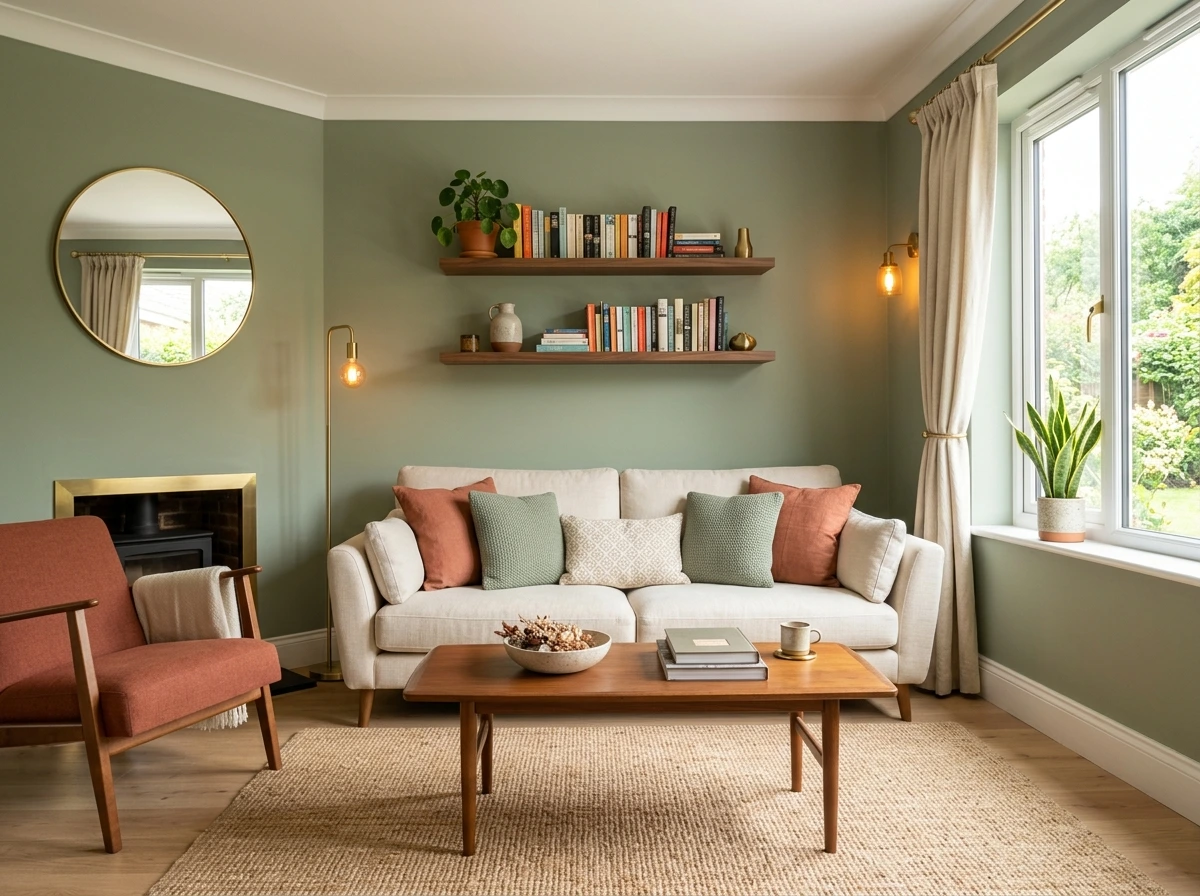
5. Sage Green and Warm Wood
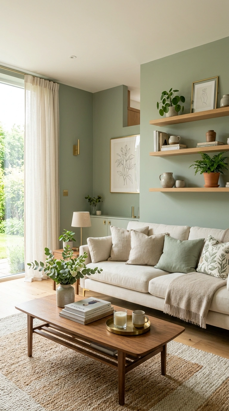
Sage green walls with warm natural wood furniture create one of the most calming and current living room palettes available. The cool natural quality of sage and the warm organic quality of wood balance each other beautifully. Use sage paint on all four walls for the most enveloping effect. Bring in warm wood through the coffee table, side tables, floating shelves, and frames. Add cream linen textiles and a few brass accents to complete the palette. This combination works in any light condition because sage is forgiving across different exposures and warm wood adds warmth regardless of the room’s orientation. For a detailed guide on using sage green successfully across any room, the sage green bathroom ideas guide covers shade selection and material pairing in depth.
6. Charcoal and Blush Pink
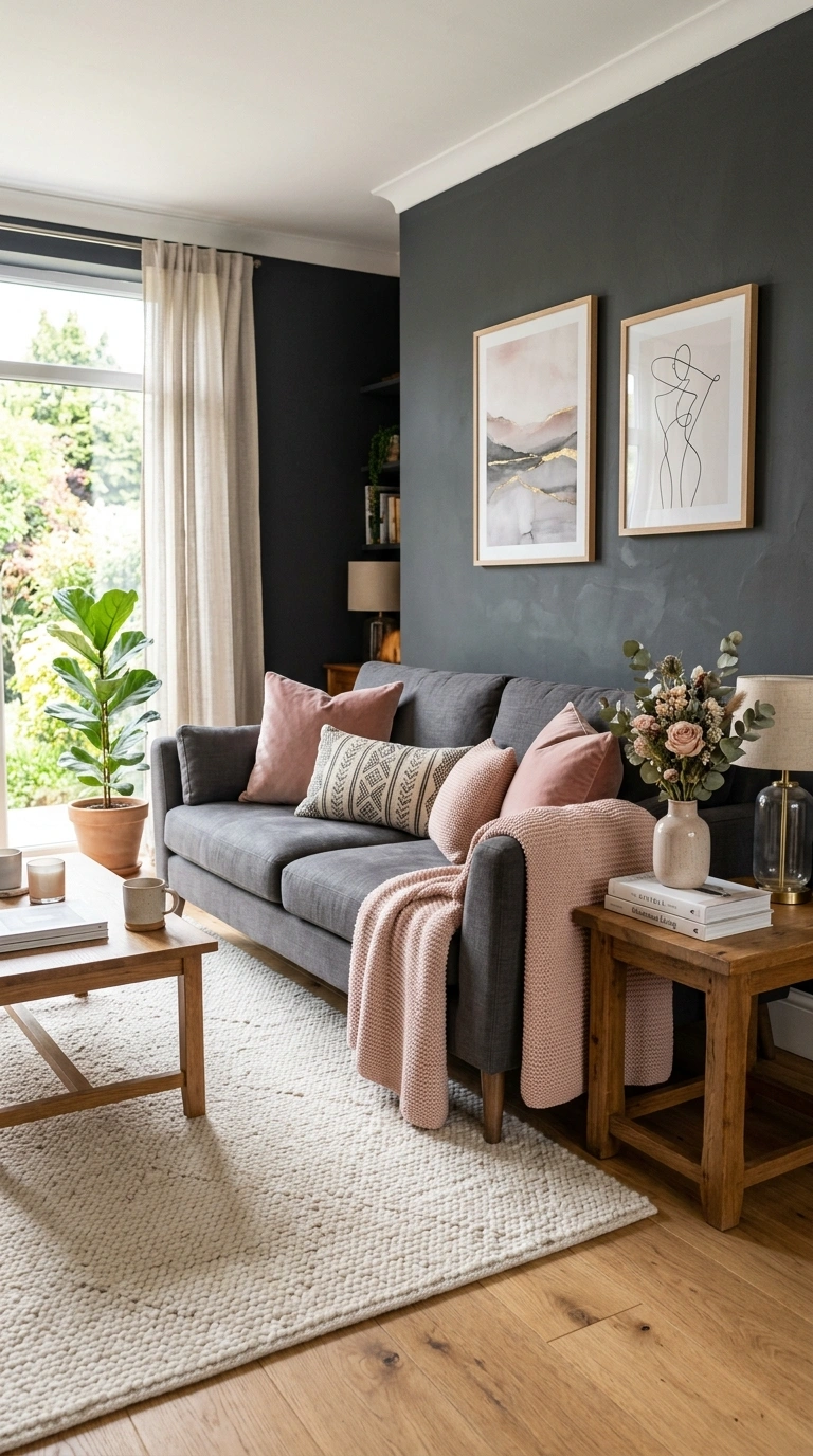
Charcoal walls or a charcoal sofa paired with dusty blush pink accents create a moody but surprisingly warm combination that suits both modern and traditional living rooms. The dark charcoal provides the depth and the blush provides the softness. Use charcoal as the dominant tone on the walls or the largest furniture piece. Introduce blush through pillows, a throw, a rug, or art. Keep a warm cream or soft white as the third element to prevent the palette from feeling too heavy. The charcoal-and-blush combination photographs exceptionally well and reads as more sophisticated in person than the individual colors might suggest.
7. Deep Green and Warm Brass
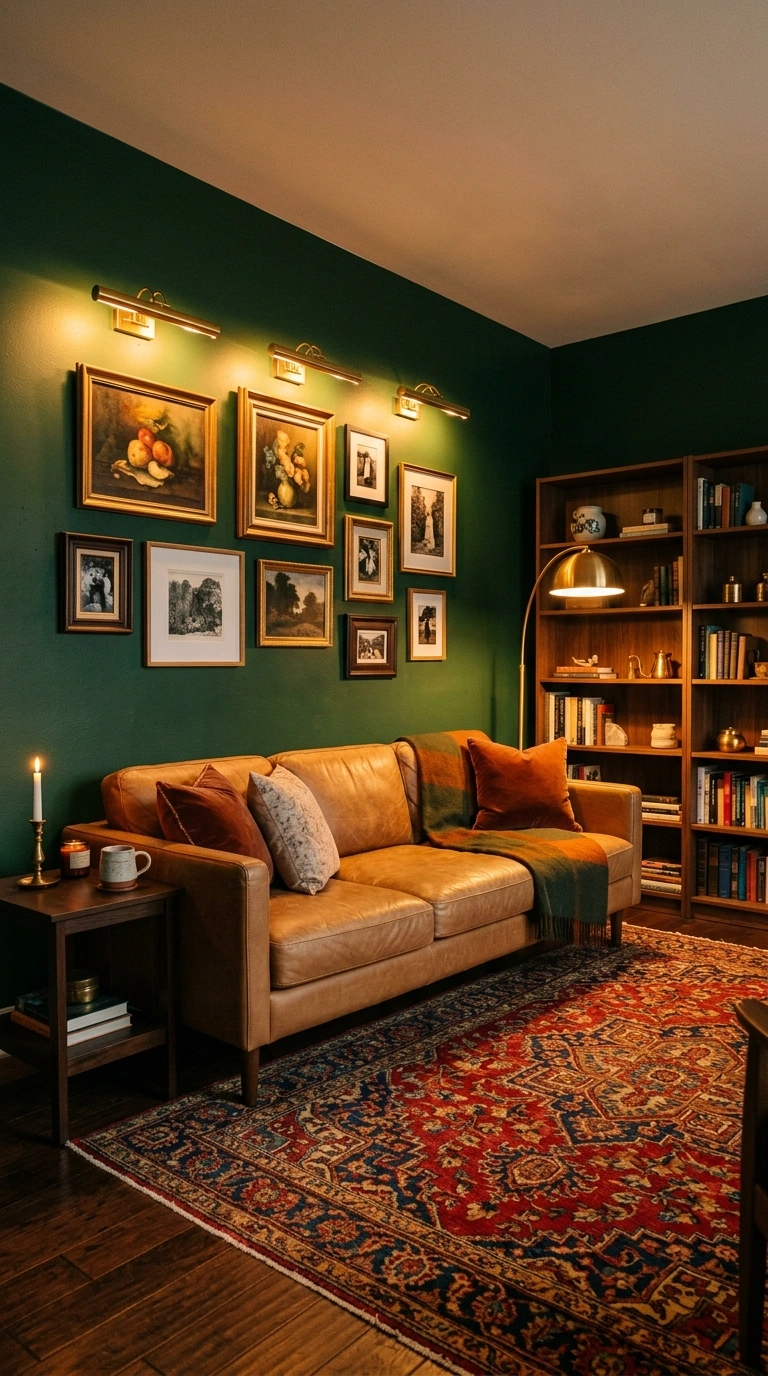
Deep forest green or hunter green walls paired with warm brass fixtures and natural warm wood create a rich, library-like quality that makes any living room feel more substantial. The deep green absorbs light and creates an enveloping atmosphere that lighter colors cannot match. Brass picture lights, brass floor lamp, brass coffee table legs, and brass hardware catch the warm light and create glowing metallic points across the dark green surface. Add a warm cream or camel leather sofa and a vintage Persian rug to complete the palette. This combination works best in rooms with some natural light or very good warm artificial lighting.
8. All Neutral Earth Tones
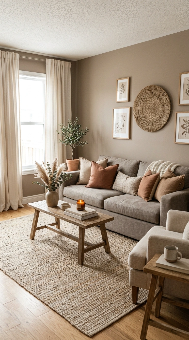
A palette built entirely from neutral earth tones, warm sand, soft mushroom, warm taupe, gentle clay, undyed linen, and warm cream, creates a living room that is calm, grounded, and unlikely to age out with changing trends. The key is using enough variation in tone that the neutrals read as layered rather than flat. A mushroom gray sofa on a warm sand rug with clay-toned pillows and cream curtains, all in slightly different earth tones, creates the visual depth the palette needs. This works particularly well in rooms with excellent natural light where the subtle tone differences are visible throughout the day.
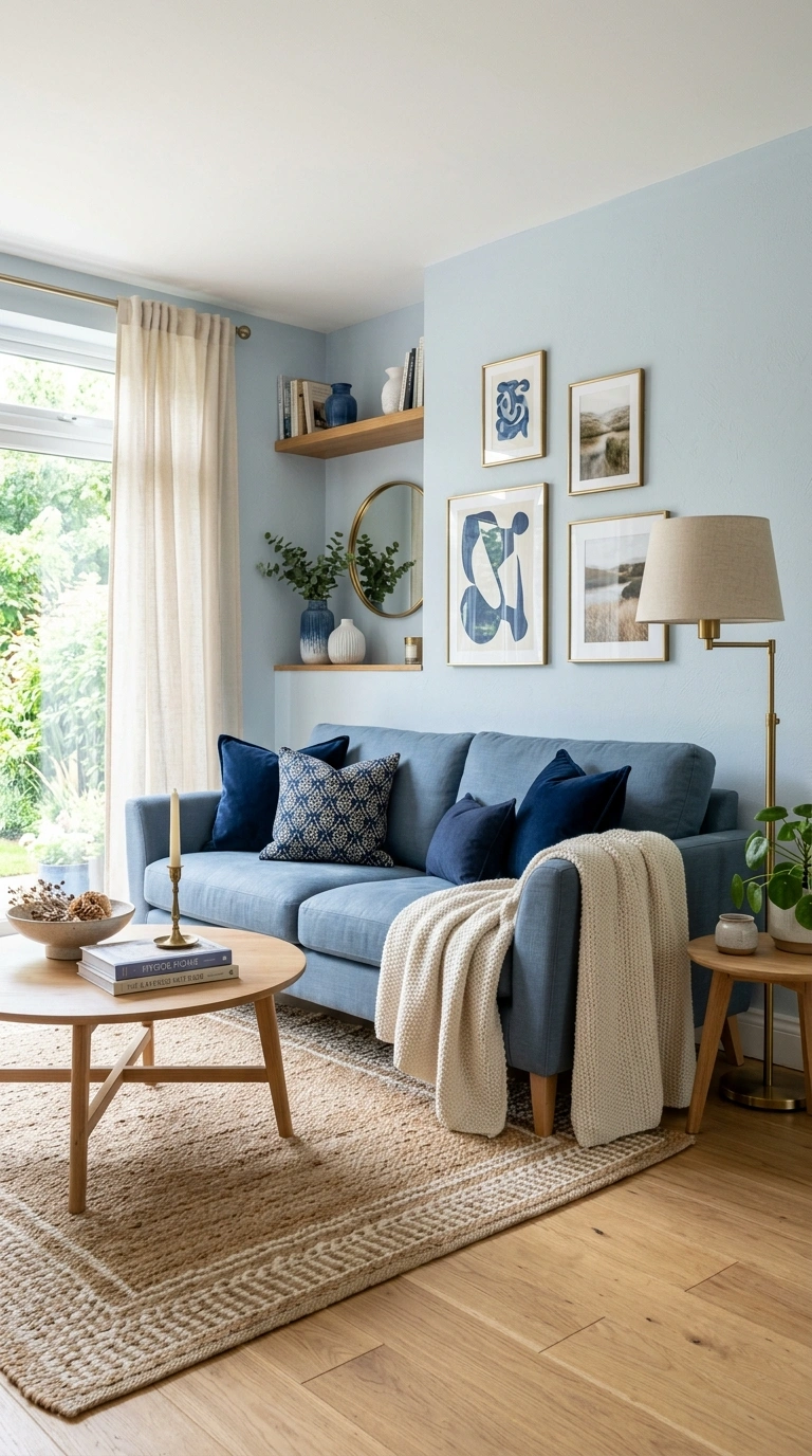
9. Dusty Blue and Warm Cream
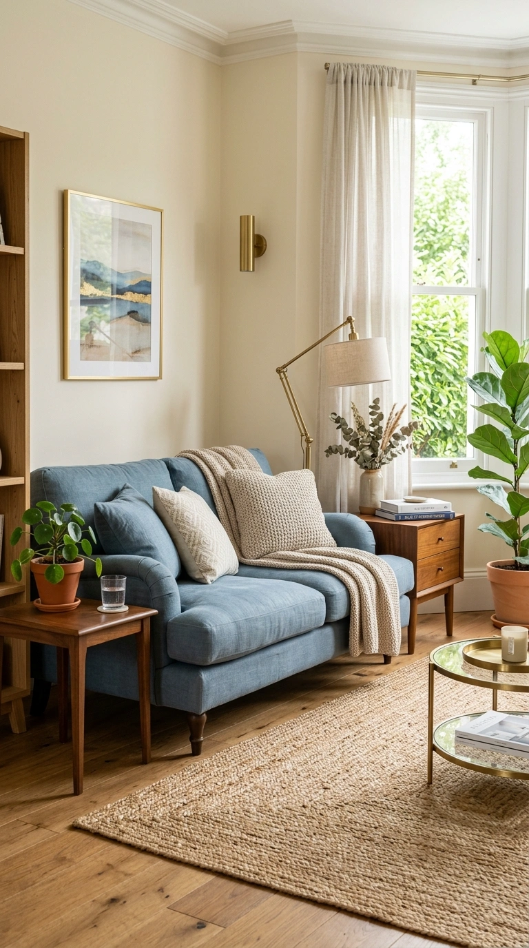
Dusty blue, the soft gray-blue that sits between powder blue and slate, creates a calm and airy palette when paired with warm cream walls and natural wood accents. The blue reads as quietly sophisticated rather than bold, which makes it suitable for living rooms that need to feel relaxing without being dull. Use dusty blue on the sofa or as the wall color, and pair with warm cream on the walls or the sofa respectively. Add warm wood side tables, a natural jute rug, and warm brass fixtures for the organic warmth that prevents the blue from feeling cold.
10. Warm Gray and Camel Leather
Warm gray walls paired with camel or cognac leather furniture create a palette that reads as modern, masculine, and warm without being heavy. The warm gray provides a sophisticated neutral backdrop and the leather introduces rich natural warmth that fabric in the same color range cannot match. A warm gray living room with a camel leather sofa, warm wood side tables, and charcoal and cream textiles reads as a very current design direction. Add a few plants and warm metallic accents to keep the room from feeling too monochrome.
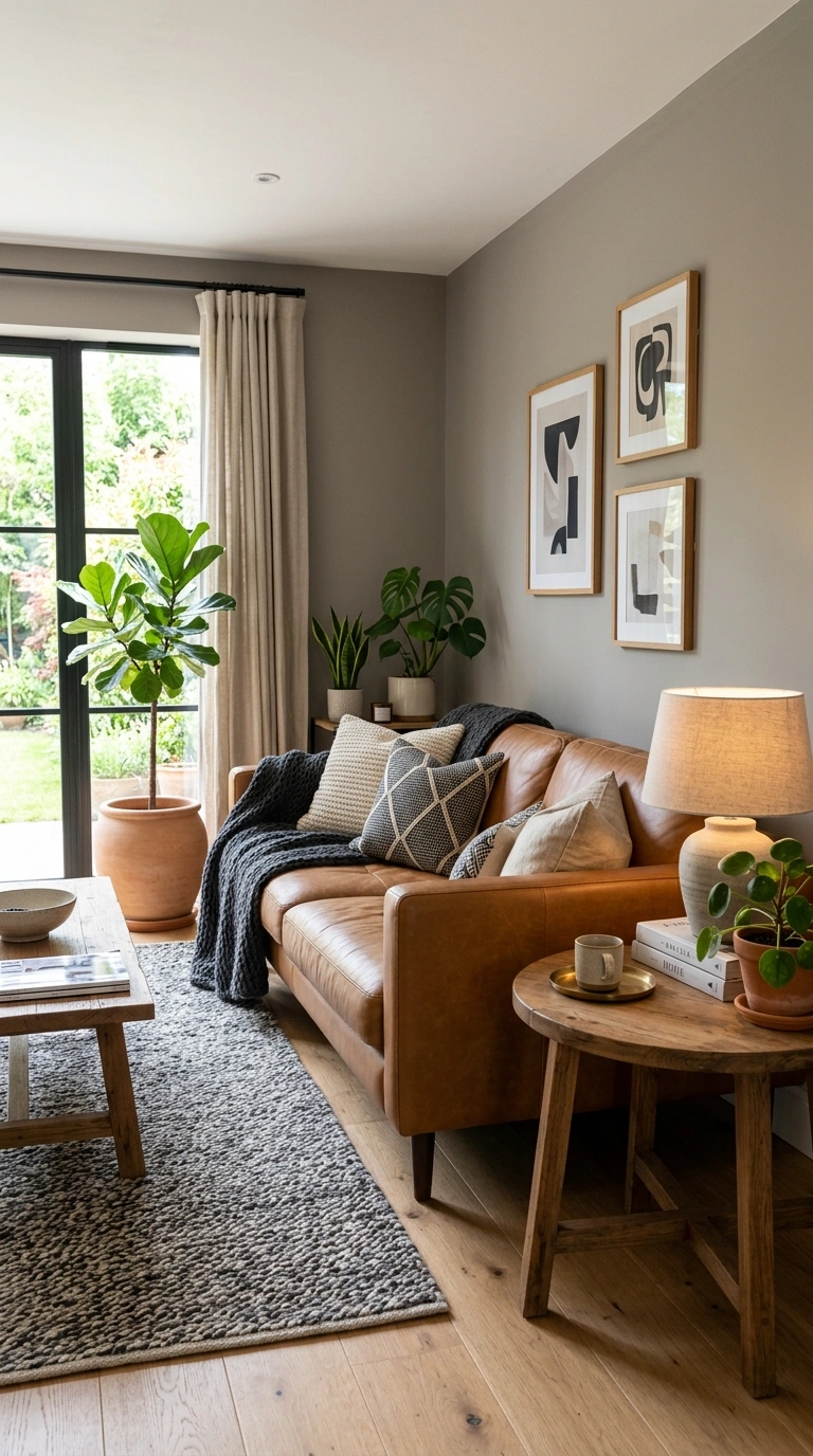
11. Black Accents With Warm Neutrals
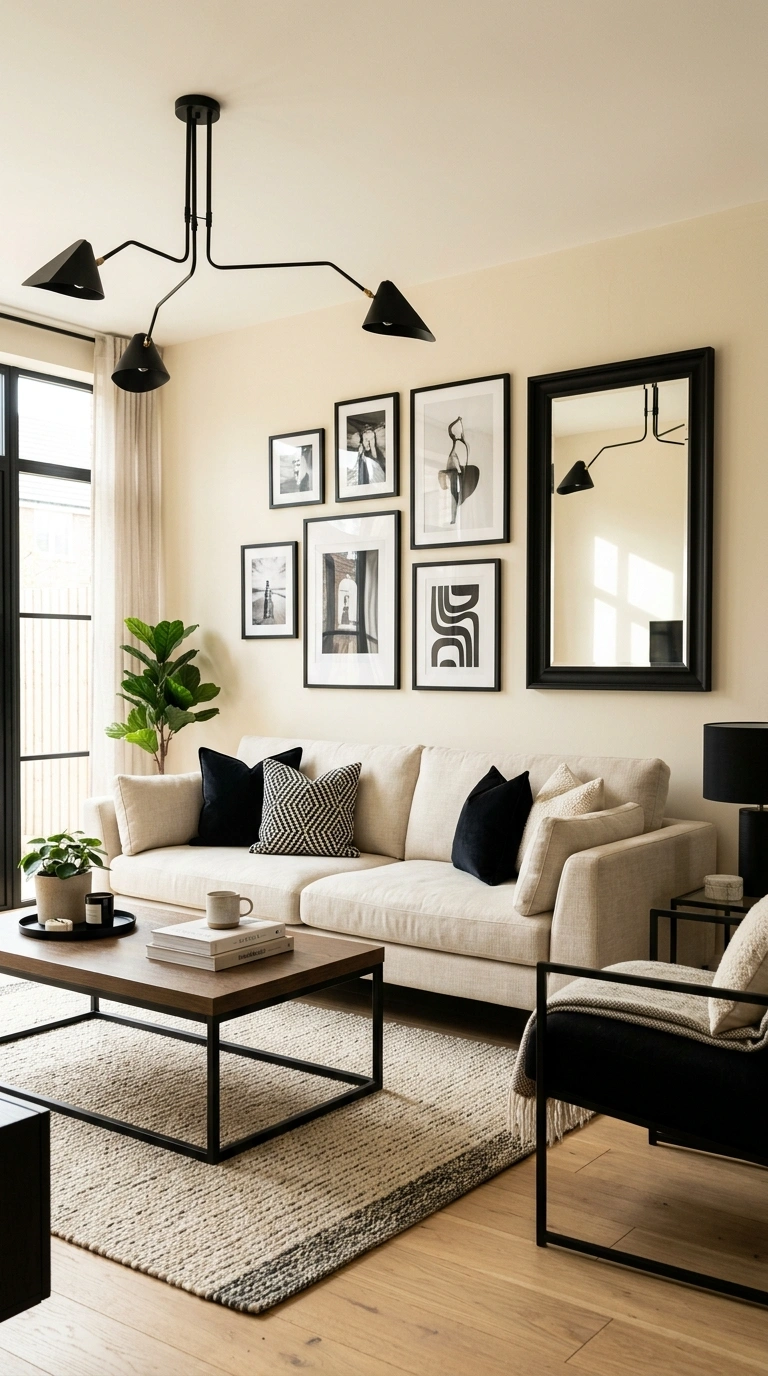
A living room built on a warm neutral base, warm cream walls, natural wood furniture, linen textiles, with deliberate black accents, a black-framed mirror, matte black light fixtures, a black picture frame gallery, black throw pillows, creates a grounded and graphic quality that all-neutral rooms can lack. The black accents provide the visual anchor points that give the eye structure to follow. Keep black to roughly ten percent of the visual palette for the strongest effect. Too much black shifts the room from warm-with-structure to heavy-and-dark.
12. Olive Green and Cream
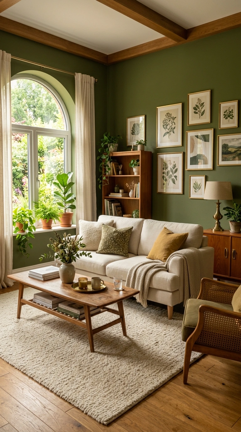
Olive green is the warmest and most yellow-leaning green available and creates a rich enveloping quality when used on living room walls. Paired with cream furniture, warm wood, and brass accents, olive green creates a living room that feels like a garden room or a gentleman’s study depending on the furniture style. Olive works best in rooms with warm afternoon light or strong artificial lighting, since cool north-facing light can make olive lean slightly muddy. Use olive at roughly forty percent of the palette with cream at forty percent and warm accents at twenty percent. For more on how to handle similar warm colorful decor that stays confident rather than chaotic, the balance of dominant color to neutral breathing room is the same principle applied across rooms.
13. Moody Burgundy and Cream
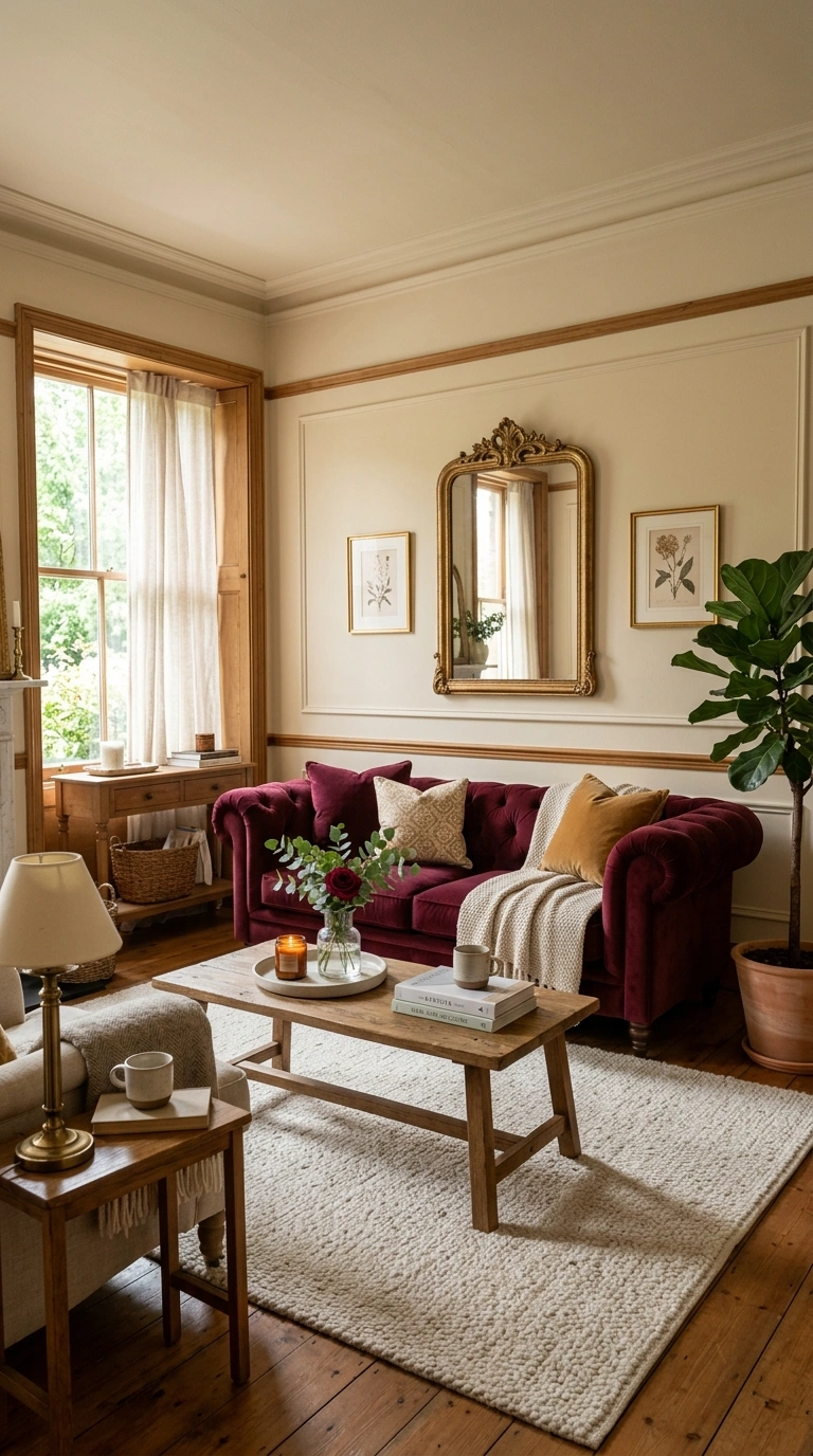
Burgundy or wine as a wall color or a large sofa color creates a rich, warm, and deeply atmospheric living room when balanced with enough cream and warm wood to prevent it from feeling oppressive. Paint one accent wall in burgundy behind the sofa and keep the remaining walls in warm cream. Or use a burgundy velvet sofa against warm cream walls. The key is containing the rich color and giving it enough neutral space to register as a deliberate design choice rather than as an overwhelming blanket. Add aged gold accents and warm wood for the most refined result.
14. Warm Peach and Soft White
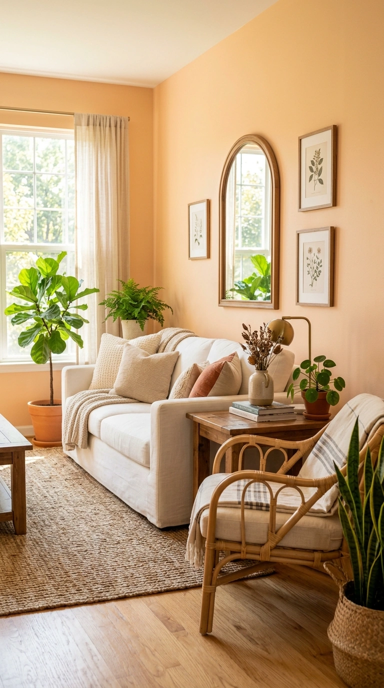
Warm peach, the slightly orange-shifted cousin of blush pink, creates a living room that feels sunny and welcoming without the sweetness that brighter pinks can carry. Use peach as a wall color or through large textiles like the sofa or curtains. Pair with soft warm white on the surrounding surfaces and add natural rattan, warm wood, and a few green plants for organic balance. Peach works particularly well in rooms with east-facing morning light where the warm color glows in the sunrise and softens to a gentle tone through the rest of the day.
15. Tonal Blue Layering
A tonal blue living room uses multiple shades of blue, from pale sky on the walls to medium dusty blue on the sofa to deep navy in the pillows and accents, creating a gradient effect that reads as both calming and visually rich. The trick is keeping all the blues in the same temperature, all slightly warm or all slightly cool, so they read as a family rather than as unrelated blues fighting each other. Add warm cream, natural wood, and brass to prevent the all-blue palette from feeling cold. The tonal approach creates significantly more visual depth than a single shade of blue paired with white.
16. Rust Orange and Dark Green
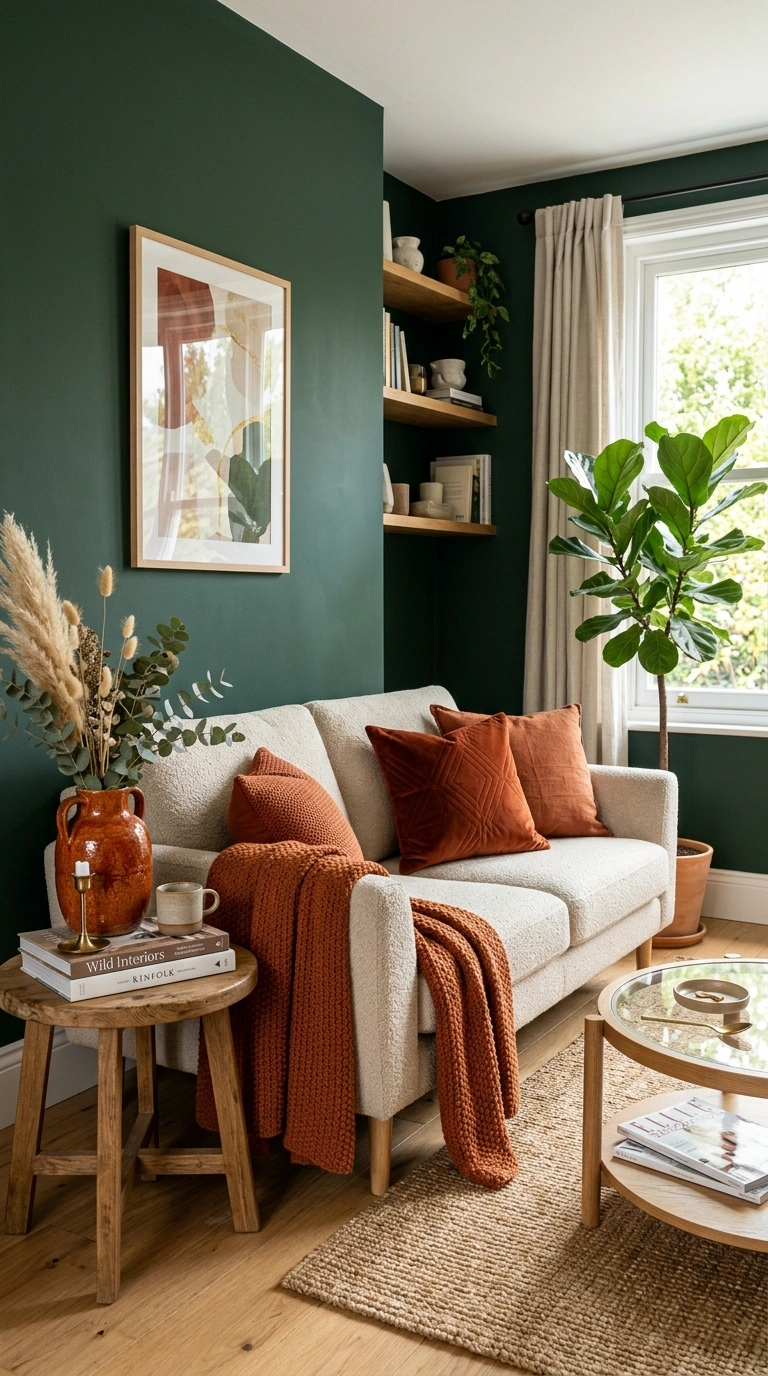
Rust orange and deep dark green is a rich complementary pairing that reads as both natural and bold. The colors sit opposite each other on the color wheel, which gives them natural visual energy when combined. Use dark green as the wall color or the sofa color and introduce rust through pillows, a throw, ceramics, and art. Or reverse the ratio with rust walls and green accents. Keep warm cream and natural wood as the neutral bridge between the two strong tones. This combination works particularly well in autumn and winter but reads as warm and grounded year-round.
17. Soft Lavender and Gray
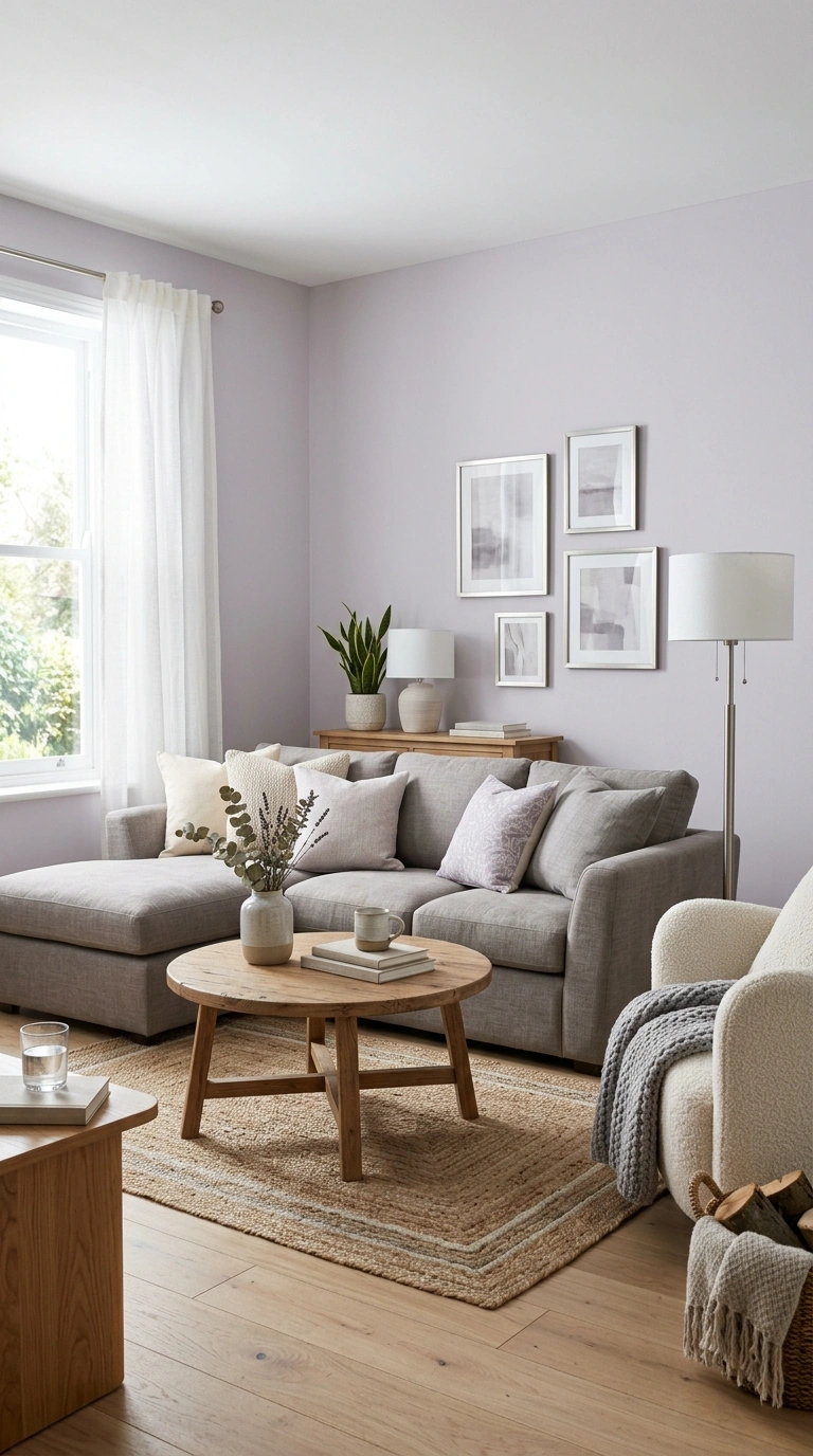
Soft lavender, the barely-there purple that sits between lilac and dove gray, creates a living room that feels calm and slightly unexpected compared to standard neutral palettes. Pair lavender walls with warm gray furniture, silver or brushed nickel accents, and soft cream textiles. The lavender should be muted enough to read as a soft neutral rather than as a purple statement. Add warm wood and greenery to prevent the cool palette from feeling detached. This combination works best in rooms with good natural light where the lavender can shift subtly through the day.
18. Chocolate Brown and Cream
Chocolate brown and cream is one of the most classic and warm living room combinations and remains effective regardless of changing trends. Use chocolate brown on the sofa, in the rug, or on a single accent wall, and keep the rest of the room in warm cream and soft white. The deep brown adds richness without the moodiness of charcoal or the commitment of a saturated color. Add warm leather, natural wood in a medium tone, and warm brass accents for a complete palette that reads as both traditional and current.
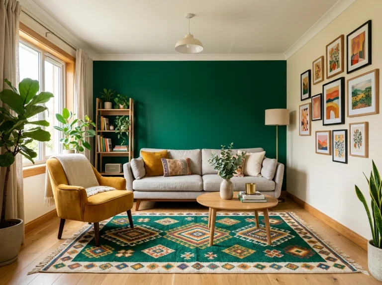
19. Emerald and Gold
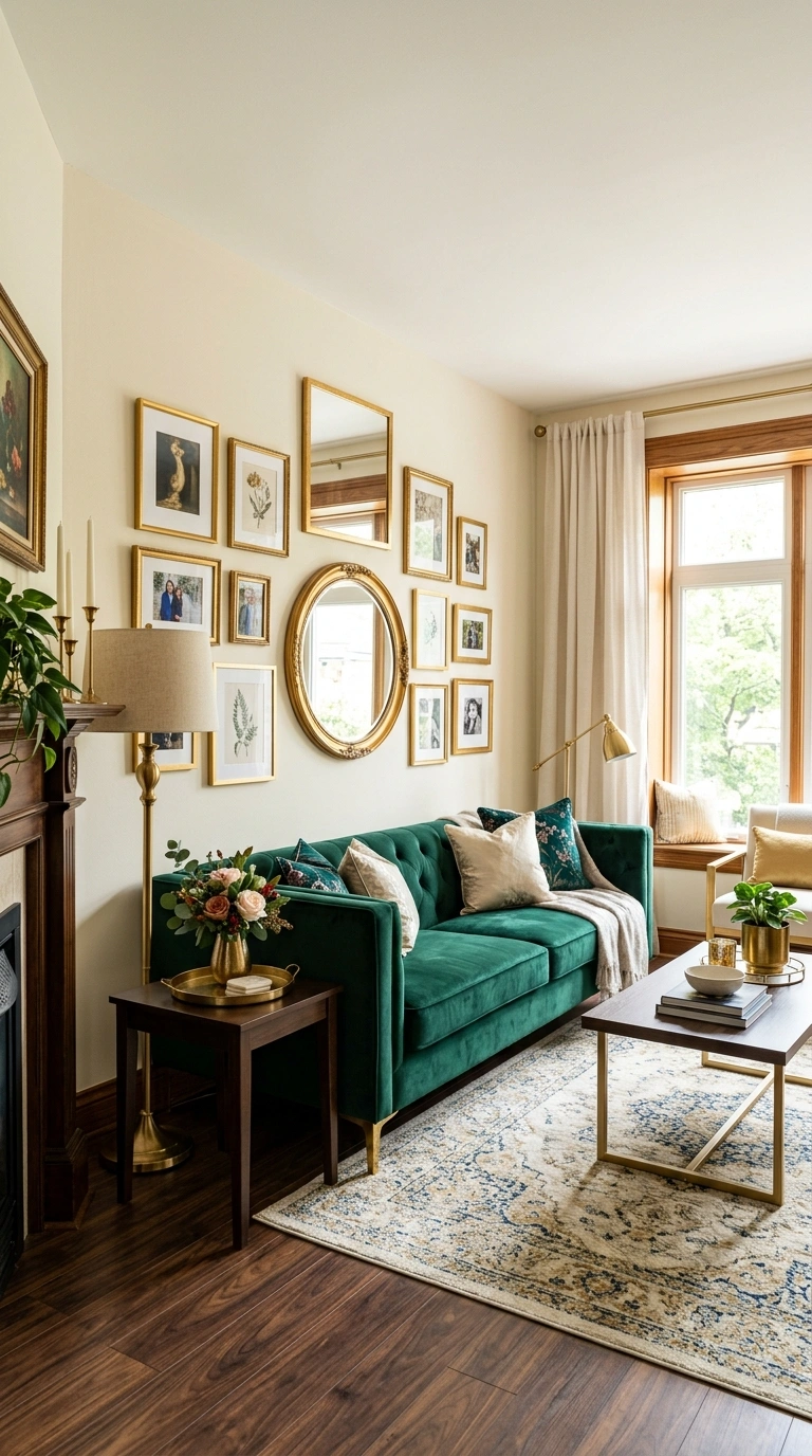
Emerald green paired with gold accents creates a jewel-toned palette that feels luxurious without being overwhelming when the ratio is right. Use emerald as a velvet sofa color or as the wall color on a single accent wall. Introduce gold through hardware, picture frames, lamp bases, and small decorative objects. Keep the rest of the room in warm cream and natural wood to prevent the jewel tones from becoming too heavy. The emerald-and-gold combination works best in living rooms where a confident design statement is desired and where the room has adequate warm lighting to bring the jewel tones to life.
20. Sand and Stone Natural
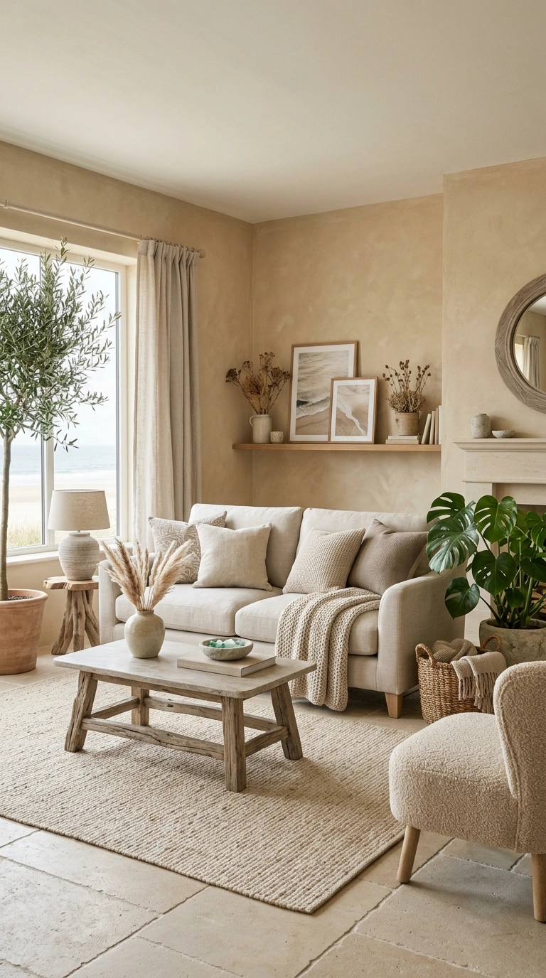
A palette inspired entirely by sand and stone colors, warm beige, soft limestone, pale sandstone, warm gray pebble, and natural driftwood, creates a living room that feels like a coastal retreat without any of the nautical motifs that coastal design sometimes leans on. Every color in the palette exists in nature, which gives the room an inherently calm and grounded quality. The variation between the sandy tones provides enough visual interest to prevent the room from feeling flat. Add green plants and warm-toned linen textiles for the soft organic layer the natural palette needs.
21. Black and Warm Wood
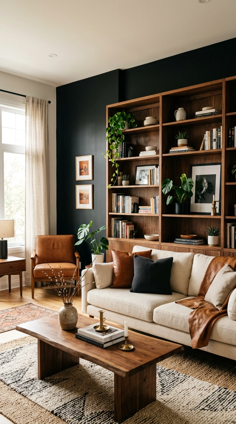
A living room that pairs matte black walls or a black accent wall with substantial warm wood furniture creates a dramatic, gallery-like space that reads as both bold and genuinely warm. The warm wood prevents the black from feeling cold or sterile, and the black gives the wood a rich backdrop that makes the grain and color glow. This combination works best in rooms with some natural light and very good warm artificial lighting. Use warm cream and warm leather as additional warm elements that soften the contrast between the black and the wood.
22. Soft Pink and Deep Navy
Soft blush pink and deep navy blue create a balanced combination where the softness of the pink and the depth of the navy complement each other without either dominating. Use navy as the sofa color or wall color and introduce soft pink through pillows, a throw, art, or a single upholstered chair. The navy provides the grounding weight and the pink provides the warmth. Add warm brass accents and cream as the third neutral element. This palette reads as sophisticated and modern without being trendy.
23. Warm Yellow and Soft Gray
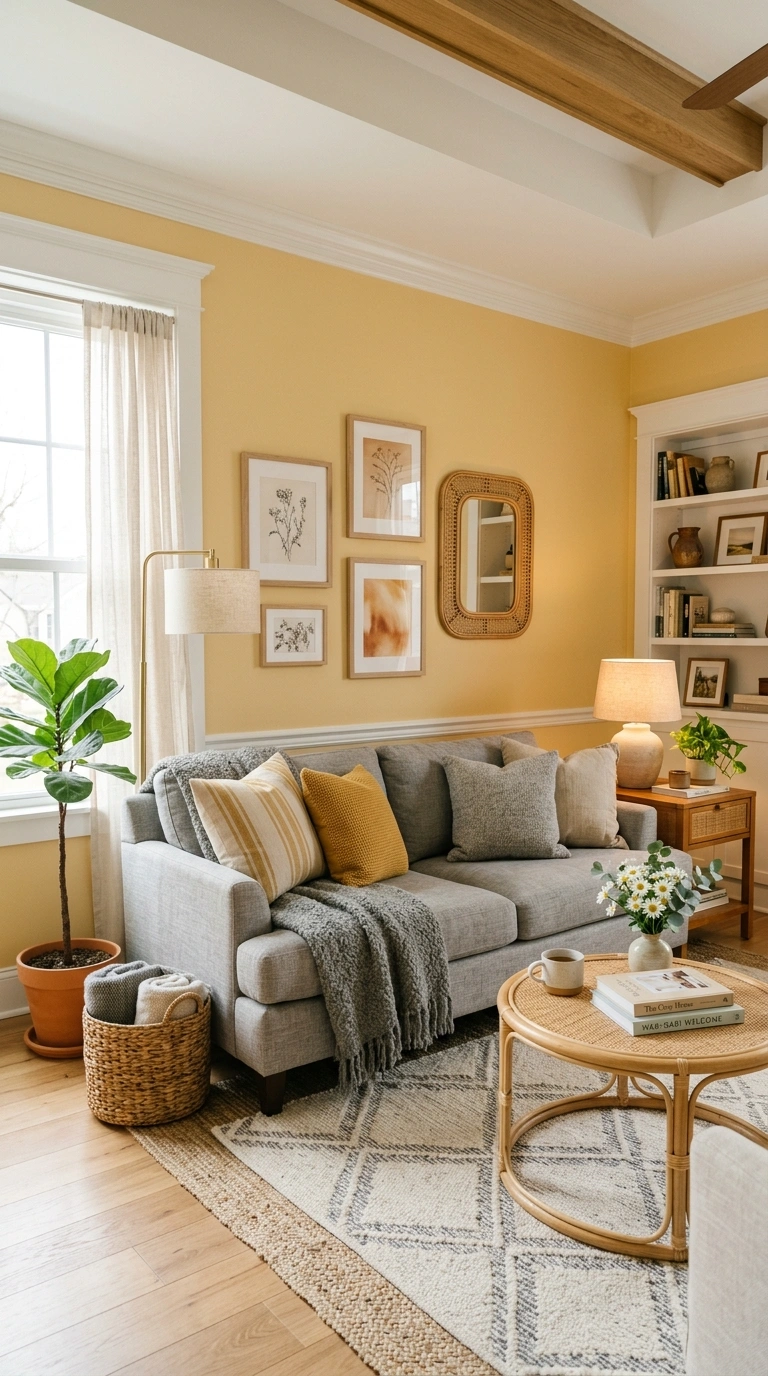
A warm buttery yellow used as a wall color or through large textiles paired with soft warm gray furniture and accents creates a living room that feels sunny, cheerful, and genuinely warm. The yellow should be muted and warm rather than bright and acidic, think aged butter rather than lemon. Pair with soft gray on the sofa and in textiles, add warm wood and natural rattan for organic warmth, and use crisp white as the fresh accent that keeps the yellow from feeling heavy. This combination works particularly well in rooms that do not get strong natural light, since the yellow provides the warmth that the absent sunlight would have delivered.
24. Your Own Palette Rule
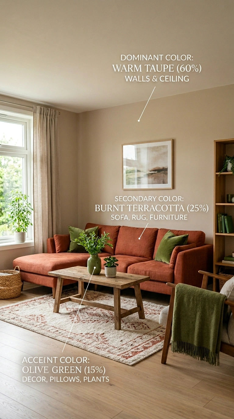
The most effective living room color scheme is one where you genuinely love the dominant color rather than one chosen because it appeared in a magazine. Every palette in this list follows the same underlying ratio: sixty percent dominant color on the walls and largest surfaces, twenty-five percent secondary color on the furniture and medium elements, and fifteen percent accent color on the small objects, art, and accessories. Apply that ratio to any combination of colors you are drawn to and the result will read as intentional and balanced. The ratio is what makes color schemes work as compositions rather than as random collections of individual colors. For broader guidance on how color sets mood across different rooms, the 20 room color scheme ideas guide covers bedroom, kitchen, and bathroom palettes alongside living room approaches.
A living room color scheme that works in a real home depends on the right colors in the right ratios under the actual light the room receives. Choose the palette that genuinely appeals to you, apply it at roughly the sixty-twenty-fifteen ratio, and test it under both daylight and evening light before committing. The right combination creates a room that feels natural and settled rather than forced.