Tired of making the same old bed? Time to shake things up.
There’s no such thing as a boring bedroom. There are such things as a sleeping space that needs some recharging. From the bland and undecorated to the hideous and overdone rooms, give those tired eyes something happy to wake up to.
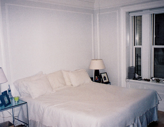
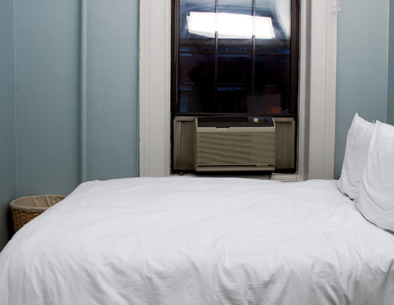
Before: Desert of white
It’s true that many people prefer to sleep in a sea of soothing whites. We’re totally into that. Calm whites needn’t be boring. All of these elements-drab duvet, undecorated windows, bare walls-are calling out for some serious help.
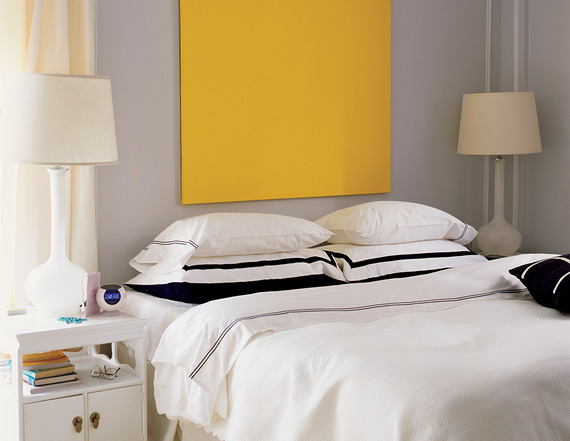
After: Pop-y oasis
walls The walls were painted a pale shade of gray. A piece of stretched canary yellow canvas doubles as art and makes a striking alternative to a headboard.
bedding swap
This couple chose a gender neutral navy-and-white combo for the bedding.
key pieces Nightstands were refinished thrift store finds; now things can be hidden behind doors. Since the bedside lamps had looked insignificant next to the king-size bed, gourd table lamps took their spots to balance out the bed’s expanse and add drama.
photography by SHARON MIDDENDORF
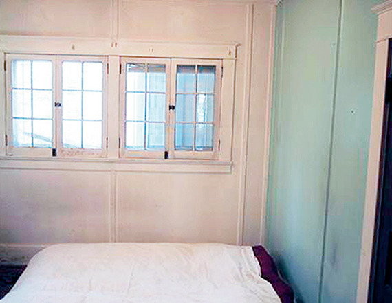
Before: turquoise takeover
This charming cottage guest room needed some serious color redirecting. Paint is great in the bedroom. A random coat of paint is not.
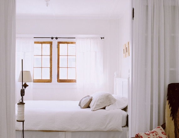
After: sleepy space
floors This room needed some serious brightening up. You can’t see it, but the light wood floors were layered with a seafoam green rug (that’s where you get your color).
windows Gauzy curtains framed the windows to give them a light and airy vibe.
paint The walls, trim, and headboard were painted a calming shade of white.
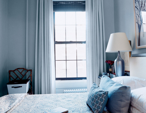
Before: tight quarters
Not all bedrooms are wide and expansive. Don’t give up on a space just because it’s short on square inches.
After: out of the blue
work with what you have The bedroom had one impressive dimension: height. Take advantage of it with some tried-and-true tricks. Choose a headboard and bedside tables that are taller than normal. (Usually, bedside tables are the height of the mattress, but this was a decorator’s trick to open up the space.)
store smart Since the space is small, it was essential to think creatively to accommodate all of the stuff. Opting for dual dresser drawers, rather than nightstands, makes room for extra clothing and blankets. The high bed allowed for under the bed space, which can be easily concealed by a pretty skirt.
work the windows Hanging drapes close to the ceiling will also give the illusion of a larger space.
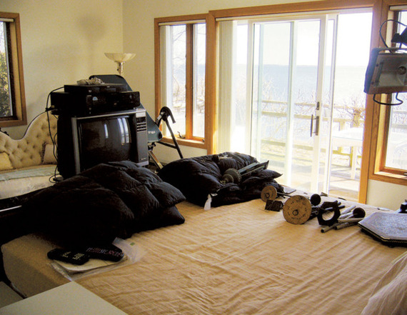
Before: character-less setup
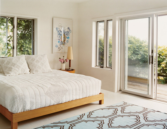
It’s nice to have a room with a view. Better to have a room with a view that you can take advantage of every morning. This room was calling for some clutter control and serious decorating decision making.
photography by FRANCESCO LAGNESE
After: be spare, not boring
pattern play Low-ceilings can make a room feel very cramped. Pretty much claustrophobic. To accentuate the sense of openness–but prevent the room from being boring–a few key graphic pieces were introduced into the space. The squares on the ivory bedspread and the moorish design of the robin’s egg-blue rug play off each other.
hang art The painting adds another visual dimension and keeps the room from looking like a catalog.
keep palette cohesive To prevent a visual distraction, the window frames were painted white to match the walls.
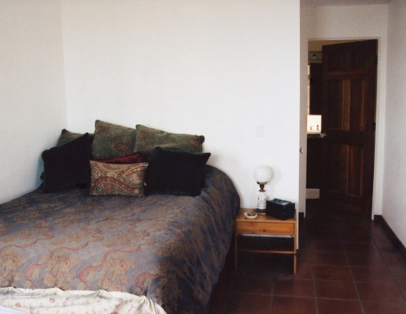
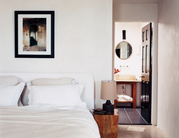
Before: Dark and drab
And in our books that is no way to describe your bedroom. This sleeping spot is cramped-100-square-feet, to be exact. The overall space is weighed down by dark linens and exposed wood floors. Feels pretty darn depressing to us.
After: lighten up
swap out the linens Say goodbye to the dark comforter. We’re all about the white duvet. Layering white on white will actually give your room a reason to breathe. (We love this white duvet!)
paint the walls We love color, but we truly believe in the power of white. Have a little faith in the mighty hue. The walls were plastered in an ivory shade (try “Ancient Ivory” from Benjamin Moore).
focus on the floors Old wooden floors were dull, dark, and calling out for some TLC. A high-shine polish treatment brought them back to life.
make an entrance When the space is small, you’ll notice-and stare at-everything. That door just felt creepy. Rather than replacing it, the homeowner refinished it with multiple applications of glossy walnut.
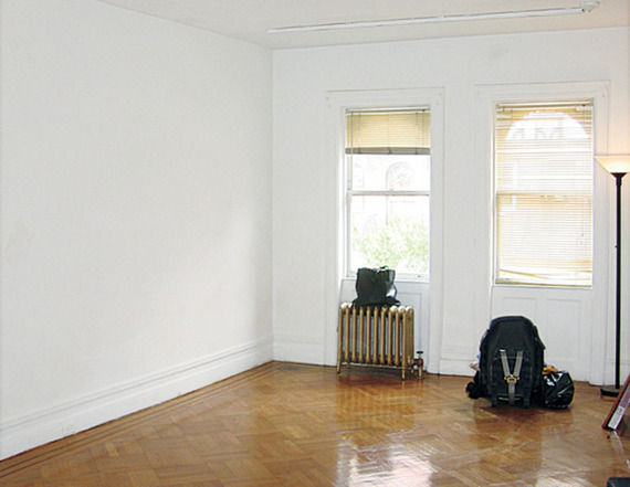
Before: blank space
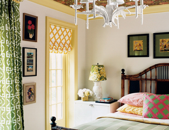
What to do with a bare space? If you have a spare room (lucky duck), turn it into a guest bedroom.
photography by JUSTIN BERNHAUT
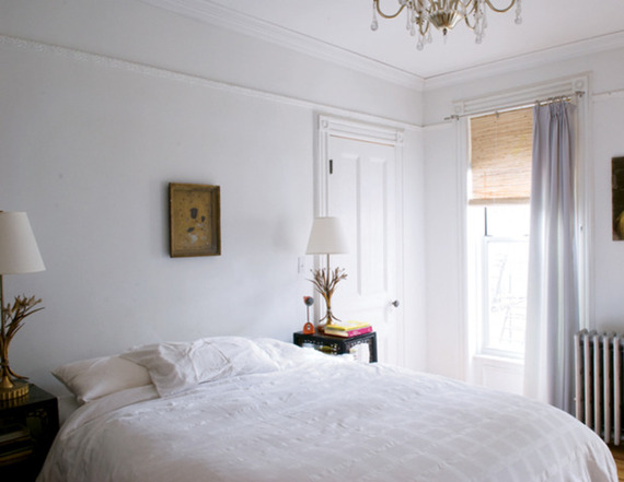
After: work in color and pattern
add visual interest Crown moldings were installed, which can transform the room into an entirely different space.
look up For a truly unexpected touch, cabbage-rose wallpaper was hung on the ceiling. It’s a smart decorating trick, which draws your eye up and away from the sides of the room.
choose the right paint. High-gloss oil paint, which was used on the moldings and trim, is easy to clean and adds a little sheen.
photography by MELANIE ACEVEDO
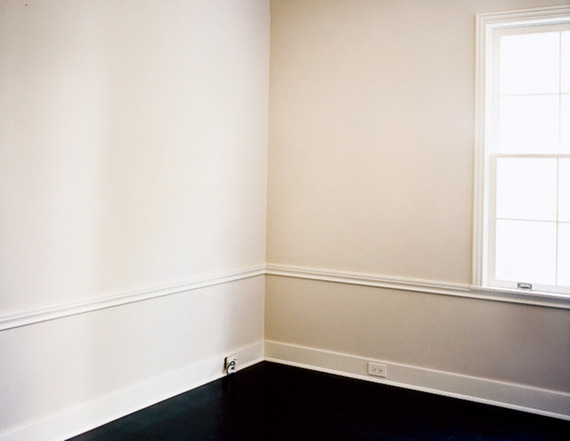
Before: starting at zero
A blank canvas can seem like a homeowner’s dream come true. That is, until you realize that there are just so many options available. Afraid to make the wrong decision? Don’t be.
photography by MELANIE ACEVEDO
After: punch up the color
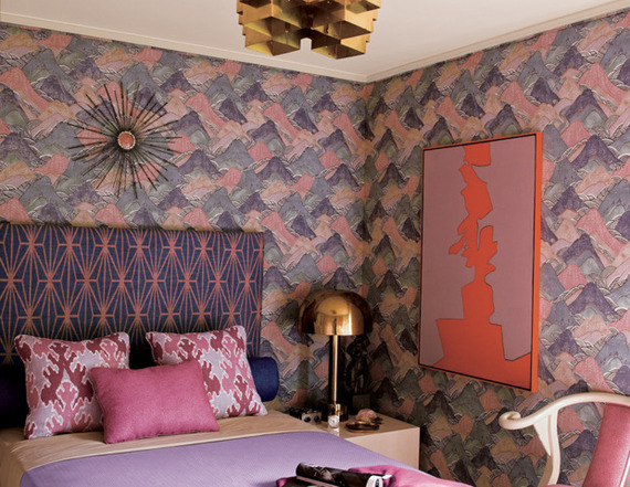
embrace color Before you make any major moves, decide on a palette. Soft pinks and lavenders feel fresh and not too girly when they’re used in bold, graphic ways. The trick is working different patterns in a cohesive colorway. There’s something soothing about a space that has color when the shades complement-don’t compete with-one another.
pick the right patterns Stick with the palette and build on it with prints and patterns. A kimono-inspired linen headboard, ikat pillows, and matelassé bedding work off one another.
bring in metallics Vintage brass lamps introduce masculinity to the pastel party.
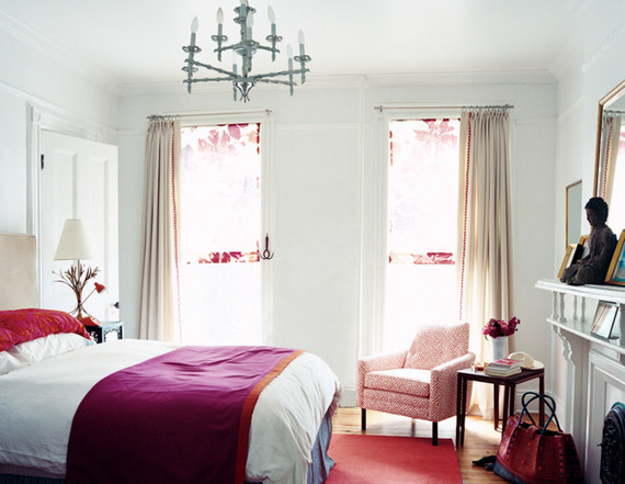
Before: desperately seeking a change
A bland palette is not a bad thing. However, it can be quite a bore. (Insert yawn.) This room is calling for a little color.
photography by MELANIE ACEVEDO
After: playful palette
make smart choices If you’re one of those people who likes to decorate their bedroom frequently, focus on easily changeable elements. Cue the linens. This bed went from an oasis of white to sophisticatedly comfortable with paisley pillow shams, a navy linen skirt, and a cashmere throw.
embellish, embellish, embellish Rather than replace the tan wool curtains, they were updated with pom pom trim. Hello, budget-friendly idea.
lay the groundwork Don’t forget the floors. Rugs are a great way to layer on the color. Plus, it’s nice for feet to step on something soft in the morning.
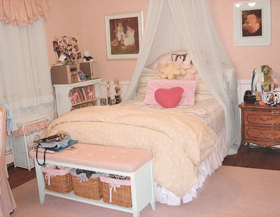
Before: teen feels trapped in pink (do you blame her?)
This bedroom is all about little girl frills and princess-inspired pastels.
After: meet miss maturity
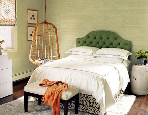
focus on texture Welcome a bit of a refined plushness, which included a cushy wool rug and a leafy-hued faux-suede headboard.
remember the rainbow Pink is not the only color for girls. A lush, garden-esque medley of greens- avocado, emerald, celery-feels organic and like a grown-up space.
play with pattern A custom lattice-print bed skirt introduces just the right amount of polish.
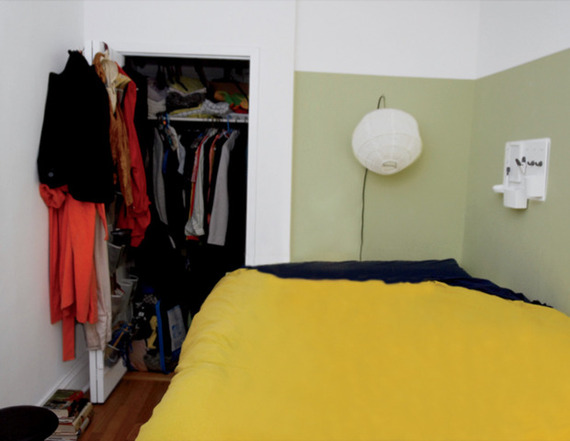
Before: dazed and confused
The person occupying this space is missing out on what a bedroom can be: a calm and soothing hideaway. Please remember that the bedroom is not a dumping ground.
After: rise and shine
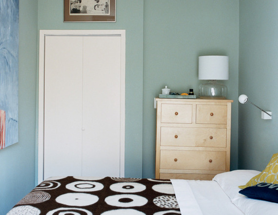
palette primer Choose a color for the walls that puts your mind and senses to rest. Soothing shades of blue are popular choices, but it’s a personal decision.
bright idea Think about how you use the space. For example, if you read in bed, a wall-mounted light is a good solution.
choose wisely If you don’t have space for a nighstand and a dresser, then we say go with the one that will offer the most storage.
Article source: https://www.huffingtonpost.com/entry/amazing-before-and-after_b_5875850.html
