22 Colorful Room Decor Ideas That Feel Bold Without Feeling Chaotic
Most homes are afraid of color. The walls are white, the sofa is gray, the rug is beige, and the result is a room that feels safe but not particularly alive. The opposite extreme, where every surface and every object is in a different bold color, produces rooms that feel overwhelming and impossible to relax in. The sweet spot is somewhere between these two ends: rooms where color is used confidently but strategically, where bold tones are balanced by neutral breathing room, and where the overall effect is energizing rather than exhausting. These 22 ideas cover how to bring genuine color into any room, from a single bold accent to a fully colorful composition, without the result tipping into chaos.
1. Single Bold Wall Color
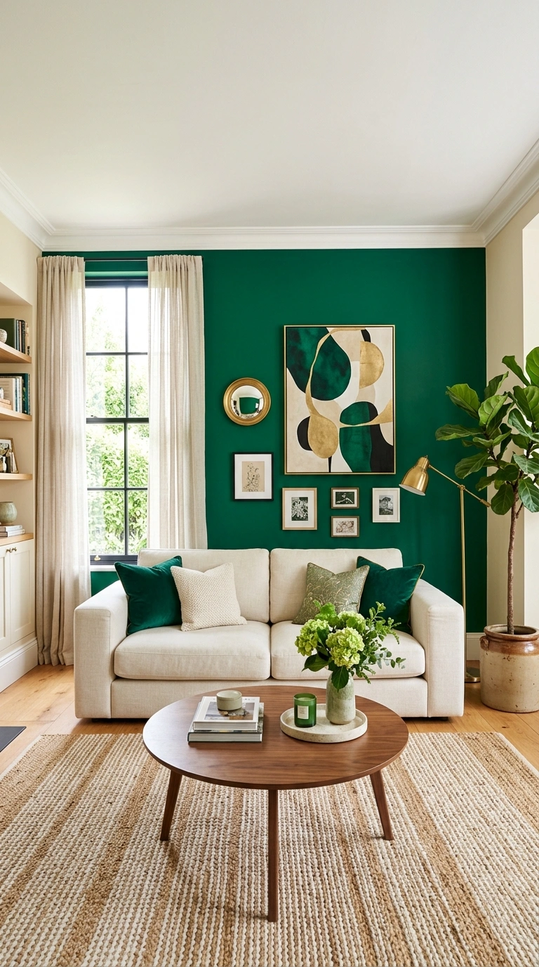
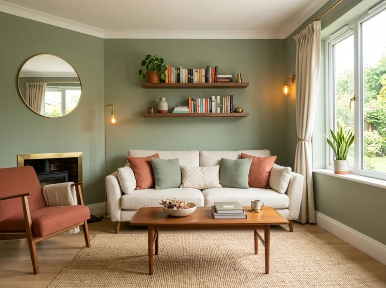
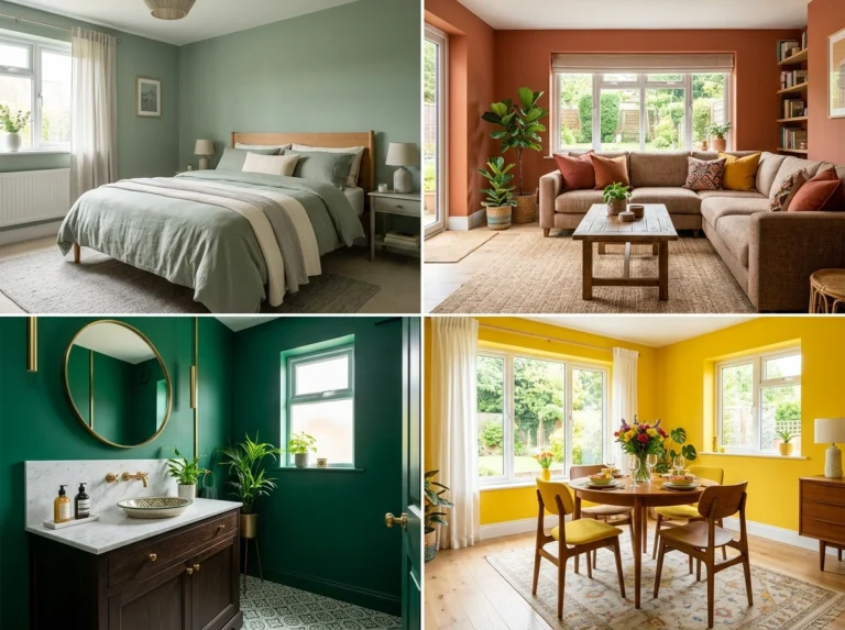
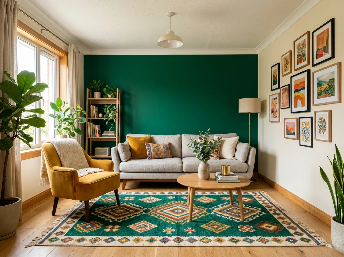
The most accessible way to introduce bold color is a single accent wall in a saturated tone. Deep emerald, rich navy, warm terracotta, bright mustard, or saturated teal on the wall behind the sofa, behind the bed, or behind the dining table creates a strong color moment that the rest of the room is organized around. Keep the remaining three walls in a warm neutral so the bold wall has room to register as a confident statement rather than as one of many competing colors. The single wall approach works in any room and is fully reversible with a single afternoon of painting.
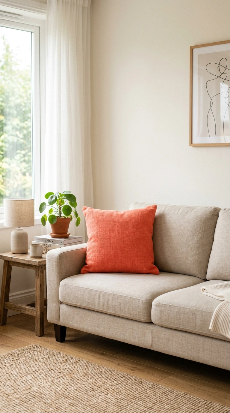
2. Colorful Sofa Statement
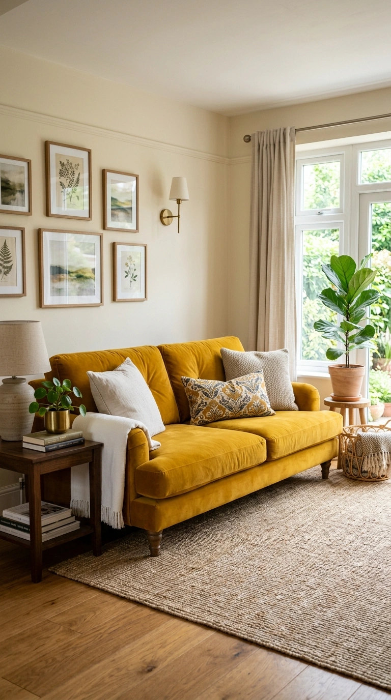
A sofa in a bold saturated color, emerald velvet, deep mustard linen, rich terracotta boucle, bright cobalt, or a warm brick red, placed in a room with neutral walls and a neutral rug, becomes the room’s centerpiece and its primary color source. The bold sofa against neutral surroundings reads as confident and intentional rather than chaotic because the color is contained to a single major element. Style the sofa with pillows in neutral tones and one or two small accessories in the sofa’s color repeated elsewhere in the room to tie the palette together.
3. Pattern on Neutral Base
A strongly patterned element, a colorful area rug, a bold wallpaper accent wall, a set of patterned curtains, or a gallery of colorful art, placed on a neutral foundation of white walls and simple furniture introduces multiple colors simultaneously in a contained and organized way. The pattern does the color work while the neutral base keeps the room from feeling chaotic. This approach is particularly useful for people who love multiple colors but are not sure how to combine them, since the pattern designer has already done the combining work.
4. Colorful Art Gallery Wall
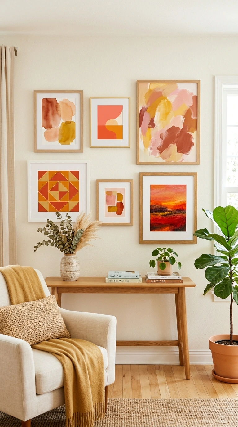
A collection of colorful art on a neutral wall introduces vibrant color without committing any permanent surface to a bold tone. Mix framed prints, paintings, photographs, and objects in a variety of colors that share a warm or cool temperature so they read as a family despite their different hues. A gallery wall with warm reds, oranges, yellows, and pinks reads as cohesive. A gallery wall mixing warm and cool tones randomly tends to feel scattered. Keep the frames in a consistent or coordinating finish so the gallery reads as one composition rather than as individual competing pieces.
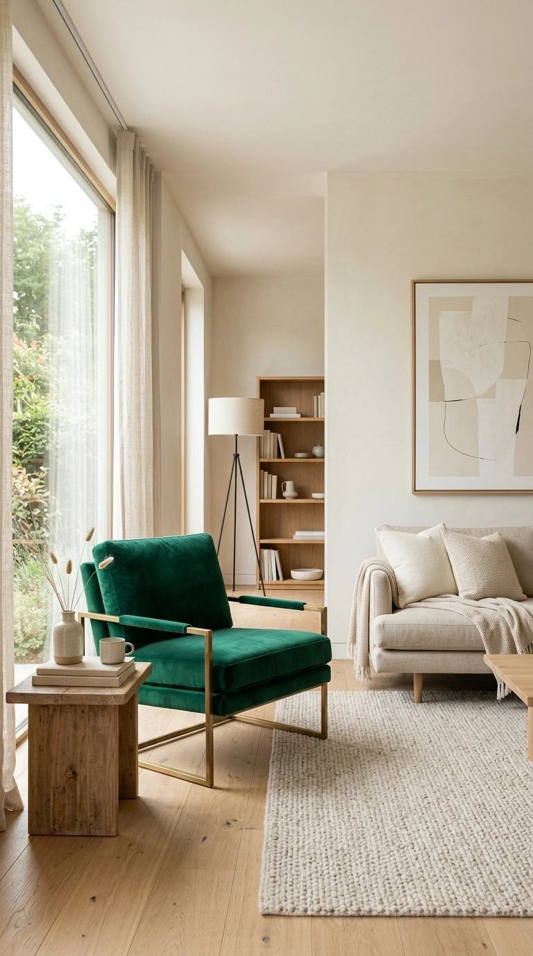
5. Jewel Tone Velvet Accents
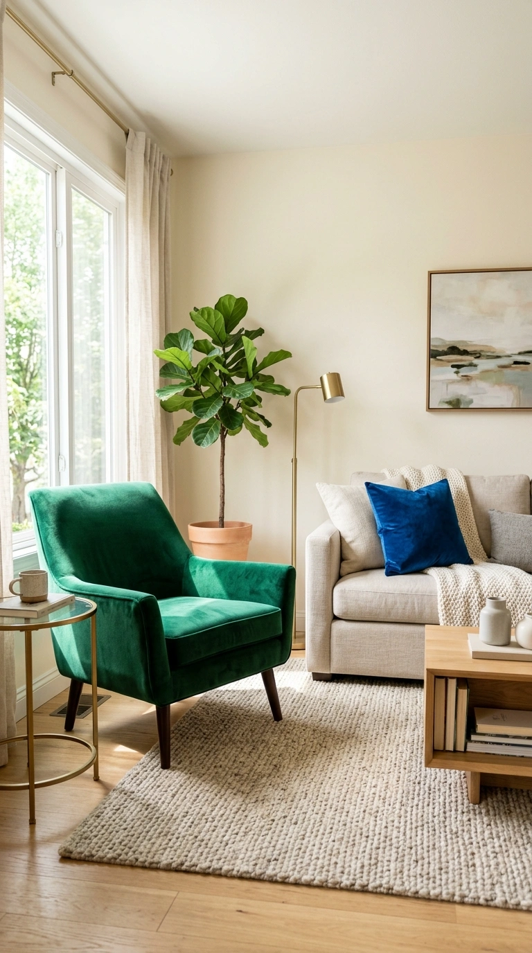
Velvet in jewel tones, emerald, sapphire, ruby, amethyst, deep gold, catches light in a way that makes saturated color look richer and more sophisticated than the same color in a matte flat fabric. A velvet throw pillow, a velvet curtain, a velvet accent chair, or a velvet ottoman introduces bold color with a visual depth and luxury that reads as intentional design rather than accidental brightness. Use one or two jewel velvet accents against neutral surroundings rather than combining multiple jewel colors in the same room, which can read as a costume ball rather than as sophisticated decor.
6. Bold Front Door Color
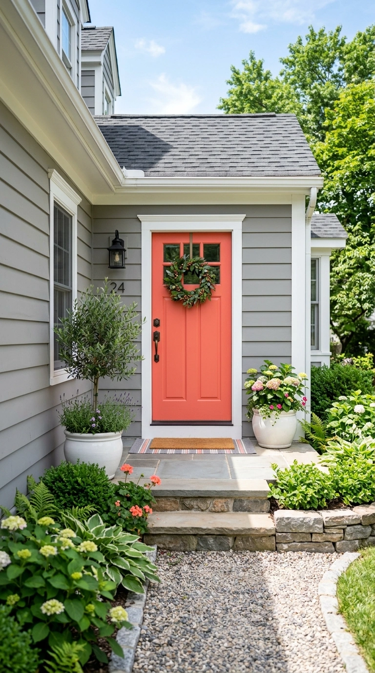
Painting the front door in a bold saturated color while the rest of the exterior stays neutral is one of the highest-impact color applications available and the most contained. A bright coral, deep teal, warm yellow, rich red, or saturated navy on the front door signals personality from the first moment someone approaches the home. The door color can be changed with a single afternoon of painting, which makes it one of the most risk-free bold color experiments available. Choose a color that complements the exterior materials, brick, stone, siding, rather than one that clashes with them.
7. Colorful Bookshelf Backs
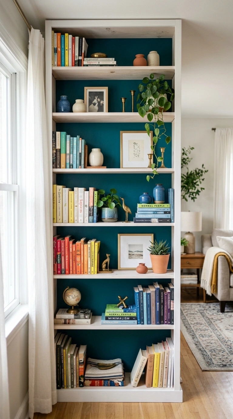
Painting the back panels of a bookshelf in a bold color, or applying a colorful peel-and-stick wallpaper to the shelf backs, introduces color behind the styled objects on the shelves in a way that adds vibrancy without dominating the room. The color reads through the gaps between books, plants, and objects, creating a subtle colored backdrop that enriches the shelf display. Choose a single bold tone that complements the book spines and objects on the shelves. This works in living rooms, bedrooms, and home offices where a bookshelf is already present. For more on how specific colors create different moods in different rooms, the living room color schemes guide covers complete palettes with specific application ratios.
8. Colored Ceiling Treatment
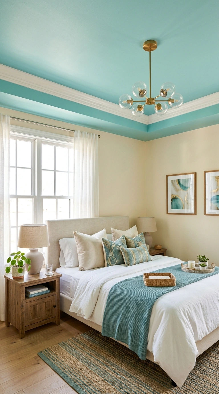
Painting the ceiling in a bold or unexpected color while keeping the walls neutral creates a color moment overhead that most rooms never use. A soft teal ceiling, a warm pink ceiling, a deep navy ceiling, or even a slightly saturated version of the wall color on the ceiling all add color from above in a way that feels surprising and designed. The ceiling color reflects subtly onto the walls and furniture below, creating a gentle color wash across the room that is more atmospheric than a colored wall. This works best in rooms with adequate ceiling height since low ceilings in dark colors can feel oppressive.
9. Mixing Two Bold Colors
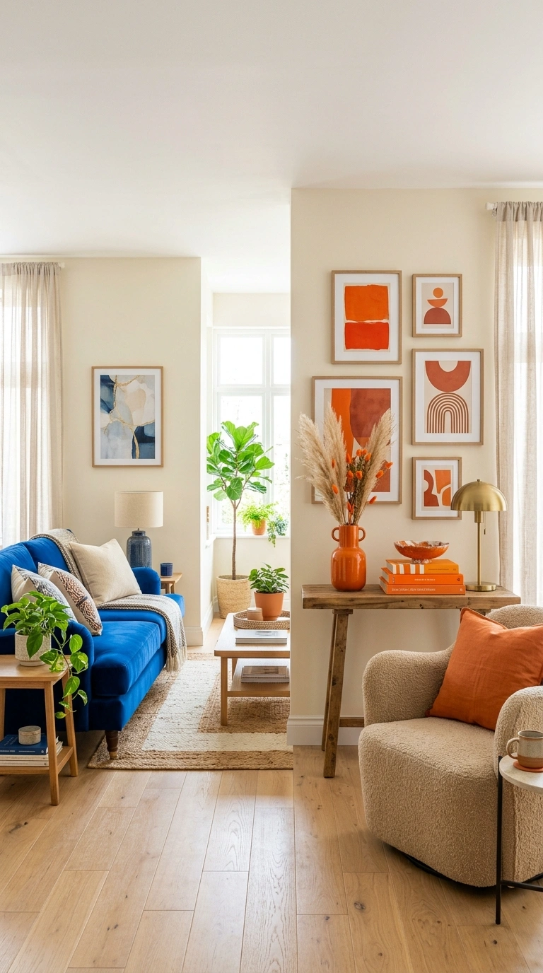
Using two bold colors together in a room works when the two colors are complementary or analogous on the color wheel and when they are given clear separate zones rather than mixed randomly. Blue and orange, green and pink, yellow and purple are complementary pairs that create natural visual energy. Blue and green, orange and pink, yellow and orange are analogous pairs that create natural visual harmony. Assign one bold color to the furniture zone and one to the accessories and art. Keep a substantial amount of neutral white or cream between them as visual breathing room so the two colors register as a deliberate pairing.
10. Colorful Dining Chairs
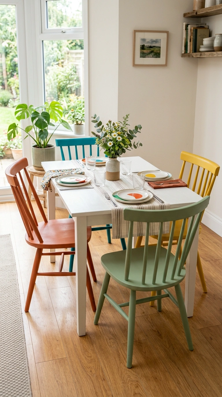
Mismatched colorful dining chairs around a simple neutral table create one of the most reliably cheerful and personality-rich room moments available. Choose four or six chairs in different bold colors that share a consistent style, all the same chair shape in different colors, or all different shapes in the same color family. The consistent element, whether shape or color family, is what keeps the mismatched chairs reading as a curated decision rather than as leftover furniture. A simple wooden or white table lets the chairs be the visual event. This approach works in both dining rooms and eat-in kitchens.
11. One Color Multiple Shades
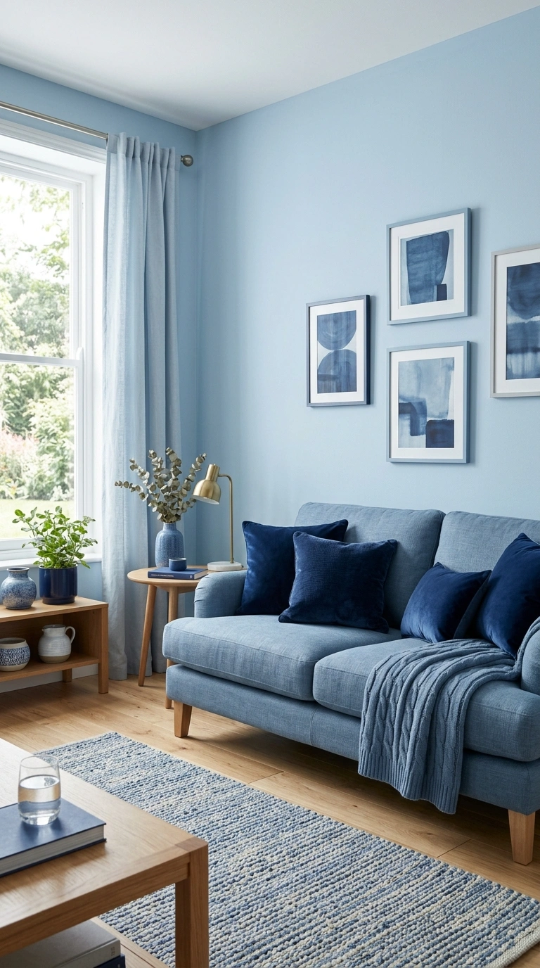
Using a single color in multiple shades across a room, from very pale on the walls to medium on the sofa to deep on the accent pillows, creates a rich monochromatic palette that feels bold and sophisticated without any of the chaos that comes from mixing multiple different colors. A room with pale blue walls, a medium blue sofa, and deep navy pillows reads as calm and deeply considered. The same approach works with green, pink, terracotta, or any color with a wide tonal range. The key is keeping all the shades in the same temperature family.
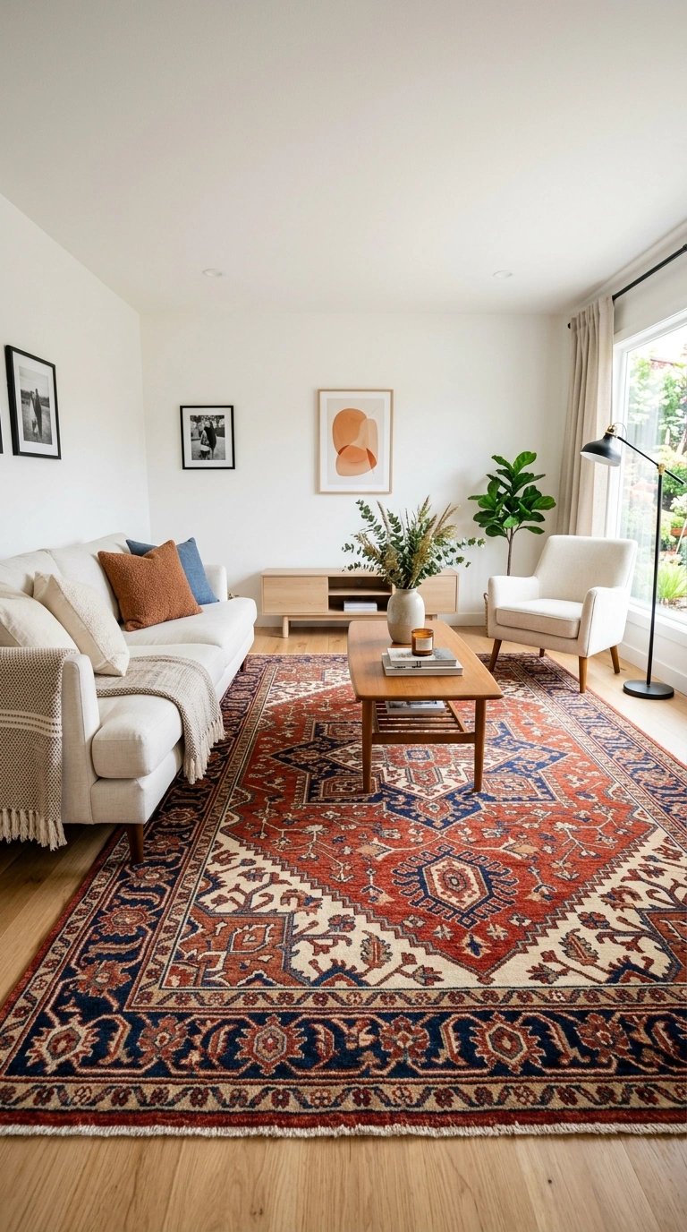
12. Bold Rug on Neutral Floor
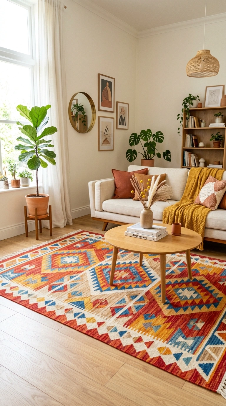
A boldly colored or strongly patterned rug placed on a neutral floor, wood, tile, or plain carpet, introduces color at the foundation level of the room without requiring any permanent changes. A bright Persian, a vivid geometric, a saturated solid-color wool rug, or a multicolored kilim all work depending on the room’s needs. The rug sets the color palette for the rest of the room: pull accent colors from the rug for pillows, art, and accessories to tie the composition together. The rug can be changed whenever the color scheme needs a refresh.
13. Colorful Bathroom Moment
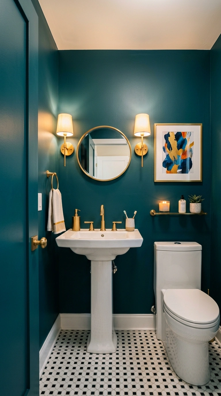
A small bathroom or powder room is the ideal place for bold color that would feel overwhelming in a larger room. Saturated teal, deep coral, bright mustard, rich plum, or vivid emerald on the walls of a small powder room creates a jewel-box moment that visitors remember. The small size of the room contains the bold color and makes it feel intimate rather than aggressive. A white pedestal sink, simple brass hardware, and one piece of art are all the room needs alongside the bold wall color.
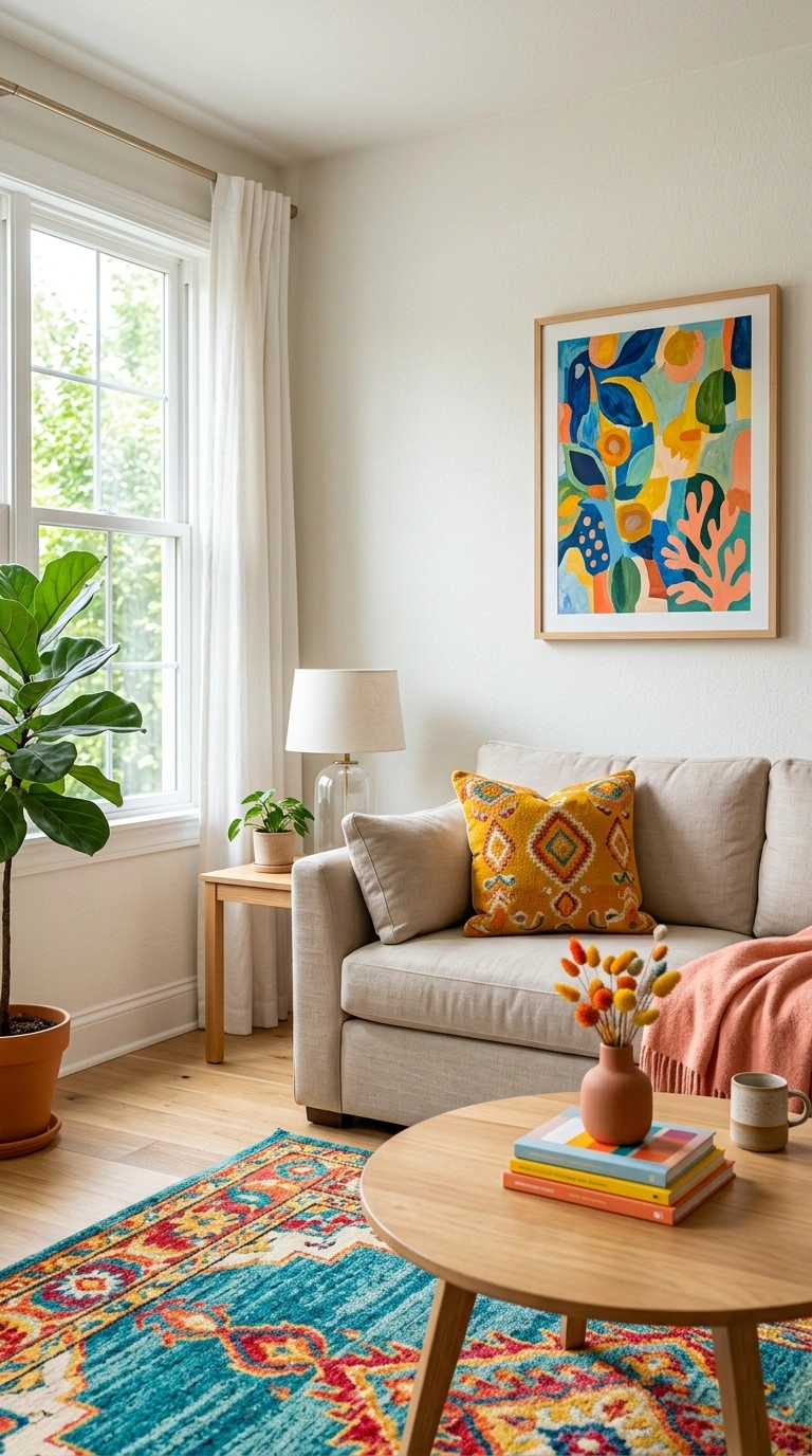
14. Colorful Throw Pillow Rotation
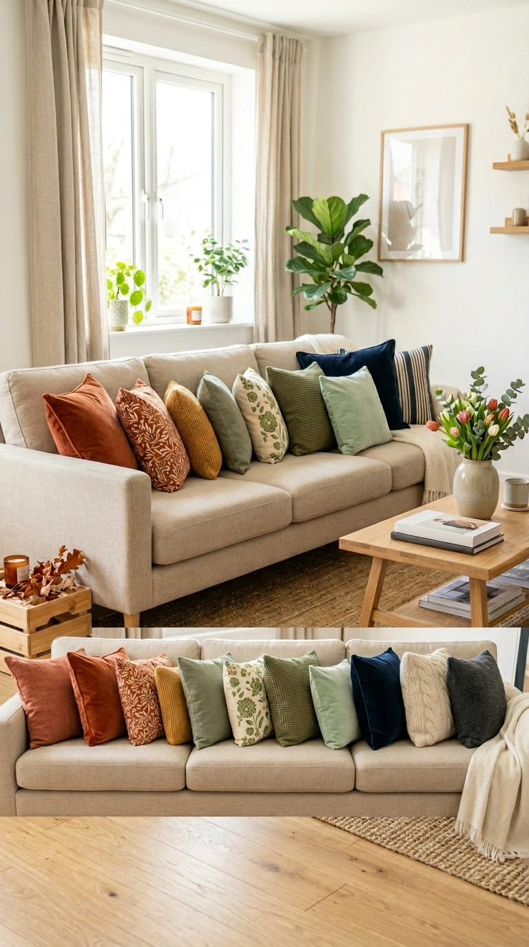
Rotating the throw pillows on the sofa seasonally in different color palettes is the lowest-cost way to change the color mood of a living room regularly. A warm terracotta and rust set for autumn, a fresh green and cream set for spring, a bright coral and warm yellow set for summer, and a deep navy and burgundy set for winter keeps the room feeling current and alive throughout the year. Store the off-season sets in a closet and swap them when the calendar and the mood change. A few sets of coordinated pillow covers cost very little and produce a meaningful seasonal refresh.
15. Bold Wallpaper Feature
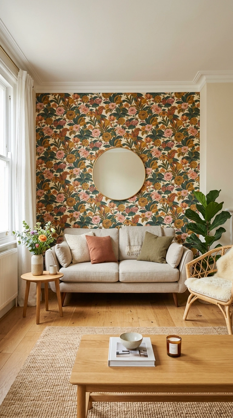
A single wall of bold patterned or brightly colored wallpaper introduces complex color and pattern in a contained application that reads as a confident design decision. The wallpaper wall becomes the room’s focal point and the rest of the room organizes around it in quieter supporting tones. Modern peel-and-stick wallpapers make this approach accessible without permanent commitment. Choose a wallpaper that includes the colors you want to use in the rest of the room, then pull those accent colors into the pillows, art, and accessories to tie the composition together.
16. Painted Furniture Piece
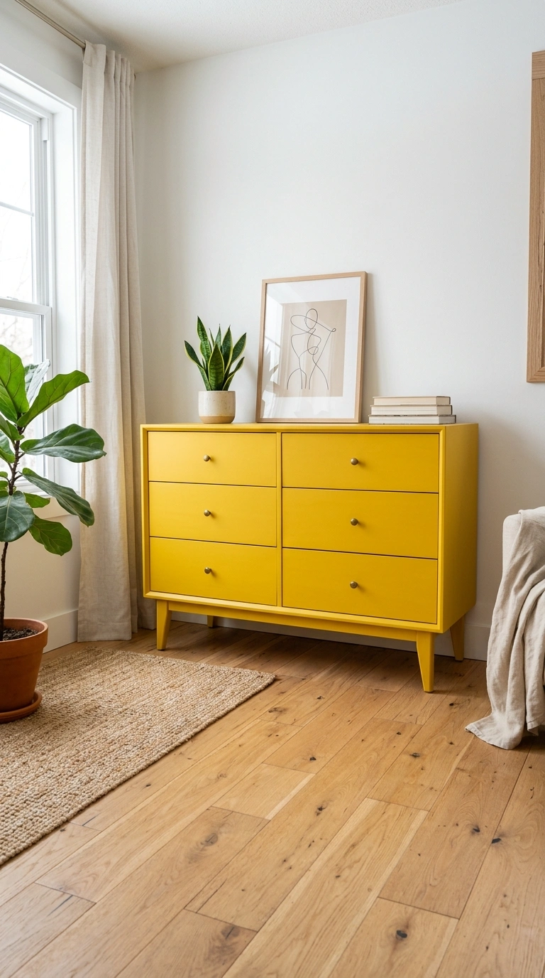
A single piece of furniture painted in a bold color, a bright yellow dresser, a deep teal bookcase, a vivid coral console table, or a rich emerald side table, introduces color through furniture rather than walls. The painted piece becomes a statement element that the rest of the room is coordinated around. Paint an existing piece of furniture with cabinet paint or chalk paint for a low-cost transformation. The single colored furniture piece against neutral walls reads as confident and creative. Two or more brightly painted pieces in different colors in the same room risks reading as a children’s room rather than a considered adult space.
17. Color Through Plants
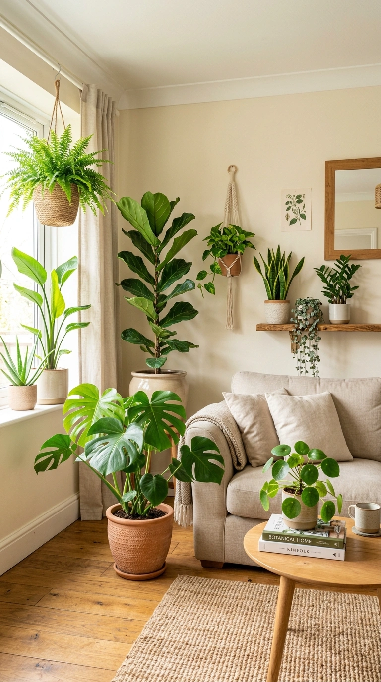
A large collection of green plants in a room with otherwise neutral decor introduces a single bold color, green, in its most natural and universally appealing form. The varied shades of green across different plant species create the same tonal depth that a monochromatic color scheme achieves. A room with ten well-placed plants in different shapes and sizes reads as vibrant and alive without any painted or textile color at all. The plants also move, grow, and change with the seasons in ways that static decor cannot, which keeps the room feeling dynamic.
18. Colorful Kitchen Backsplash
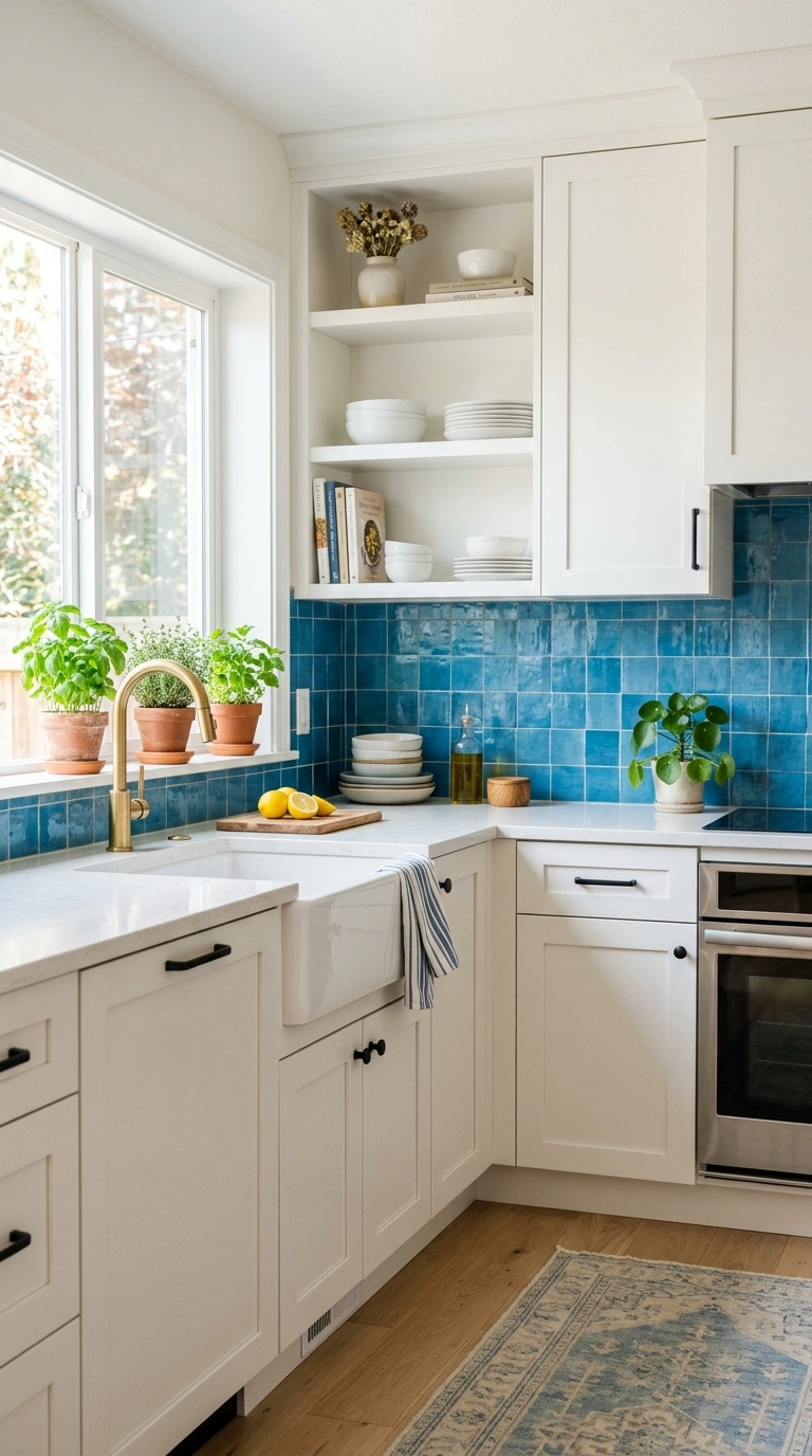
A brightly colored or strongly patterned tile backsplash in the kitchen introduces bold color in a contained area that is designed to be wipeable and durable. The backsplash sits between the counters and the upper cabinets, which frames the color in a defined horizontal band. Bright blue, warm yellow, vivid green, rich red, or a multicolored patterned tile all work depending on the kitchen’s existing materials. Keep the cabinets and counters in neutral tones so the backsplash is the clear color statement. A colorful backsplash is one of the most photographed and one of the most impactful kitchen color applications.
19. Warm Colorful Textiles
Introducing bold color through textiles rather than paint, a bright rug, colorful curtains, vivid throw blankets, and saturated pillow covers, allows color to be layered in gradually and changed easily. Textiles are the most forgiving way to experiment with bold color because any individual piece can be swapped out if it does not work without any damage to the room. Start with one bold textile element and build from there, adding color gradually until the room reaches the level of vibrancy you want. The gradual approach prevents the common mistake of adding too much bold color at once.
20. Color Blocking Technique
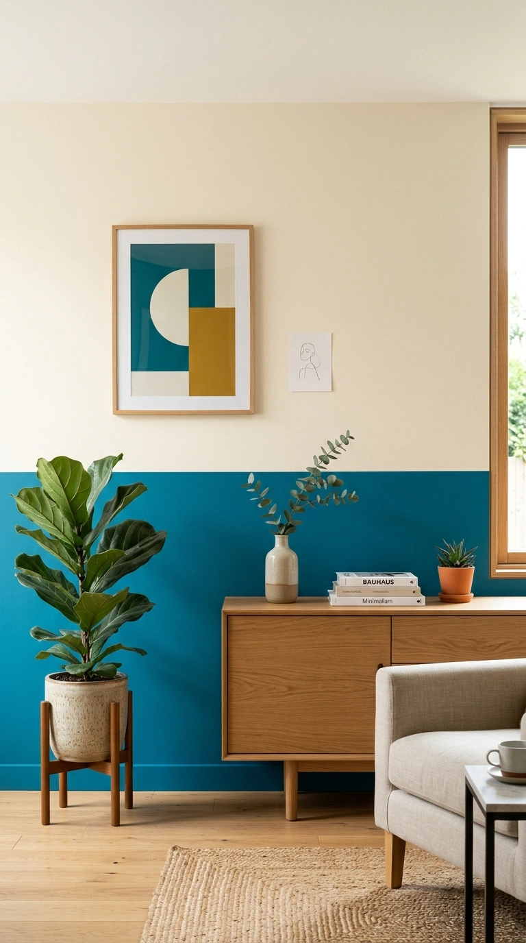
Color blocking, using two or three bold colors in large flat areas that sit directly beside each other with clean edges, creates a graphic modern effect that reads as very intentional. Paint the lower half of a wall in one bold color and the upper half in another. Use a bold color on the wall behind the sofa and a different bold color on the wall behind the bookshelf. The clean sharp edges between the color areas are what give color blocking its graphic quality. This technique suits modern and contemporary rooms and requires careful taping for clean paint lines.
21. Bold Color Restraint
The single most important principle when using bold color in room decor is knowing when to stop. One bold color used confidently and supported by neutral space always reads as more designed than five bold colors competing for attention. The neutral space between the colorful elements is what allows each color moment to register as intentional rather than as part of a visual noise. When in doubt about adding another color, leave it out. The room will look better for the restraint.
22. Start Small and Build
If bold color feels risky, start with the smallest reversible change and build from there. A single bright throw pillow. A colorful piece of art. A bold vase. Each small addition tests your tolerance and your room’s capacity for color without any significant commitment. If the small addition feels right, add the next slightly larger one: a colorful rug, a set of bright curtains, a painted accent wall. The gradual approach lets you find the exact right amount of color for your specific room and your specific comfort level rather than guessing and overshooting in a single dramatic gesture. For a more structured approach to building complete color palettes room by room, the room color scheme guide covers how different color intensities and ratios create different moods across bedrooms, kitchens, and bathrooms.
Colorful room decor that feels bold without feeling chaotic comes down to three principles: contain the color to deliberate zones rather than scattering it everywhere, give every bold element enough neutral space to register clearly, and know when to stop adding. Follow those three rules with any colors you genuinely love and the result will be a room with energy and personality that still feels like a place you want to spend time in.