Janet Dunn, Houzz
If you’re scratching your head over why the decor in some of the spaces in your home leaves you feeling slightly underwhelmed, a remedy — or at least an improvement — may be just a few moves away. Whether it’s a bland room, a paint color you’re not quite sure about or throw pillows that refuse to sit right no matter how many times you arrange them, here are the tweaks that can help turn your questionable decorating decisions into resounding wins.
Related: Get Advice on Color Palettes From a Professional Painter
1. Your Dark Walls Need a Lift
Inky indigos, gunmetal grays and midnight blacks have never been more popular. If you’ve been tempted by their elegance and drama but they’re making your room feel a little closed-in, here’s how to dump the dungeon feeling.
What to do: Good lighting is essential to reveal the tonal complexities in deep, saturated darks. Multiple light sources allow you to control the ambiance and light direction. Combine uplights and downlights and don’t let the ceiling disappear into gloom. The bedside lights shown here, for example, make the most of a sophisticated blue-black wall.
Also, bear in mind that an over-furnished room will seem more cave-like than one that’s simply furnished. Clear out clutter and nonessential furniture.
“The darker the night, the brighter the stars,” Dostoyevsky wrote. Your bold move gives you the perfect excuse to indulge in rich, theatrical color contrasts. Play up dark walls with jewel tones, natural wood, reflective metallics, greenery and dramatic artwork.
Far from restricting a color palette, dark walls come to life when used with shades such as pale aqua and mint, silver-gray, teal, mustard, dusky pink and pumpkin yellow. And you can never go wrong with white.
2. Your Shelves Are Bursting at the Seams
Putting every ornament you own on open shelves often leads to a distracting mishmash of nondescript items. Serious sorting is needed to create some focus.
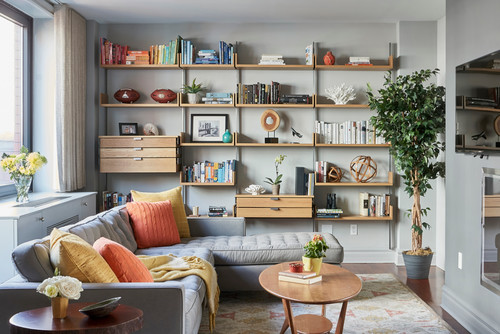
What to do: I recommend organizing-expert Marie Kondo’s life-changing advice of honoring items, then letting them go. Another motto may be “Beautiful, interesting or out.” Empty your shelves and create “yes” and “no” piles. You don’t have to throw items away, but this is a good chance to do the Kondo. The shelves seen here make clever use of space in a way that enhances every object.
Once you’ve reduced your candidates to the beautiful and meaningful, let them shine. You might want to paint the back of the shelves to emphasize lovely shapes and colors among your chosen collection; white items against a dark shade really stand out. Avoid highly patterned or textured backgrounds since they can be confusing to the eye.
Rather than lining books up soldier-style, stack some to form bookends and mini shelves, choosing intriguing titles and spines that coordinate with your display.
Related: Too Many Books? Get Help From a Magazine Rack
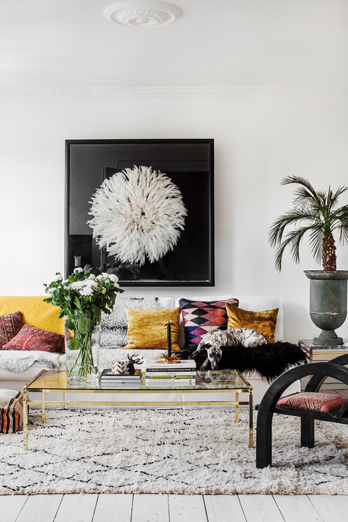
3. Your Sofa Is Pale and Interesting but Totally Impractical
You somehow forgot that a dog, a cat, two toddlers, sticky fingers, raspberry cordial and pet hair just don’t go with light sofas.
What to do: Have the fabric professionally cleaned and treated. Be aware that no stainproofing is infallible and that its effectiveness depends on the fabric. Modern formulas penetrate fibers and enable most liquid and other residue to be removed. DIY aerosol sprays are a short-term solution, but they only coat the surface and wear away after one cleaning.
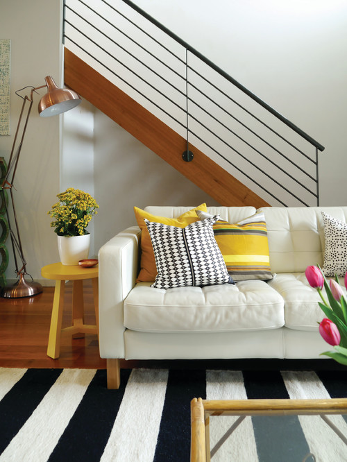
We’re loving sofa throws at the moment. Drape them casually and pile on big pillows to deflect the worst of spills and grime. Another solution is to opt for slipcovers that can go in the washing machine when dirty.
If you want to leave sofas bare, vacuum often with a spotlessly clean brush attachment. In the event of a spill, blot carefully and never rub.
4. Your Vignettes Look Like Bargain Tables
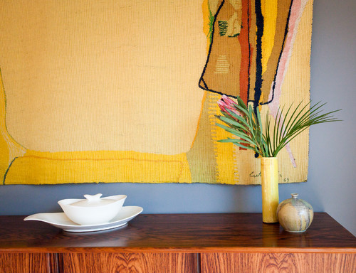
Vignettes like this are a lovely way to show off treasures and create character. They’re pocket-sized portraits of your personality, so if you haven’t mastered the knack, read on.
What to do: Start with an anchor piece and build from it. Asymmetry avoids a stiff, formal look. Contrast shapes and textures. Connect with a theme, color or mood.
Related: Display Vignettes Across Beautiful Accent Tables
5. Your Family Room Doesn’t Feel Friendly
We want guests to be impressed by our home’s public spaces, but often style takes precedence over comfort and we end up with a dressy room that feels stiff and unwelcoming.
What to do: The problem may simply be in how the furniture is positioned. Seating should be arranged in a way that encourages social interaction. When deciding where to put sofas and armchairs, imagine how sitters will communicate with one another. Put seating close enough to encourage conversation rather than back against the walls, which can leave you with a no-man’s land in the center of the room.
6. You Can’t Get the Hang of Hanging Art
Whether art to you means canvas or framed prints, blown-up photographs, a priceless original, a treasured heirloom or your child’s finger painting, its impact depends on the way it’s displayed. Are you getting the best out of yours?
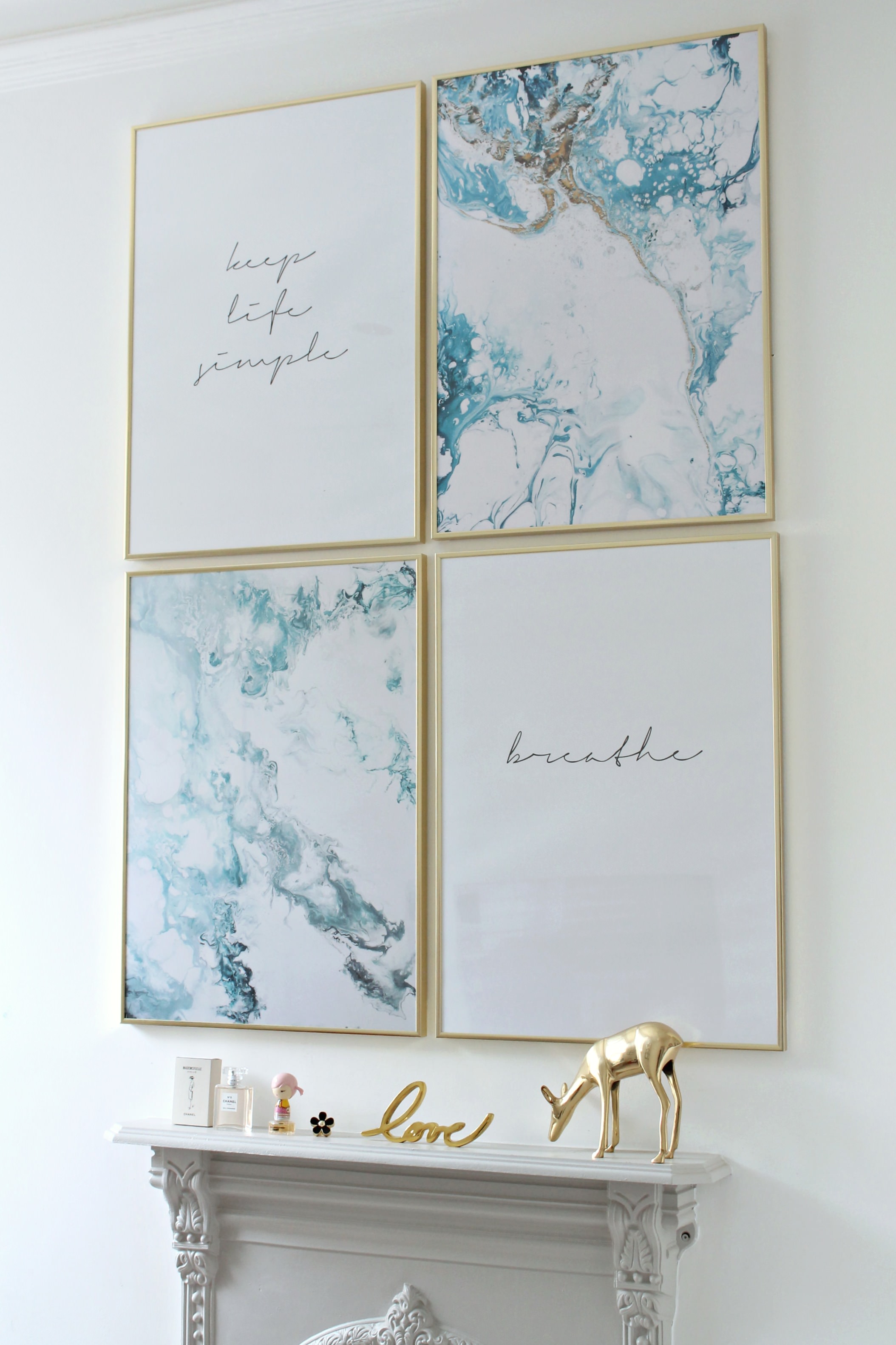
What to do: If art is a defining feature in your home, calling upon the services of a professional hanger is a good investment. A common mistake is hanging art too high. Consider the human scale and hang artwork with the center point at eye level in spaces where people stand, and lower where it’s viewed from a seated position.
7. Your White Kitchen Is Practical but Lacks Warmth
Kitchens are in the limelight more than ever — and often open to other living areas. While all-white is common, clinical coldness can creep in.
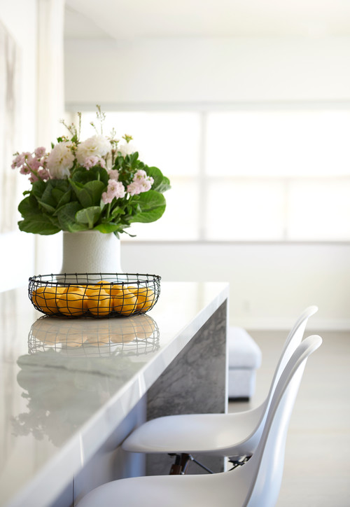
What to do: Kitchenware has moved beyond functional to become something worthy of display. Appliances come in a rainbow of colors and styles, and cookware is designed to be seen. Don’t hide all this beauty away in cupboards: Hang great-looking saucepans from wall hooks, leave a stack of pretty dishes out on display or set a bowl filled with fruits or veggies on the counter.
Kitchen designer Anne Ellard believes a white kitchen is the perfect blank canvas. “Add bold flourishes of color with accessories such as books, flowers or small appliances, all of which can easily be changed,” Ellard says. “Or make your pop of color even grander with a colorful backsplash.”
Bright artwork, wood accessories, potted plants and mini herb gardens help relieve sterility and make a sleek kitchen feel more like home.
8. Your ‘Focal Points’ Are All Over the Place
If you walk into a room and nothing — or everything — catches your eye, then it has no focal point. This much-used designer’s term simply means a primary place for the eye to rest before taking in the whole space. A room without one lacks life, balance and harmony.
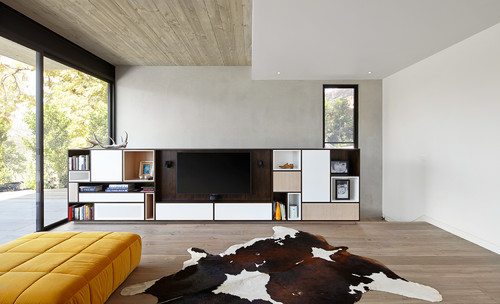
What to do: A focal point could be an architectural feature, a view, a piece of art, a fireplace, a statement furniture piece, a mirror, a textural surface or a stunning rug, as seen here. It’s easier to start with a focus and plan the rest of the room’s decor around it. If you prefer to work with what you already have, decide what the focal feature will be and then arrange existing furniture to direct attention toward it.
9. You Can’t Control Your Pillow Habit
We all know one: a pillow addict who doesn’t know when to stop. Perhaps it’s you? Get help here.
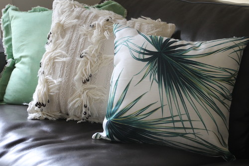
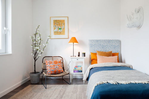
What to do: Pillows heaped high on sofas, chairs and beds don’t always add much to a room. If you can’t sit on a sofa or lie on a bed without putting pillows on the floor, they lose their purpose. Try to restrict pillows to two at each end of a sofa, one (or none) on an armchair and three on a bed.
10. You Haven’t Changed Anything in Years
Has decor ennui crept in? You could just be tired of the same old, same old. We all have favorite styles, but it’s easy to get stuck in a groove.
What to do: Shake things up. Reignite your passion and inject new energy and interest into your home by mixing up what you already have or adding some inexpensive new accessories. Change bedding and pillows and move houseplants, chairs, lamps and rugs around. Reposition furniture for a fresh perspective — it’s cheap as well as fun. This bedroom shows how a few well-chosen accessories can make for a pretty and inviting space.
Article source: https://www.forbes.com/sites/houzz/2017/08/18/how-to-fix-10-common-design-mistakes/

