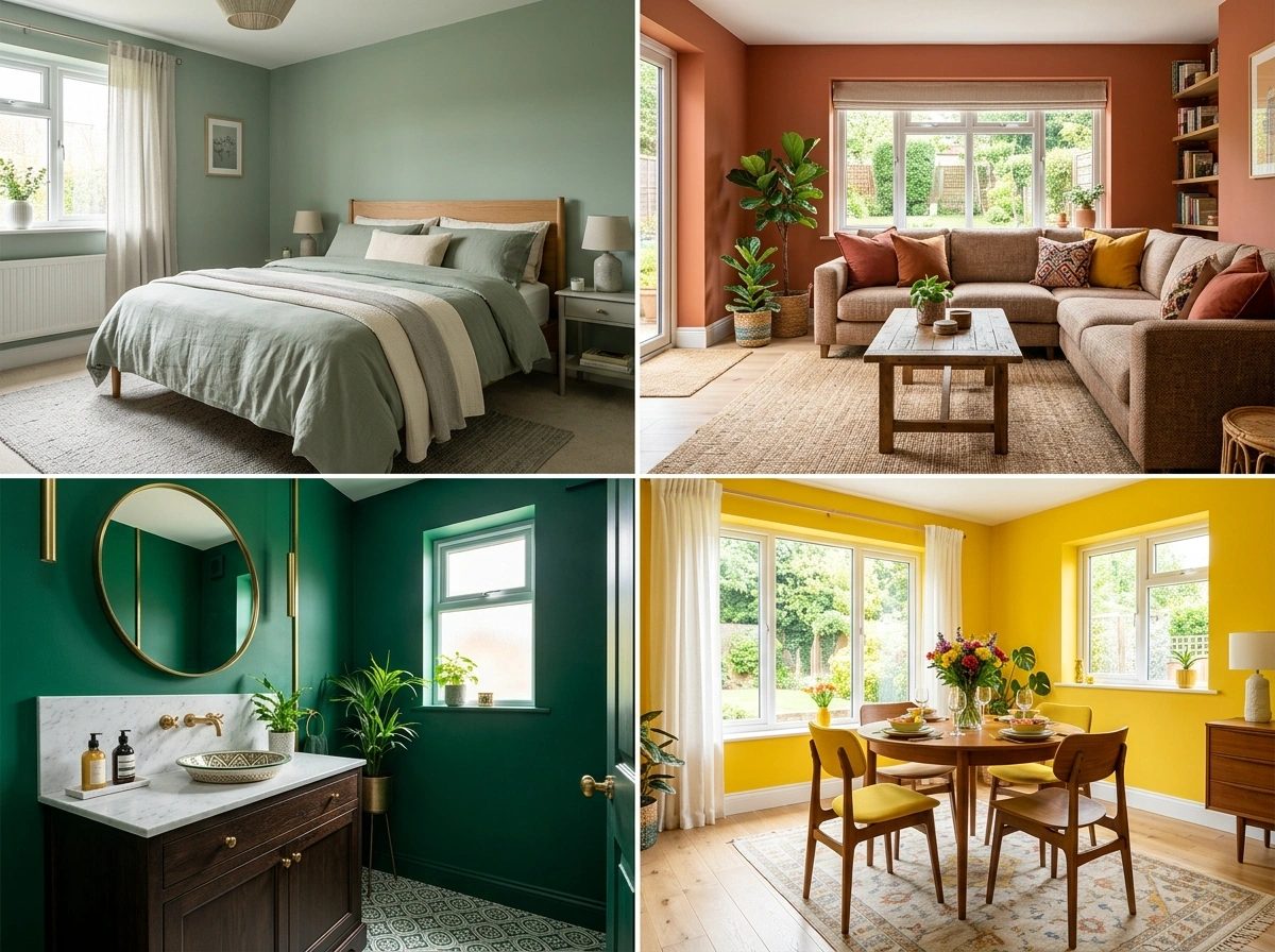
20 Room Color Scheme Ideas That Set the Right Mood in Any Space
The color scheme of a room does more than determine how it looks. It determines how the room feels, how long you want to stay in it, and how your mood shifts when you walk through the door. A bedroom in bright white feels different from the same bedroom in warm sage. A kitchen in cool gray creates a different cooking experience than the same kitchen in warm cream. The relationship between color and mood is real and consistent, which means choosing the right color scheme for a specific room starts with deciding how you want the room to feel and working backward from there. These 20 color scheme ideas are organized by room type and by the mood each palette creates, so the match between your room, your desired feeling, and the right colors is as clear as possible.
1. Bedroom: Calm and Restful
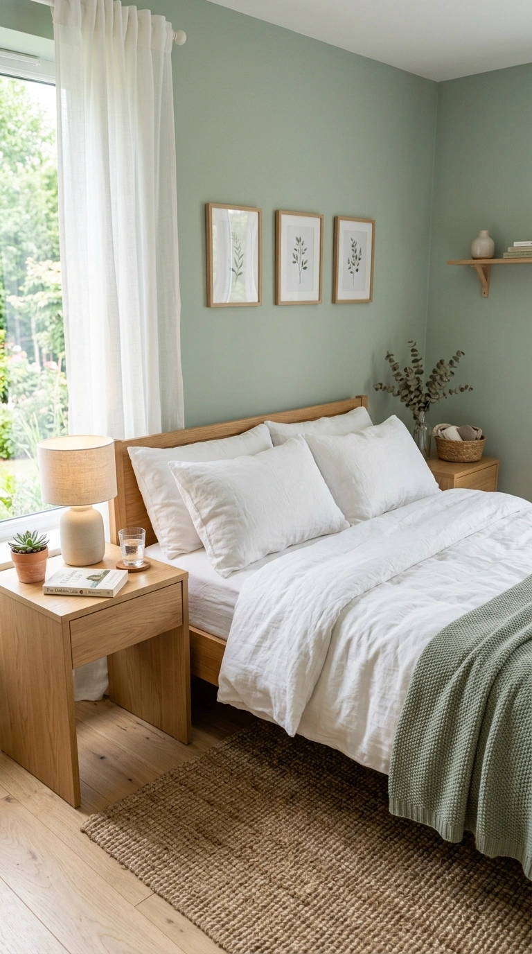
A bedroom that needs to feel calm and conducive to sleep benefits from a muted, warm palette with no high-contrast elements. Soft sage, warm cream, dusty blush, or muted lavender on the walls, paired with white or cream bedding and natural wood furniture, creates the quietly enveloping quality that supports rest. Avoid bright whites that feel clinical and deep dark colors that can feel oppressive in the room where you wake up. The ideal calming bedroom palette reads as a gentle color hug rather than as either a blank slate or a dramatic statement.
2. Bedroom: Warm and Cozy
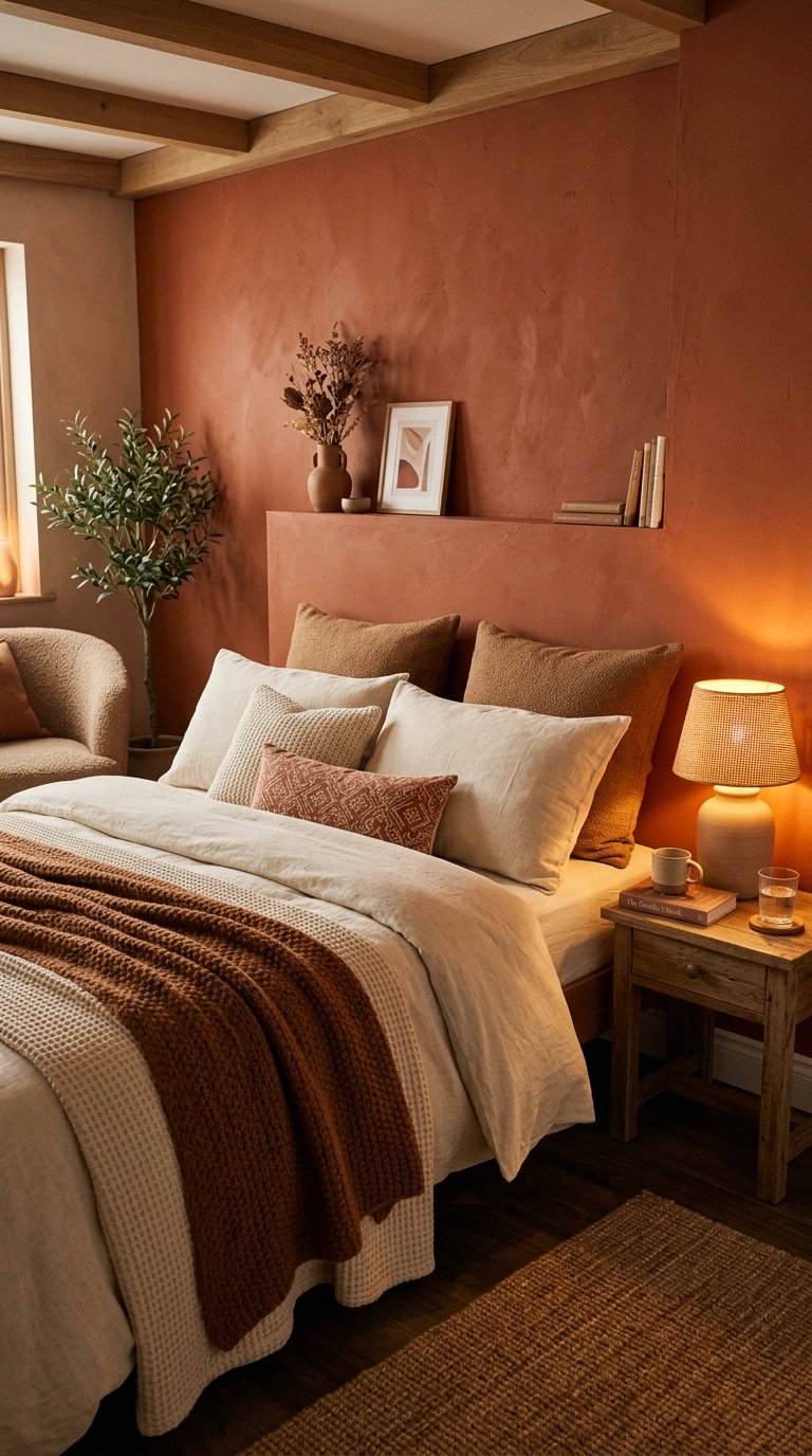
A bedroom that needs to feel warm and nest-like benefits from deeper, richer tones than the calm bedroom. Warm terracotta, deep clay, rich caramel, or a saturated warm cream on the walls, paired with layered textiles in complementary warm tones, creates an enveloping quality that makes getting into bed feel like settling into a cocoon. Add warm amber lighting in the 2200K to 2700K range to intensify the warmth in the evening. The cozy bedroom palette should feel like the room wraps around you rather than simply surrounding you.
3. Bedroom: Fresh and Bright
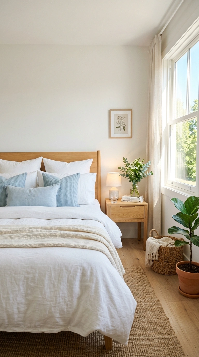
A bedroom that needs to feel energizing in the morning benefits from a lighter, fresher palette with some brightness. Crisp warm white, soft sky blue, clean pale green, or warm lemon cream on the walls, paired with white bedding and natural wood, creates a room that catches morning light and makes waking up feel welcoming rather than reluctant. Add a few small accents in a brighter tone, warm yellow pillows, a small piece of colorful art, to give the room a spark that the muted palettes lack.
4. Bedroom: Moody and Romantic
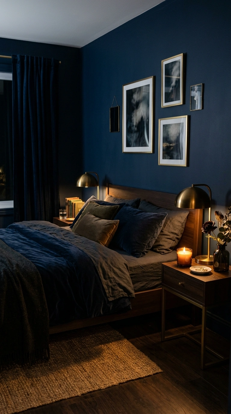
A bedroom that needs to feel intimate and romantic benefits from a deeper, darker palette that absorbs light and creates enclosure. Deep navy, rich forest green, warm charcoal, or dark plum on the walls, paired with warm brass fixtures, candlelight, and luxurious textiles in complementary tones, creates a bedroom with genuine atmosphere. The dark color makes the room feel smaller in the best sense: intimate, protected, and separated from the busy world outside. Use warm lighting at multiple levels rather than relying on a single overhead fixture.
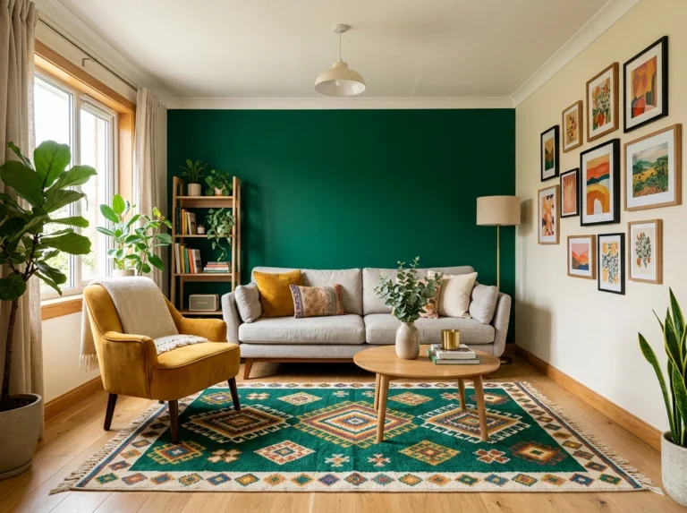
5. Living Room: Social and Warm
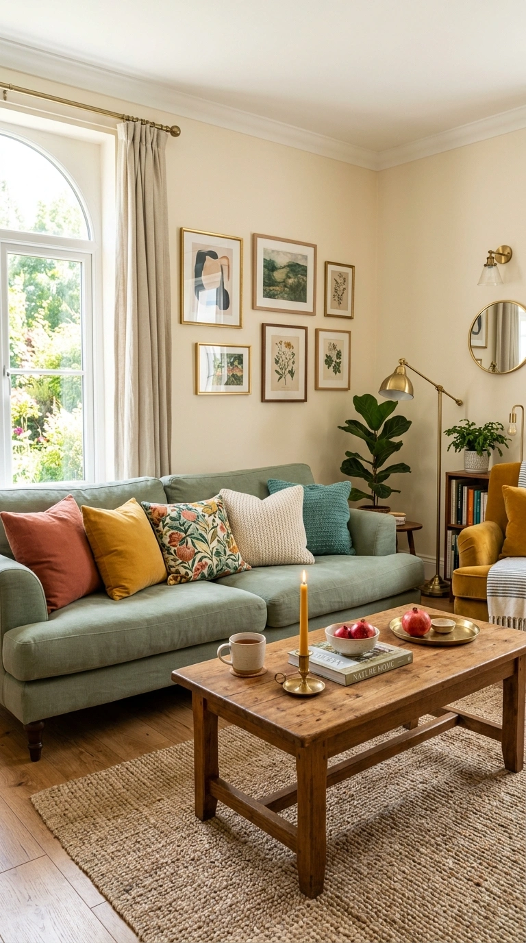
A living room designed for regular socializing needs warm colors that make guests feel welcome and conversation feel natural. Warm cream, soft sage, gentle terracotta, or warm sand on the walls creates the background warmth. A sofa in a warm neutral or a muted accent color, paired with warm wood, brass, and a few colorful accent pillows, sets the tone for gathering. Avoid cool grays and stark whites which can make a social living room feel corporate rather than welcoming. The warm palette signals hospitality from the moment someone enters. For specific color combinations that work in living rooms, the 24 living room color schemes guide provides complete palettes with application ratios.
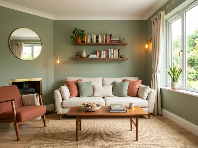
6. Living Room: Calm Retreat
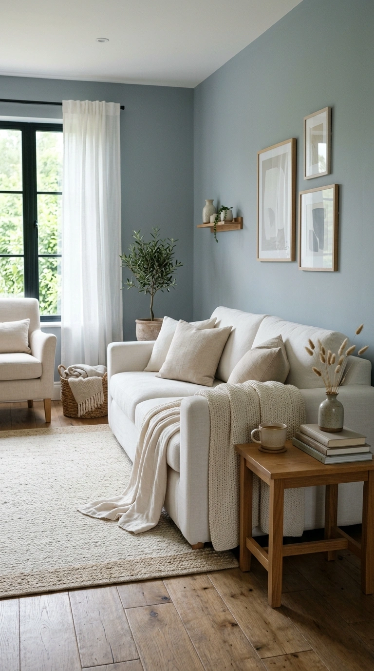
A living room that functions primarily as a personal retreat from the day needs a palette that calms rather than stimulates. Muted blue-grays, soft warm whites, gentle lavender-grays, or pale sage greens create a quiet atmosphere that supports reading, thinking, and unwinding. Keep the palette in a tight tonal range without strong contrasts. Add soft textiles and warm wood for physical comfort. The calm living room palette should feel like a gentle exhalation rather than a visual event.
7. Living Room: Bold and Expressive
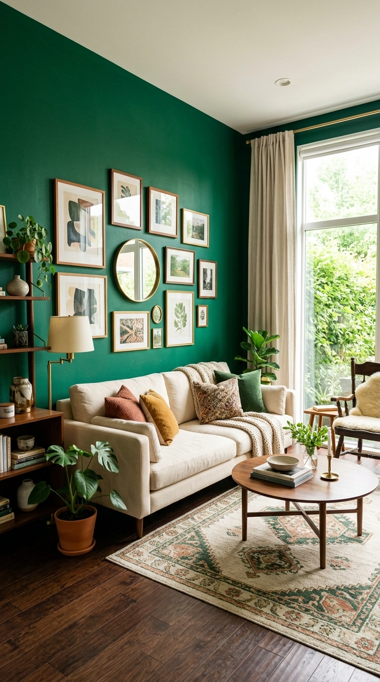
A living room that expresses personality and confidence can handle stronger colors than rooms designed for calm. Deep jewel tones, rich emerald, saturated navy, warm brick red, or bold teal on one or more walls create rooms with genuine character that make a strong first impression. Balance the bold wall color with enough neutral space on the remaining surfaces, and add warm wood and metallic accents to keep the room feeling warm rather than overwhelming. The bold living room is not for everyone, but for the right person it creates a space that feels uniquely and unmistakably theirs.
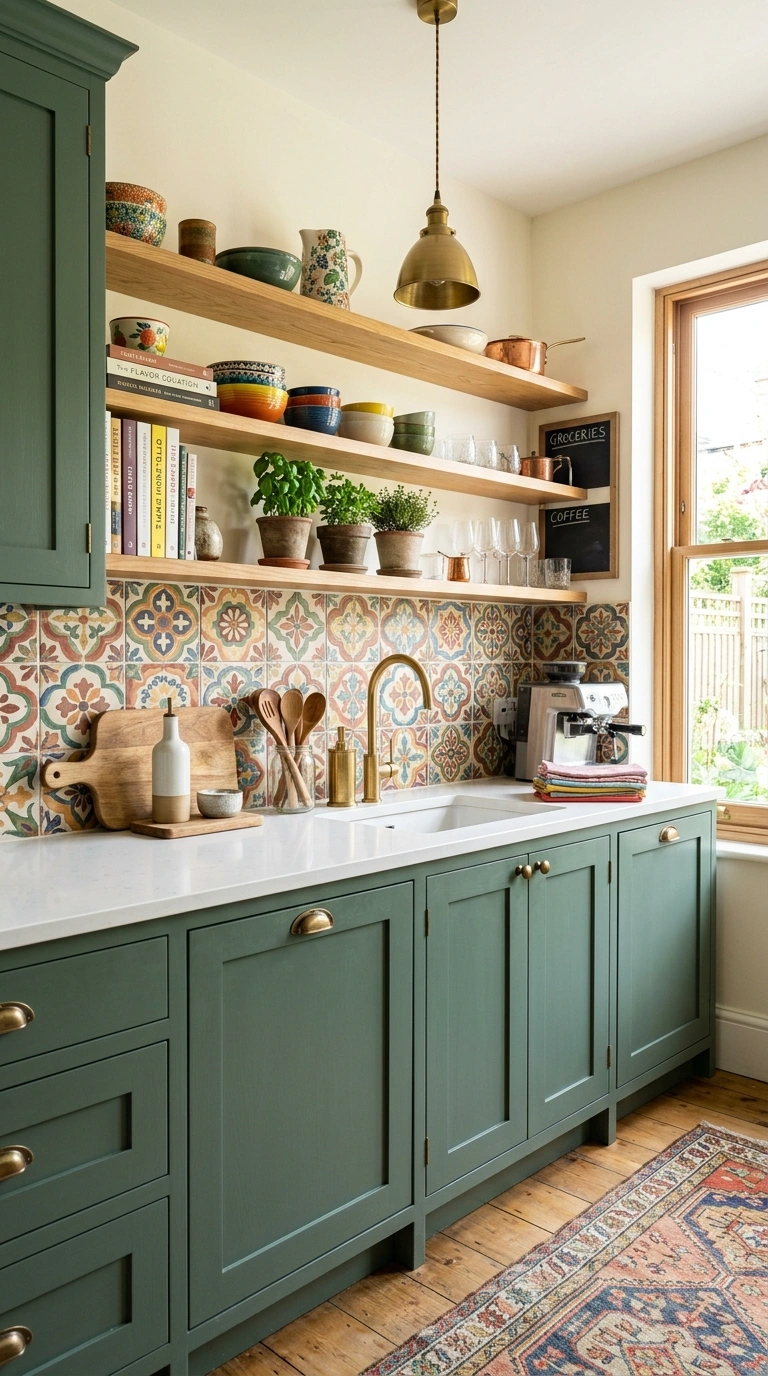
8. Kitchen: Warm and Welcoming
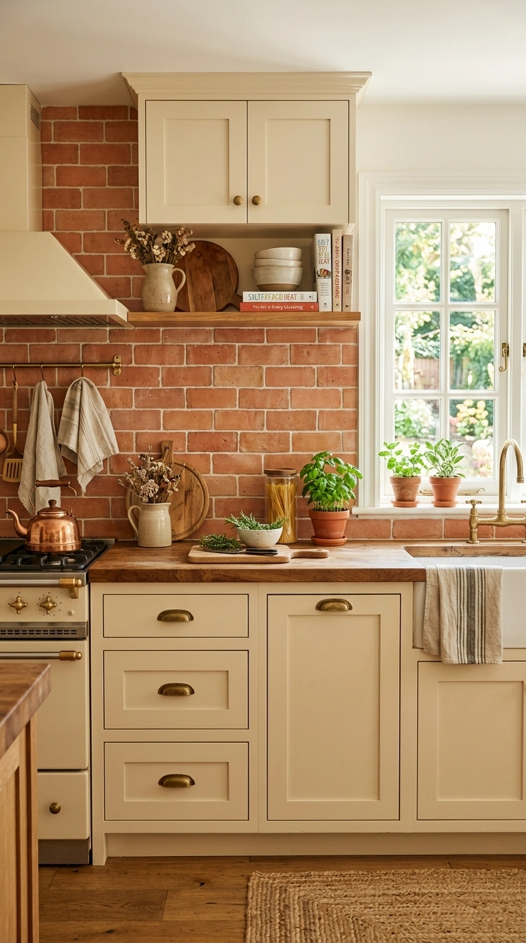
A kitchen designed to feel warm and welcoming for both cooking and gathering benefits from a palette that includes at least one warm tone. Warm cream on the walls or cabinets, a warm wood counter or a warm terracotta accent, and warm brass or copper hardware together create a kitchen that feels like the heart of the home rather than a sterile workspace. Avoid all-white kitchens which can feel clinical and uninspiring for daily cooking. Even a single warm element, a warm wood open shelf, warm toned subway tile, or a warm rug, shifts the kitchen atmosphere meaningfully.
9. Kitchen: Clean and Bright
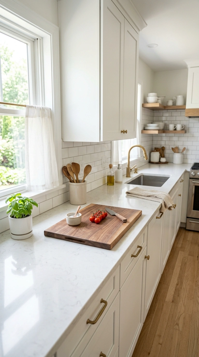
A kitchen that needs to feel clean and efficient benefits from a lighter palette with crisp edges. White or very light gray cabinets, white or light stone counters, and a clean simple backsplash create the bright functional quality that serious cooks appreciate. Add warmth through a single natural wood element, a cutting board displayed on the counter, a wooden shelf, or a warm floor, to prevent the clean palette from tipping into sterile. The clean kitchen palette reads as professional and capable while the warm accent keeps it from feeling like a laboratory.
10. Kitchen: Colorful Personality
A kitchen that wants to express bold personality can handle more color than most rooms because the functional elements, appliances, counters, and fixtures, provide a built-in neutral framework. A bold backsplash, colored cabinets in a deep sage or navy, a bright runner rug, or colorful open shelf displays all introduce personality without overwhelming the functional quality of the room. The key is keeping the color contained to one or two zones while the work surfaces stay neutral. A kitchen with bold personality cooks just as well as a neutral one, and the daily experience of using it is more enjoyable. For more on using bold color confidently in any room, the colorful room decor guide covers the principles of bold color restraint in detail.
11. Bathroom: Spa-Like Calm
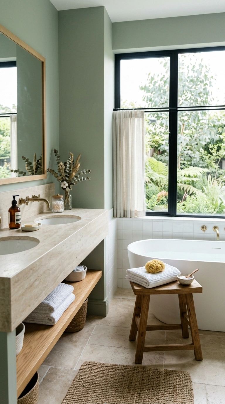
A bathroom designed to feel like a spa needs a palette that is muted, natural, and free of visual noise. Soft sage, warm cream, pale gray-blue, or muted earth tones on the walls, paired with white fixtures, natural stone, and warm wood accents, create the quiet atmosphere that spa-like bathrooms depend on. Keep patterns minimal and let the materials, stone, ceramic, wood, and water, be the visual content. The spa bathroom palette should feel like the room itself is breathing slowly.
12. Bathroom: Bold Small Space
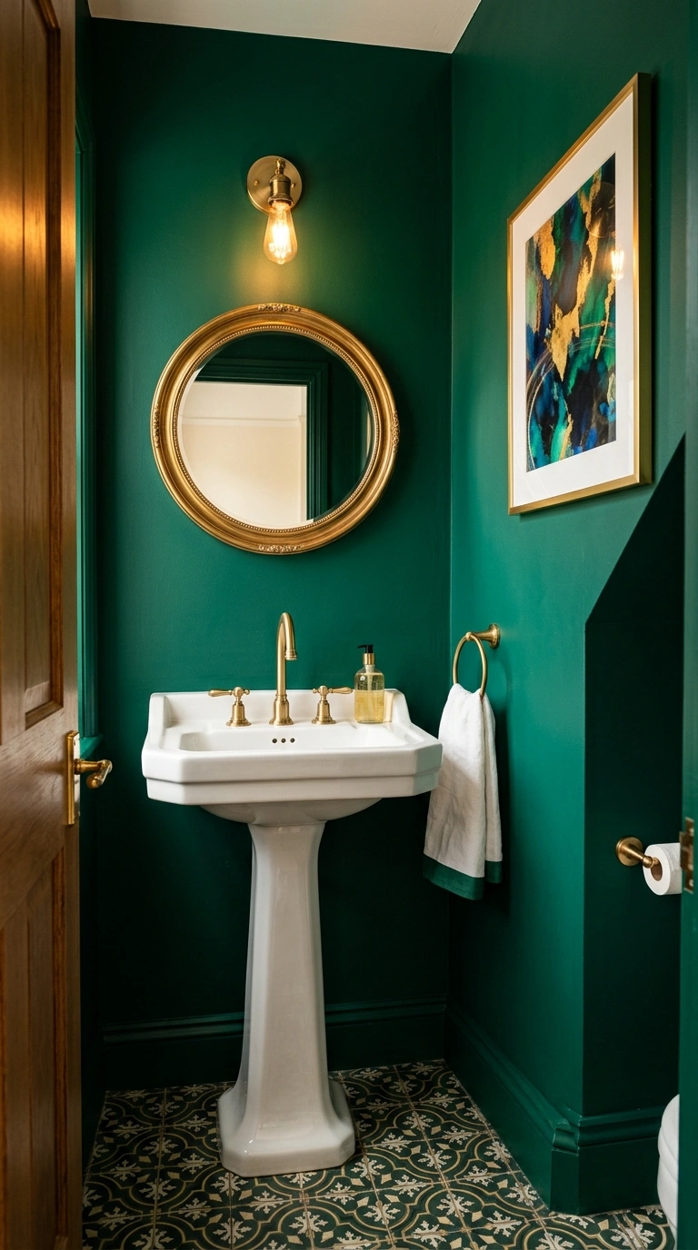
A small bathroom or powder room can handle bolder colors than a large bathroom because the small size contains the color and creates a jewel-box intensity. Deep emerald, rich navy, saturated terracotta, or warm plum on the walls of a small bathroom creates a memorable moment that the same color in a large room might overwhelm. Pair the bold walls with white fixtures and brass hardware for the cleanest result. The bold small bathroom palette should feel like a confident surprise behind a closed door.
13. Bathroom: Fresh and Clean
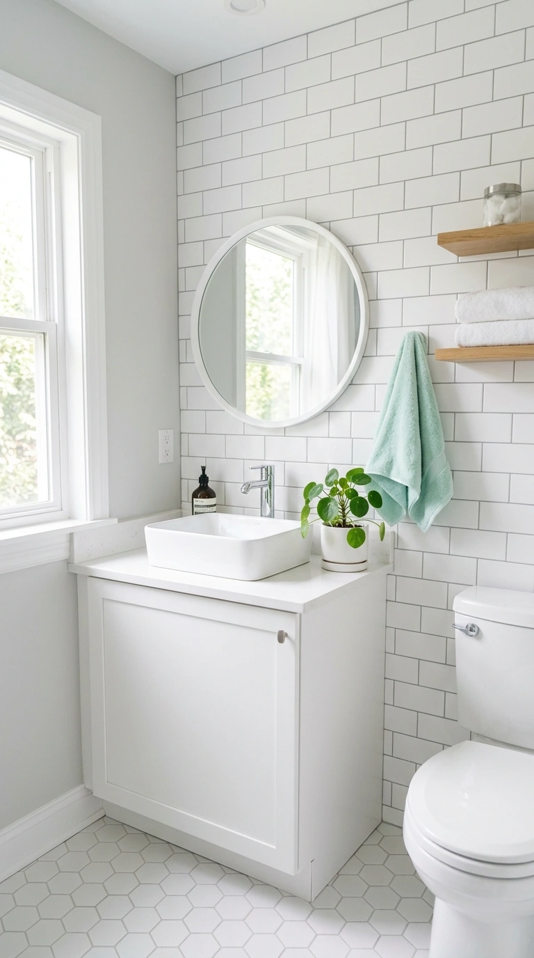
A bathroom that needs to feel maximally fresh and clean benefits from a palette of crisp whites, soft cool grays, and a single fresh accent. White tiles, white fixtures, and light gray walls create the foundation. A fresh accent in pale blue, soft mint, or barely-there sage prevents the all-white from feeling clinical. The fresh bathroom palette reads as hygienic and welcoming, which is what most standard family bathrooms need to achieve.
14. Home Office: Focused Work
A home office designed for focused work benefits from a palette that calms the mind without putting it to sleep. Muted sage, warm taupe, soft dusty blue, or warm mushroom gray on the walls creates a quiet backdrop that supports concentration without the distraction of bold color or the sterility of bright white. Keep the desk surface and the immediate work zone in warm wood or neutral tones. Add warmth through a quality rug, warm lighting, and one or two personal objects. The focus office palette should feel like a quiet library rather than either a creative studio or a corporate cubicle.
15. Home Office: Creative Energy
A home office designed for creative work can handle brighter, more stimulating colors than a focus office. A bold accent wall in warm mustard, deep teal, or rich terracotta behind the desk creates visual energy that suits brainstorming, creative writing, and design work. The bold color on the wall behind you also creates an interesting video call background. Keep the desk area itself in warm neutrals so the actual work surface is calm even when the surrounding walls are energizing. The creative office palette should feel stimulating without being exhausting.
16. Dining Room: Intimate Evenings
A dining room designed for intimate evening meals benefits from a darker, warmer palette that looks best under candlelight and low warm lighting. Deep navy, warm charcoal, rich forest green, or dark plum on the walls creates the enclosed atmospheric quality that makes dinner feel like an event rather than a task. Brass candlesticks, warm wood table, and cream linen napkins complete the palette. The intimate dining palette should make guests lean in and lower their voices, which is the mark of a room with genuine atmosphere.
17. Dining Room: Family Meals
A dining room designed for daily family meals needs a warmer, brighter palette than the intimate evening version. Warm cream, soft sage, gentle terracotta, or warm sunshine yellow on the walls creates a cheerful quality that makes everyday eating feel pleasant rather than obligatory. Add colorful place settings, a simple fresh flower or plant centerpiece, and warm natural wood for a complete palette. The family dining palette should make sitting down feel welcoming rather than formal.
18. Kids Room: Playful Color
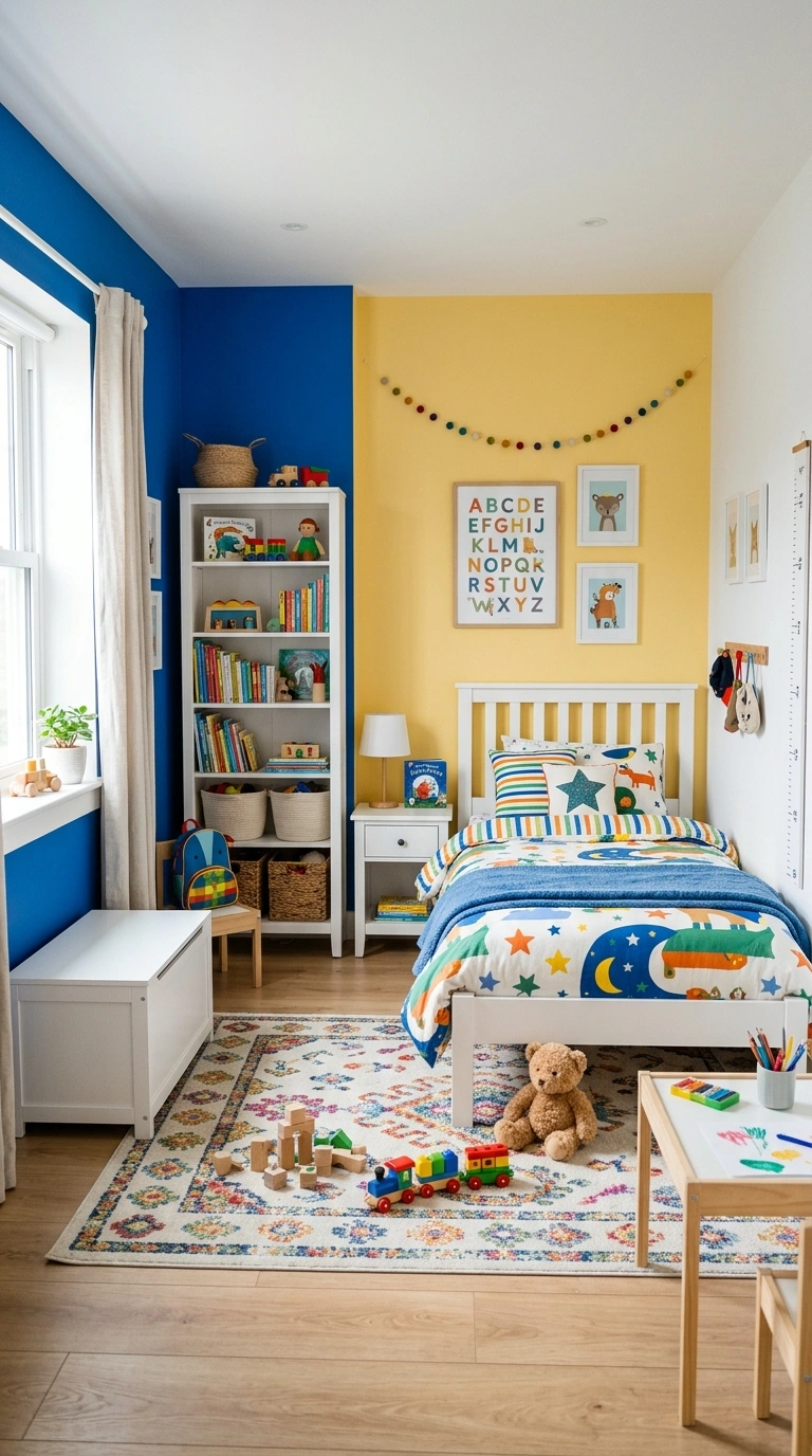
A child’s room benefits from more color than an adult room because children respond positively to visual stimulation and bright colors support active play and creative thinking. Use one or two bold colors on the walls or in the furniture, a bright blue, a cheerful yellow, a warm coral, or a vivid green, and balance with enough white or warm cream that the room does not feel overwhelming during rest time. Consider painting the sleeping wall in a calmer tone and the play wall in the bolder color so the room supports both activities. The kid’s room palette should feel energizing during play and calm enough to support sleep.
19. Hallway and Entry Color
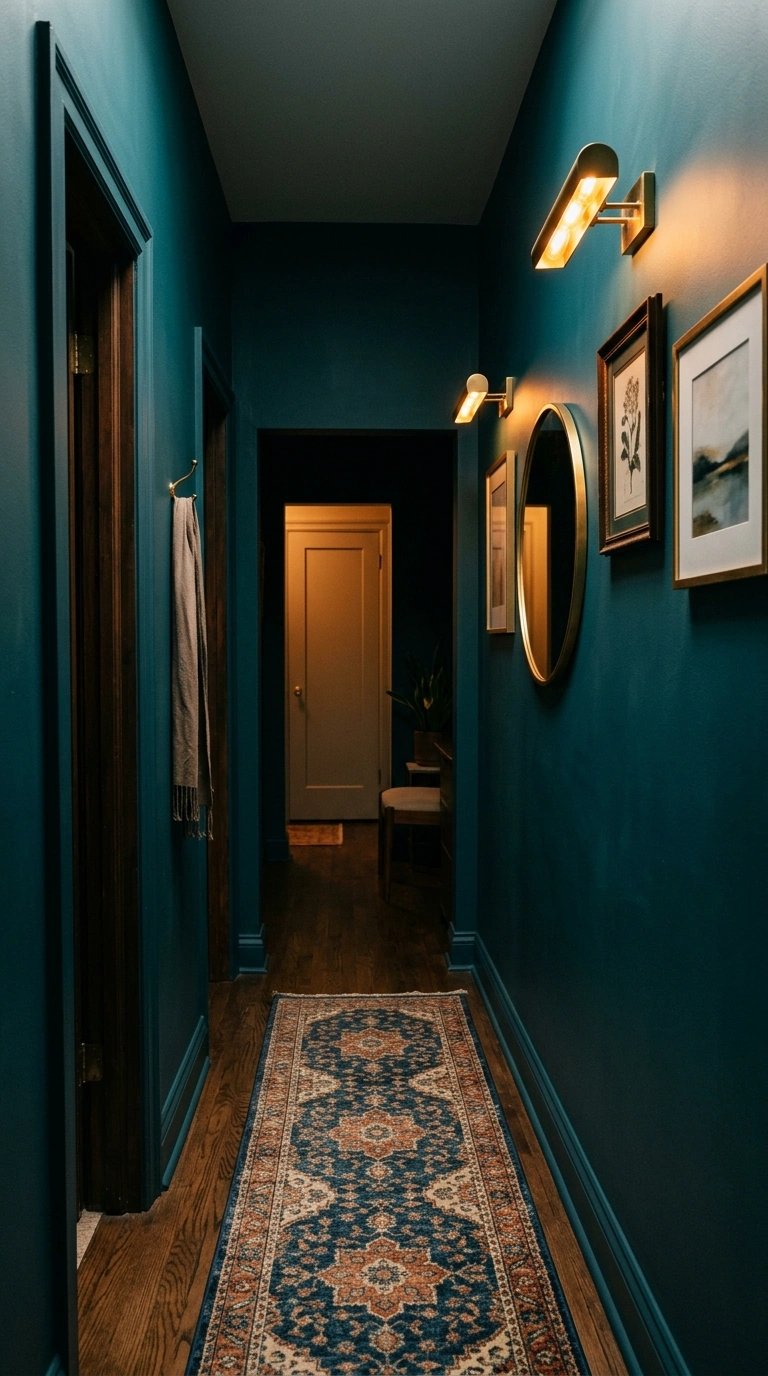
A hallway or entryway is one of the best places to use a color that would feel overwhelming across an entire room because it is passed through rather than lingered in. A rich deep tone, warm burgundy, saturated teal, deep mustard, or emerald green, in a narrow hallway creates a dramatic moment that is experienced briefly during every transit through the home. The short exposure means the bold color feels interesting rather than tiring. Add warm lighting and a simple mirror or piece of art to complete the hallway palette.
20. The Mood Comes First
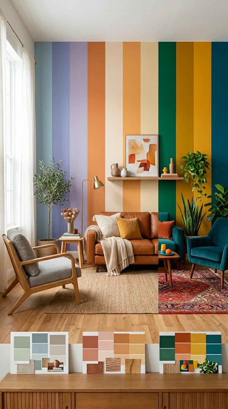
The most effective room color scheme starts with the mood you want to create rather than with a specific color you saw online. Ask how you want the room to feel: calm, warm, energized, intimate, focused, cheerful, bold, or restful. Then choose the palette category that matches that mood. Calm rooms use muted soft tones. Warm rooms use deeper earthy tones. Energizing rooms use brighter, more saturated tones. Intimate rooms use dark enveloping tones. Starting from mood rather than from color ensures the final palette serves the room’s actual purpose rather than just looking good in a photograph.
Room color schemes work best when the colors are chosen for the mood they create rather than for how they look in isolation. Start by deciding how you want the room to feel, choose the palette intensity that matches that mood, and apply it at the right ratios across the room’s surfaces. The right color scheme makes a room feel like it was designed to support the specific life that happens inside it, which is the only thing a color scheme ultimately needs to do.