20 Kitchens With Black Worktops That Look Striking Without Feeling Heavy
A black worktop in a kitchen creates a visual anchor that grounds the room with weight and presence that lighter counters cannot achieve. The black surface reads as the horizontal foundation that everything else in the kitchen is built upon and around. The risk is that the black counter, combined with other dark elements, makes the kitchen feel heavy and oppressive rather than striking and balanced. The kitchens that pull off black worktops successfully are the ones where the counter is balanced by lighter elements above, beside, and below it, so the black reads as a deliberate design choice anchoring a lighter room rather than as part of an all-dark enclosure. These 20 ideas cover the materials, the cabinet pairings, the lighting, and the small details that keep a black worktop striking without tipping the kitchen into heaviness.
1. Black Granite Natural Depth
Natural black granite is one of the most popular and most reliable black worktop materials because the stone has genuine depth and subtle variation that manufactured solid-color surfaces lack. Absolute Black granite from India and Zimbabwe is one of the most uniformly dark granites available. Black Pearl granite has subtle silver mineral flecks that catch light and add dimension. Ubatuba granite has deep green undertones in the black that add warmth. The natural variation in real stone prevents the black from reading as flat and dead, since the mineral content creates subtle movement across the surface that changes with the light throughout the day.
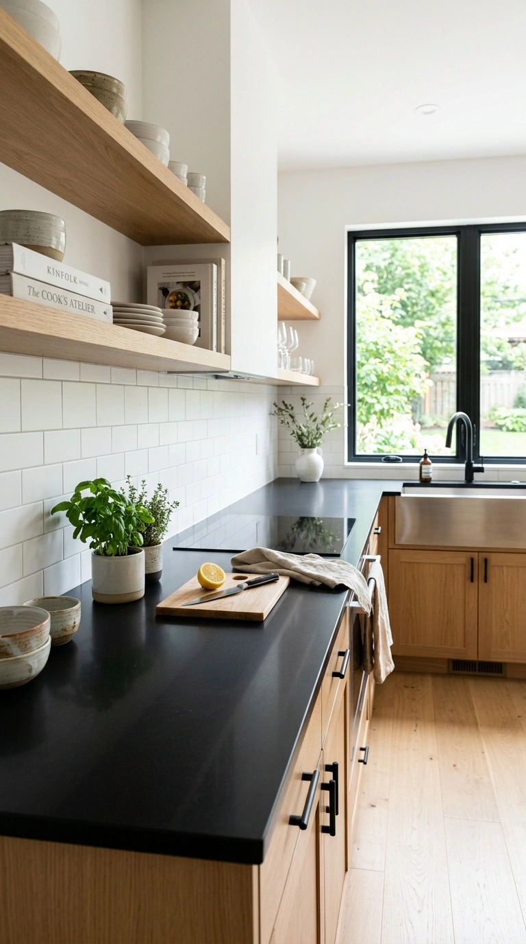
2. White Cabinet Classic Pairing
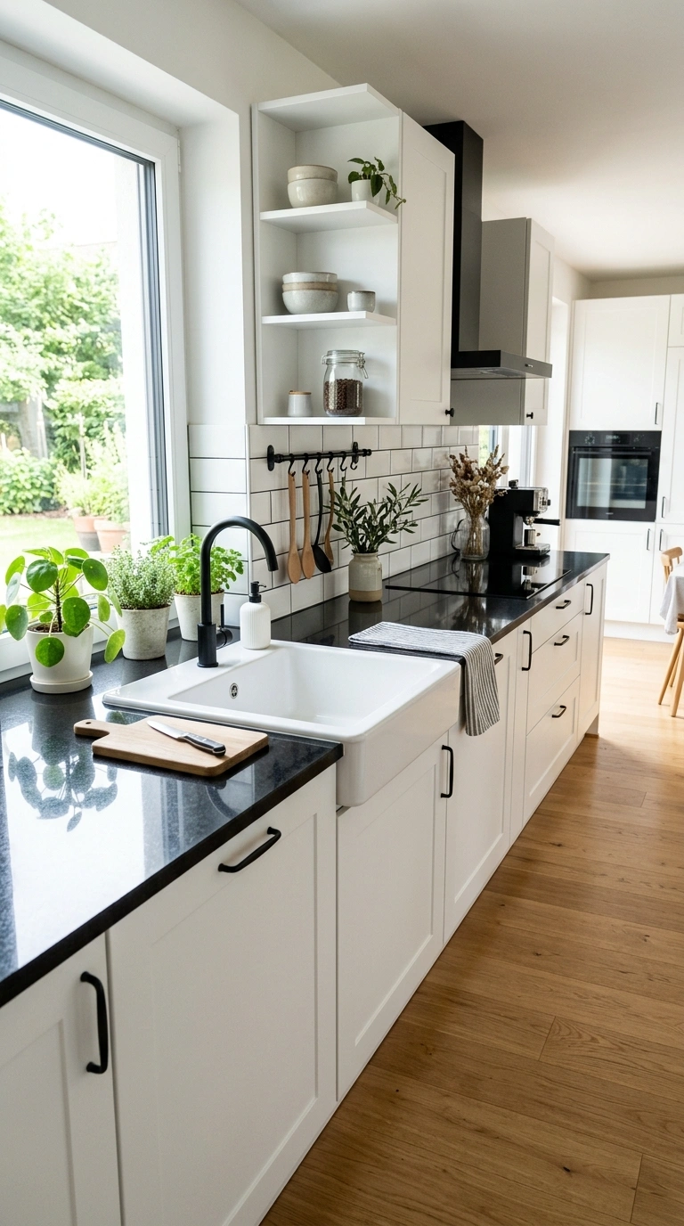
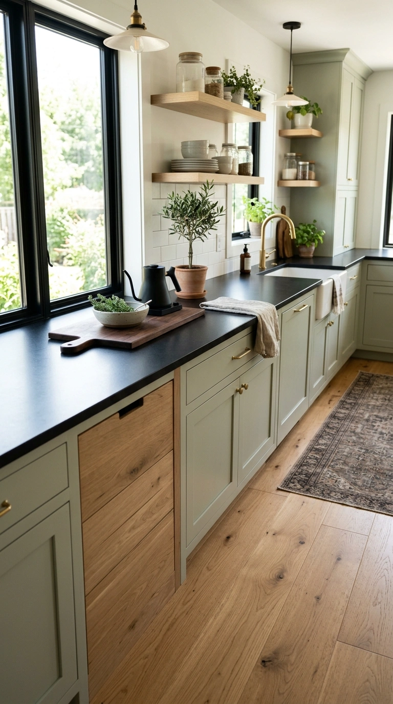
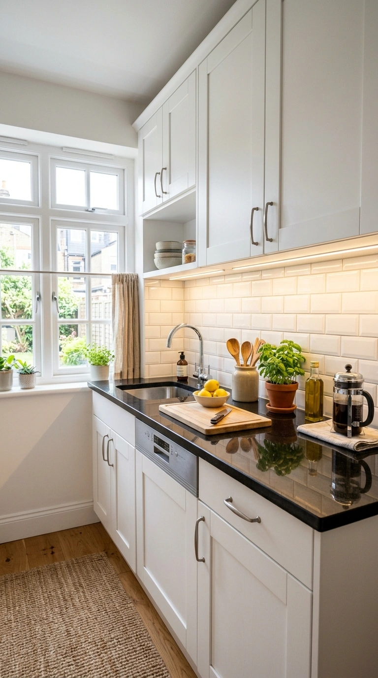
The most reliable and most popular pairing with a black worktop is white cabinets. The strong contrast between the black horizontal surface and the white vertical cabinets creates a clean, graphic kitchen that reads as both modern and timeless. The white cabinets provide the brightness that the black counter absorbs, which keeps the kitchen feeling open and balanced rather than dark. Use warm white rather than cool white on the cabinets for the most welcoming result. The black-and-white kitchen is one of the few design combinations that never looks dated because the contrast is based on fundamental visual principles rather than on trend.
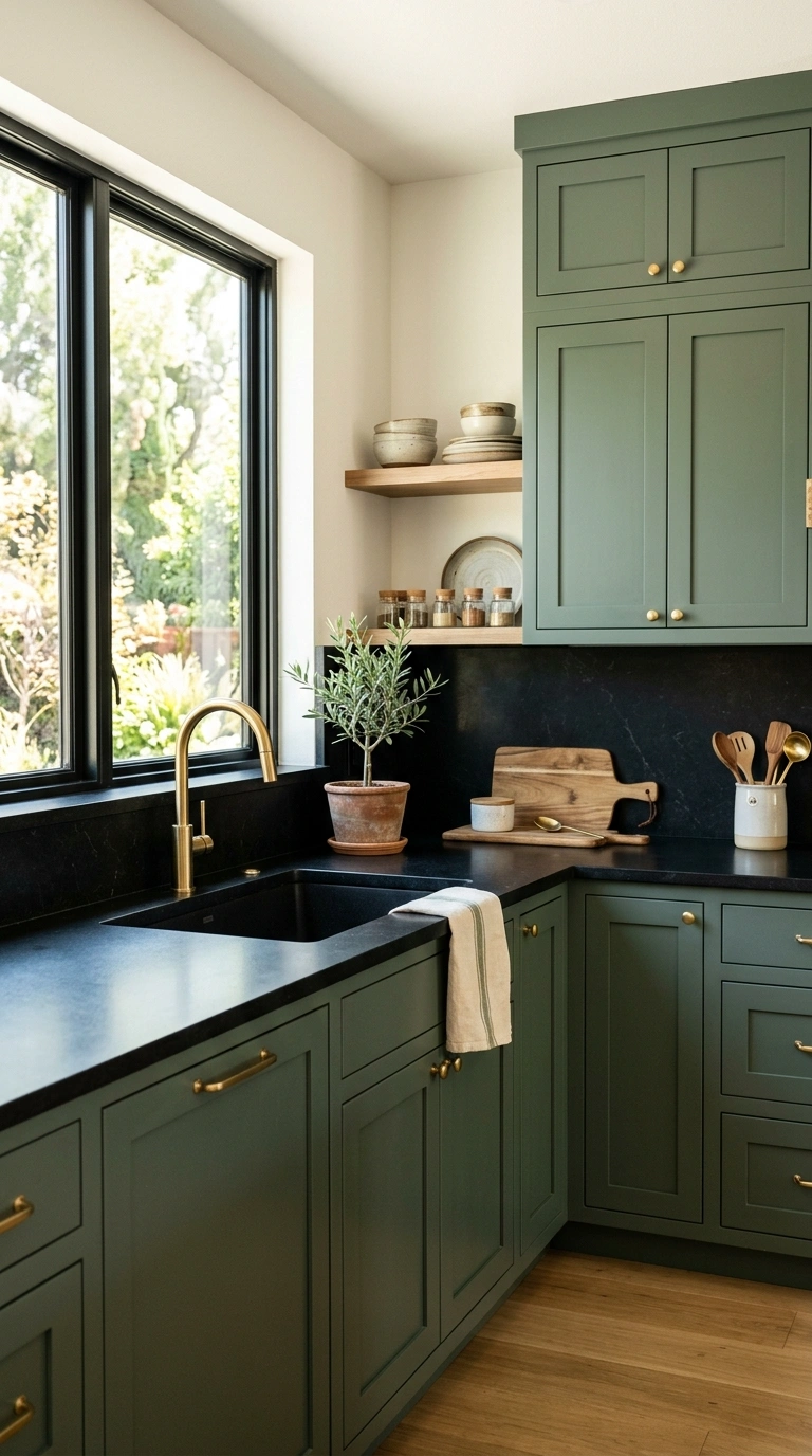
3. Warm Wood Cabinet Organic
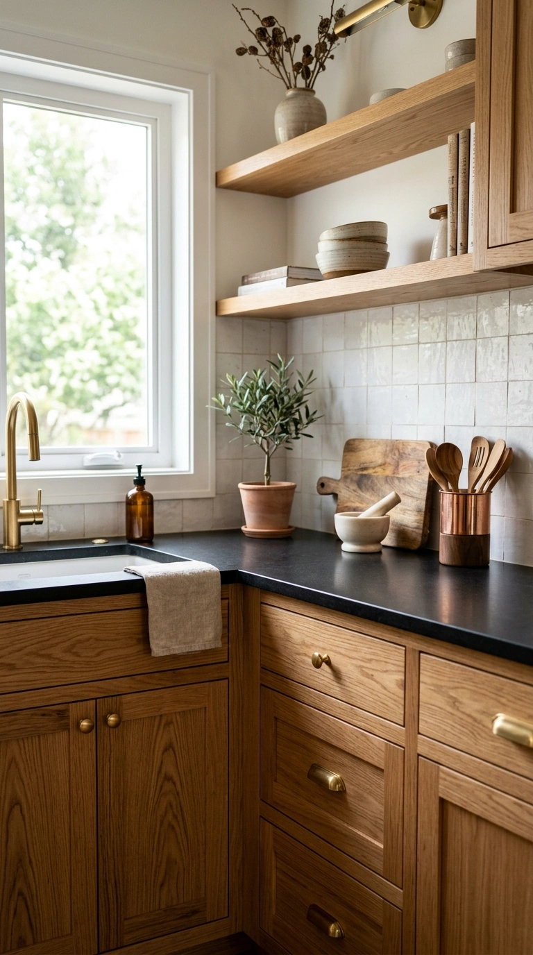
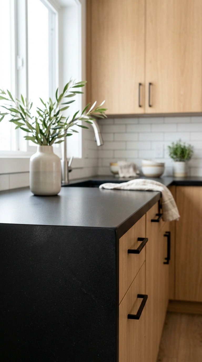
Natural warm wood cabinets paired with a black worktop create an organic, earthy combination that feels warmer and more residential than the black-and-white version. The visible grain and warm color of natural oak, walnut, or ash cabinets soften the severity of the black counter and add the organic warmth that painted cabinets lack. The combination reads as a kitchen where natural materials take priority, with the black stone grounding the warm wood above. Add brass hardware and green plants to complete the warm organic palette. The same principle of warm wood softening dark surfaces creates beautiful results in black cabinet kitchen designs where the wood provides the organic counterpoint to the bold dark cabinetry.
4. Honed vs Polished Finish
The finish of the black worktop significantly affects how the kitchen reads and how practical the surface is for daily use. A polished black granite or quartz reflects light sharply and shows every fingerprint, water spot, and crumb immediately, which requires constant wiping to maintain the showroom appearance. A honed matte finish absorbs light softly, hides fingerprints and minor marks, and reads as more contemporary and more relaxed than the polished version. The honed finish is more practical for daily kitchen use and produces a softer, warmer quality of black that suits kitchens where the counter is heavily used rather than primarily displayed.
5. Black Quartz Low Maintenance
Engineered black quartz provides the uniform color and the low-maintenance quality that natural stone cannot match. Quartz does not require sealing, does not stain from acidic foods, and maintains its consistent color without the natural variation that some homeowners find unpredictable in granite. Black quartz is available in finishes ranging from pure matte black to versions with subtle veining that mimics natural marble. The engineered consistency makes quartz the most practical choice for homeowners who want the striking quality of a black counter without the ongoing maintenance commitment that natural stone requires.
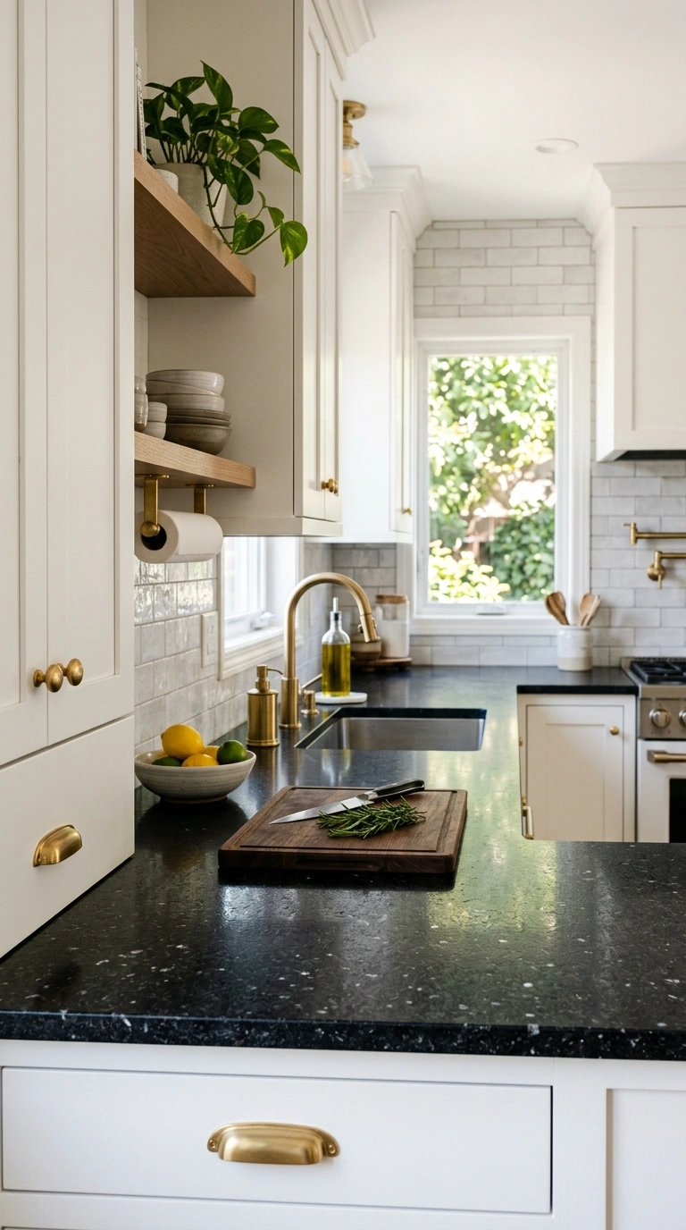
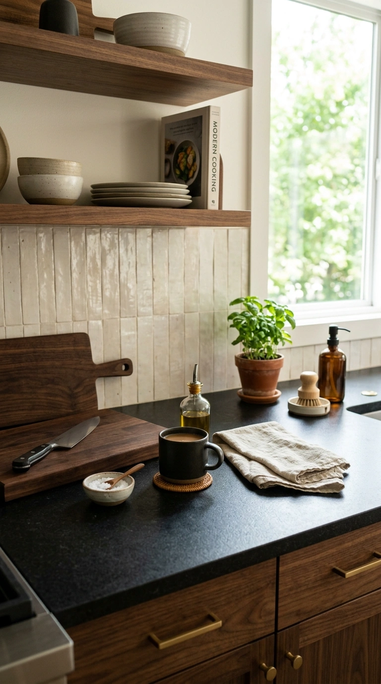
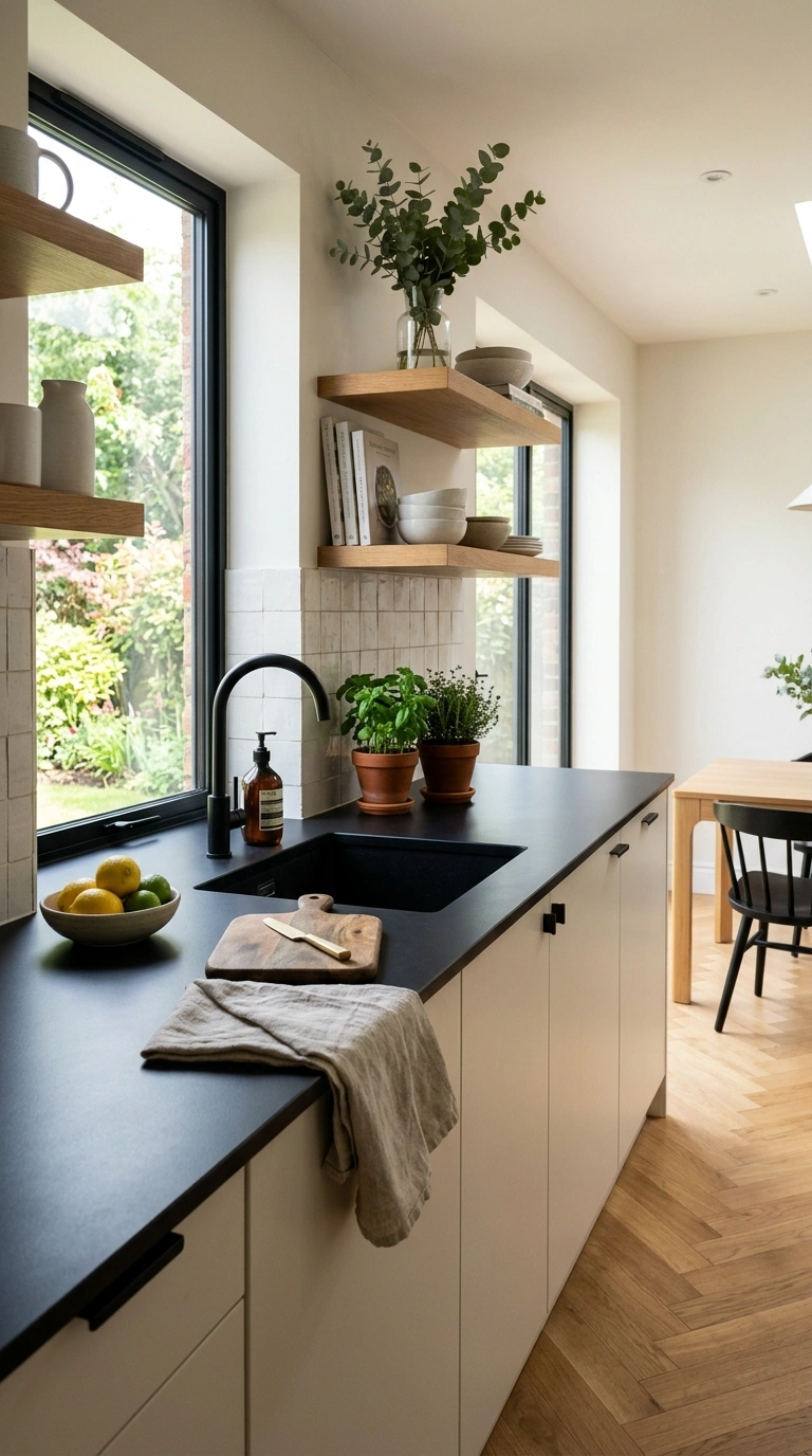
6. Light Backsplash Necessary
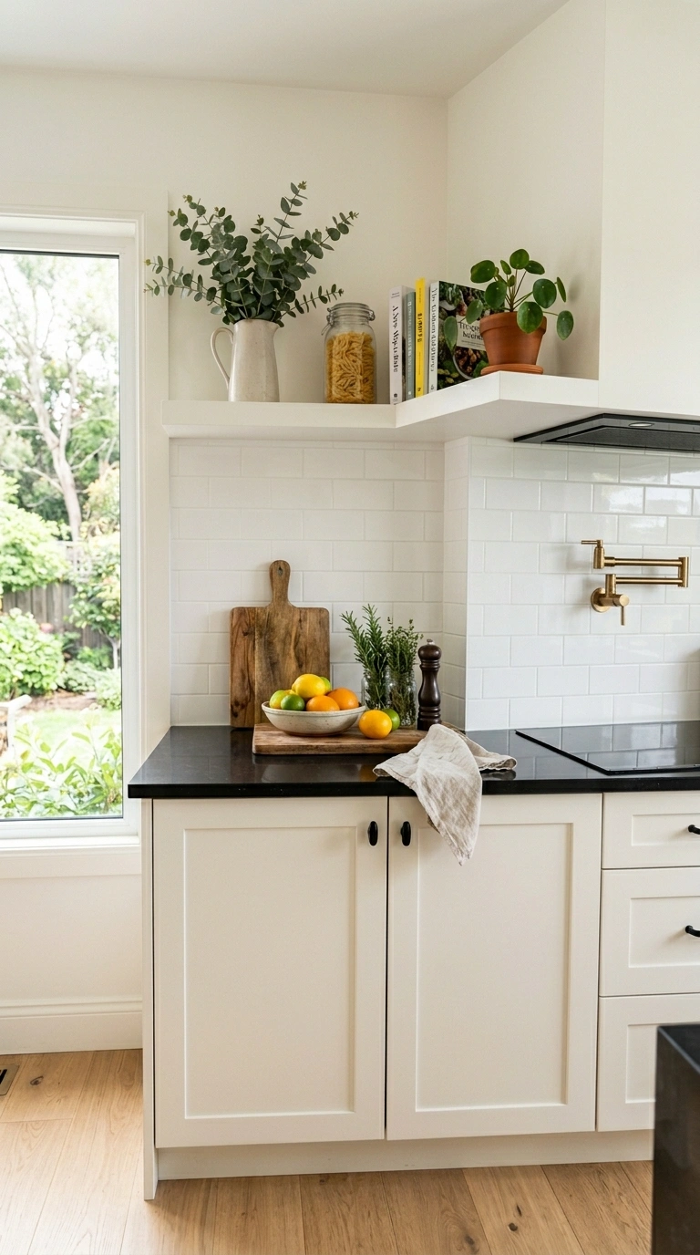
A bright backsplash behind the black worktop is essential for preventing the dark counter from visually dragging down the area between the counter and the upper cabinets. A white tile backsplash, a light marble slab backsplash, or a warm cream painted wall between the counter and the uppers provides the vertical brightness that separates the dark counter from the space above. Without a light backsplash, the black counter can read as part of a dark band that extends from the counter surface up the wall, which makes the kitchen feel heavy in the middle of the visual field.
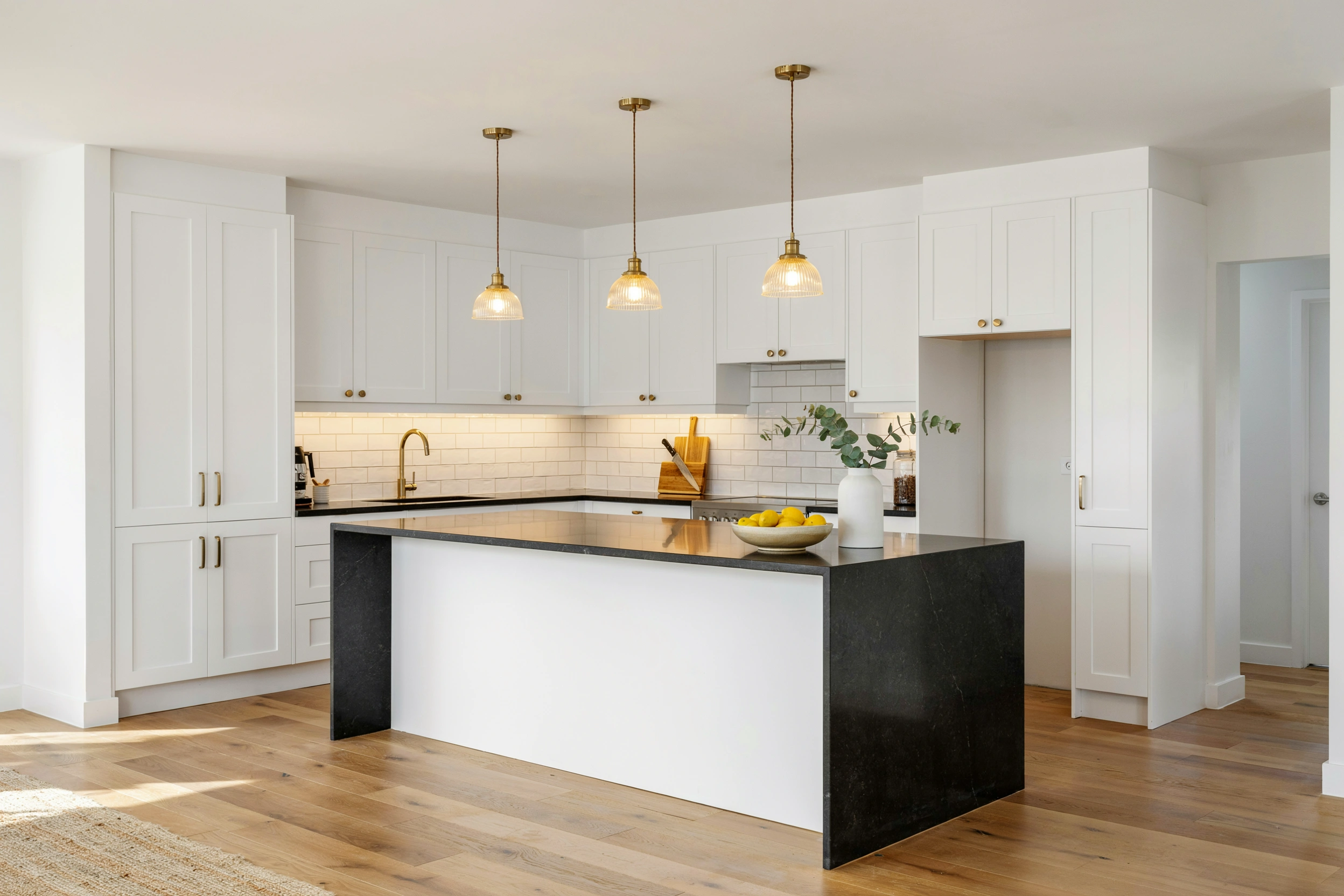
7. Black Worktop White Island
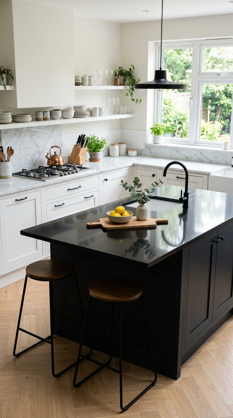
In a kitchen with both perimeter counters and an island, using a black worktop on the island and a white or marble counter on the perimeter cabinets, or vice versa, creates visual variety and prevents the all-dark counter feeling that a single material across every surface can produce. The contrasting counter colors also distinguish the island as a different functional zone from the perimeter, which gives the kitchen a more designed and more considered quality. The black island counter against white perimeter counters makes the island the visual anchor of the room.
8. Integrated Black Sink
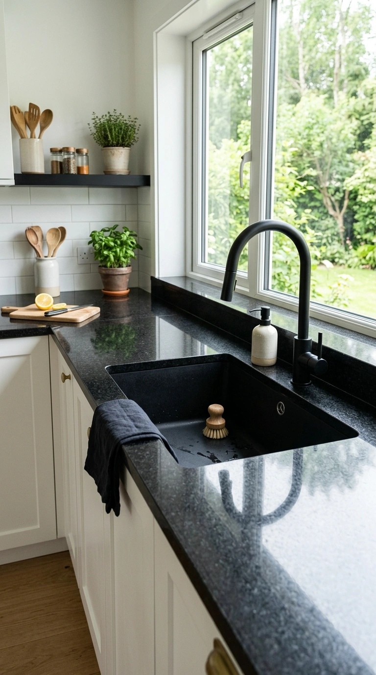
A black composite or granite sink integrated into a black worktop creates a seamless dark surface that flows continuously from the counter into the sink basin without a visible edge or a color break. The integrated sink makes the black counter look like a single continuous piece of material and simplifies cleaning since there is no gap between the counter edge and the sink rim where debris accumulates. Black composite sinks are available in undermount formats that achieve a similar continuous effect with most black counter materials.
9. Waterfall Edge Design
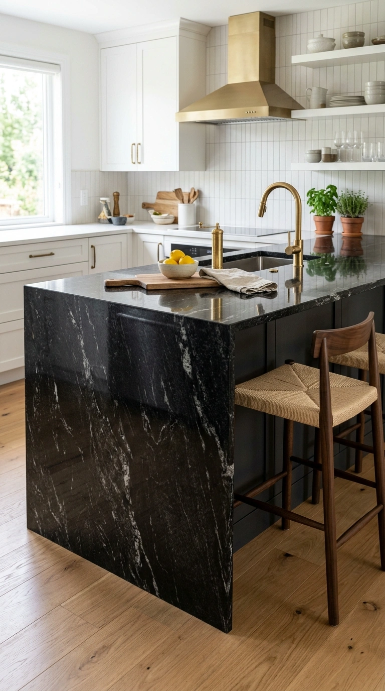
A waterfall edge, where the black worktop material continues down the side of the island or the cabinet end panel in a continuous vertical fall, creates the most dramatic and most modern black counter presentation. The waterfall edge turns the counter from a flat horizontal surface into a three-dimensional material feature that wraps around the furniture. The continuous material flow showcases the beauty of the black stone or quartz at its most impactful and creates the strongest possible visual anchor in the kitchen. The waterfall edge works best with materials that have natural variation, like granite or veined quartz, where the pattern flow from horizontal to vertical adds visual interest.
10. Black Counter on Color Cabinets
A black worktop paired with colored cabinets rather than white or wood creates a bold contemporary combination that uses the black as a neutral anchor for the color above. Deep sage, warm navy, dusty blush, warm terracotta, or forest green cabinets all pair well with black counters because the dark counter grounds the color without competing with it. The black reads as a neutral foundation that lets the cabinet color be the star. This approach produces some of the most distinctive and most memorable kitchen designs because the combination is less common than the standard black-and-white version.
11. Pendant Light Over Black Counter
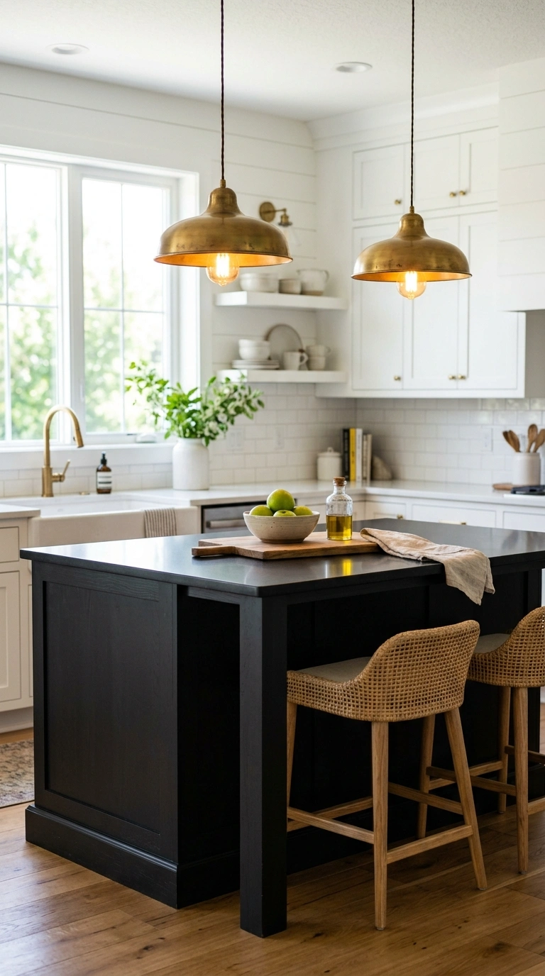
Pendant lights hung over a black island counter or a black peninsula serve the practical function of illuminating the dark surface and the design function of adding visual content and warm metallic accents above the dark horizontal plane. Brass pendants, warm gold pendants, or warm-toned glass pendants all catch light and create warm glowing points above the dark counter that prevent the surface from reading as heavy. Position the pendants at about thirty inches above the counter surface for the most balanced visual proportion and the best functional lighting of the work surface.
12. Black Marble Veining Drama
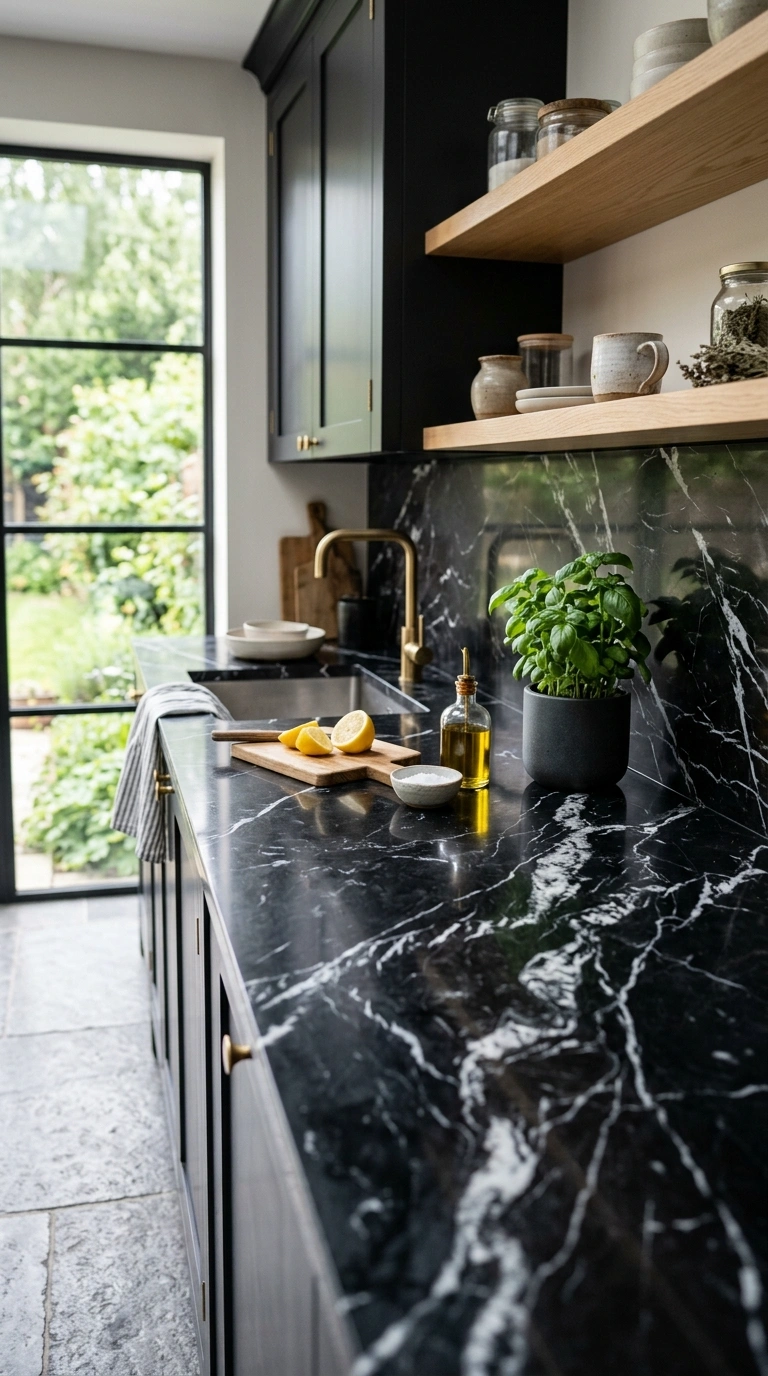
Black marble with white or gold veining, such as Nero Marquina or Port Laurent, provides the most dramatic and most luxurious black counter option. The veining creates natural patterns across the dark surface that add movement, visual interest, and genuine material beauty that solid-color counters cannot match. The white or gold veins also provide small bright accents within the dark surface that relieve the visual weight of the black. Black marble requires more maintenance than granite or quartz, including regular sealing and careful treatment of acidic spills, but the visual result is one of the most stunning counter surfaces available.
13. Matte Black Concrete Look
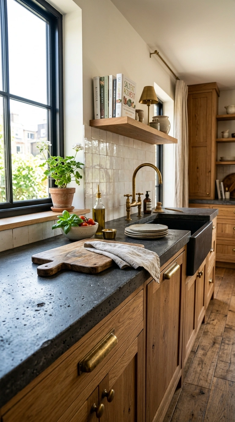
A concrete counter in a dark charcoal or black finish, whether real poured concrete or a concrete-look composite, provides a raw industrial quality that polished stone does not have. The matte surface, the slight textural variation, and the industrial character of concrete suit modern and industrial kitchen aesthetics particularly well. A black concrete counter paired with warm wood cabinets and brass hardware creates a kitchen that feels like a professional workshop rather than a domestic kitchen, which is a quality that many contemporary kitchen designs aim for.
14. Light Floor Balance Below
The floor in a kitchen with a black worktop should be light or medium-toned rather than dark to provide visual balance from below. A warm light wood floor, a light tile, or a warm medium-toned stone floor all prevent the dark counter from reading as part of an all-dark lower half of the kitchen. The light floor reflects ambient light upward and provides the visual counterweight that keeps the kitchen feeling balanced. Dark floors combined with dark counters create a heavy lower visual field that even bright upper cabinets cannot fully overcome.
15. Black Worktop Edge Profile
The edge profile of the black worktop affects how the counter reads visually. A simple eased edge with slightly rounded corners is the most modern and the most popular choice for black counters. A waterfall square edge is the most dramatic. A beveled or bullnose edge reads as more traditional. An ogee or other ornate edge profile adds formality that suits period kitchens. Choose the edge profile that matches the kitchen’s overall design style: simple edges for modern kitchens, slightly more detailed edges for transitional or traditional ones. The edge profile is a small detail that consistently affects how the counter reads at eye level.
16. Black Counters Small Kitchen
Black worktops in a small kitchen can work when balanced correctly, but they require more careful planning than in a large kitchen. Keep the cabinets and walls in a bright warm white to maximize the visual contrast with the dark counter. Use reflective materials where possible, a polished black counter reflects more light back into the room than a matte one. Install strong under-cabinet lighting to illuminate the dark surface adequately. Add a bright backsplash to prevent the dark counter from making the middle of the kitchen feel heavy. Black counters in a small kitchen create a bold design statement but the room needs every possible light source working to prevent the dark surface from shrinking the perceived space. For broader small kitchen strategies, the small kitchen ideas guide covers layout and color approaches that maximize the sense of space.
17. Accessories on Black Surface
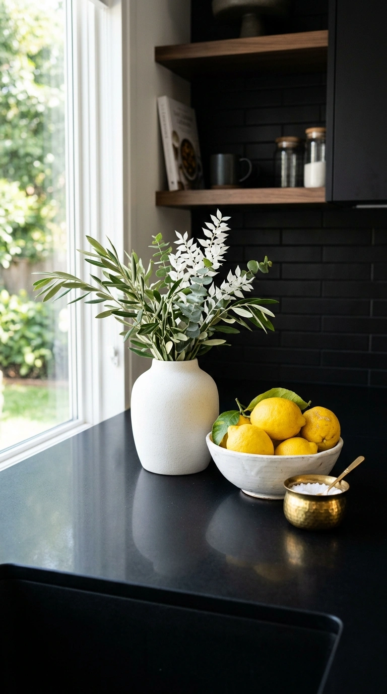
Objects displayed on a black counter surface read differently than objects on a white or neutral counter. Light-colored objects pop dramatically against the black background, which makes even simple items like a white ceramic vase, a light cutting board, or a brass bowl look more striking than they would on a lighter surface. Use this contrast deliberately: display light-toned accessories and kitchen tools on the black counter for maximum visual impact. A bowl of bright lemons, a white marble salt cellar, or a brass paper towel holder all become more visually compelling when set against the dark backdrop.
18. Black Counter Maintenance
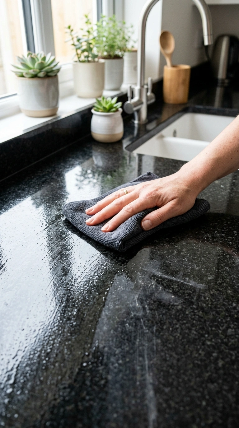
Black counters show dust, crumbs, water spots, and fingerprints more visibly than light counters, which means the daily wiping routine needs to be slightly more attentive than it would be with a lighter surface. A quick wipe with a damp cloth after each meal prep session keeps the black surface looking clean and dark. For granite, apply sealer annually to prevent staining. For quartz, wipe with a non-abrasive cleaner. For honed finishes, use a product specifically designed for matte stone surfaces. The maintenance is not difficult but it is more visible when skipped, which means black counters reward the daily habit of keeping them clean more than lighter surfaces do.
19. Black Counter With Open Shelving
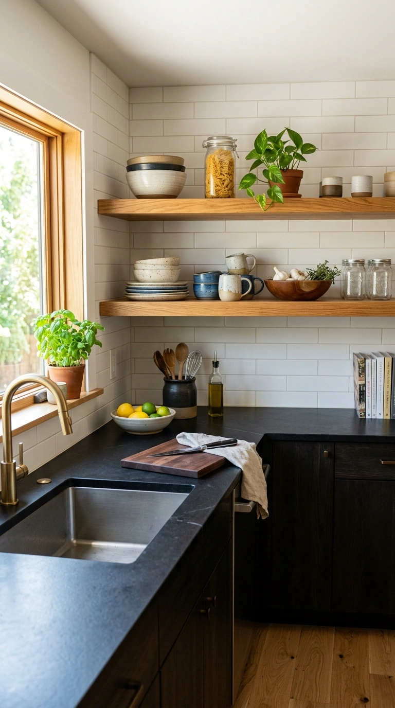
Black counters paired with open shelving above rather than upper cabinets create a lighter, more gallery-like quality in the upper portion of the kitchen that balances the dark horizontal surface below. The open shelves display light-colored dishes, glasses, and objects against the kitchen wall, which adds brightness and visual content above the dark counter without the enclosed feeling that dark or even white upper cabinets can create. The contrast between the heavy dark counter and the airy open shelving creates a balanced composition that feels both grounded and open.
20. Bold Choice Confidence
A black worktop is a bold design choice that requires confidence in the decision and commitment to the contrast with surrounding elements. The kitchens where black counters look their best are the ones where the homeowner deliberately chose black rather than settling on it as a compromise, and where every other element in the kitchen was selected to support and balance the dark surface rather than compete with it or apologize for it. The confidence shows in the result. A kitchen where the black counter is clearly the intentional anchor of the design reads as sophisticated and considered. A kitchen where the black counter feels accidental or uncertain reads as heavy and confused.
A kitchen with black worktops that looks striking without feeling heavy depends on genuine brightness from the cabinets, the backsplash, and the floor to balance the visual weight of the dark surface. The black counter grounds the kitchen with presence and drama that lighter surfaces cannot achieve. The surrounding brightness keeps the drama from becoming heaviness. Choose the right material finish for your maintenance tolerance, commit to the contrast with genuinely bright counterparts, and the black worktop becomes the strongest and most sophisticated element in the kitchen.