All photos courtesy of Décor Aid.
When it comes to buying a home in New York City, being overly picky is hardly ever a good idea. With real estate hard to come by and demand for housing always on the rise, prospective homeowners may find themselves sticking to a shortlist of must-have criteria–things like on-site laundry; a kitchen that doesn’t require a complete gutting; a view that isn’t your neighbor’s bathroom. For Lisa and Anthony, a mid-40s couple with one child, the shortlist included pre-war details, coziness, and the oh-so-elusive and highly coveted “character.” They found it in a charming building on Manhattan’s Upper East Side. At 2,800 square feet, this four bedroom had enough space for their family and beautiful details to boot–incredible moldings, hardwood floors, and a stunning fireplace. The downside? Limited storage, a dearth of natural light, and a desperate need for an update. With their shortlist criteria met, the couple turned to Décor Aid to figure out the rest.
“The goal was to transform this full-of-potential space into a fully-designed home; one with a cohesive look that was both classic and up-to-date” says co-founder Sean Juneja. Alex Caratachea, our lead designer on the project, certainly had his work cut out for him. “The apartment was a dark dry wall maze when we first walked in,” he says. “We knew that to get the home in tip-top shape, maximizing light and space would be essential.” The first step was to choose a color palette that would tie the space together and create a lucid transition between the rooms and hallways. Informed by the clients’ fashion aesthetic–an elegantly subdued combination of heathered grays, woolen knits, and classic forms– a scheme of subtle grays, metallics, and color-blocked details was carried out throughout the home. Translucent and iridescent materials like lucite and gold leaf were employed to add richness and light to each room. The clients’ existing furniture looked au courant mixed in with new rugs, lighting, and artwork, additional pieces that brought the entire space to a whole new level. The real game-changer? A series of built-ins that drastically increased storage while adding to the home’s sophisticated charm. The end result is a home that is both contemporary and utterly timeless, one that’s perfectly suited to the needs of modern city living while paying beautiful homage to the home’s fabulous original details.
BEFORE
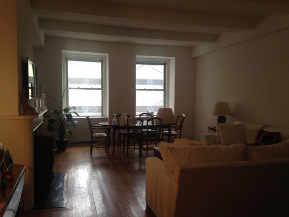
Like the rest of the apartment, the living room needed some major restructuring. As it originally stood, the room was dark, poorly laid-out, and lacking in storage.
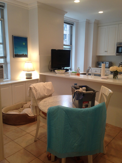
A run-of-the-mill breakfast nook, this area of the kitchen made a poor use of its space.
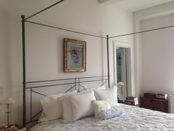
The master bedroom was small and cramped–it needed to be opened up, lightened, and made to be the serene escape that the clients wanted.
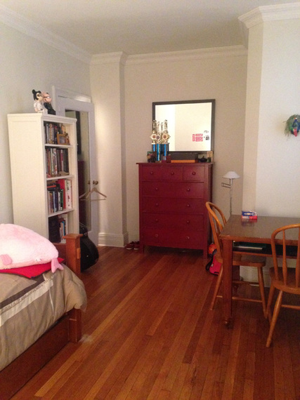
The kids room was drab and awkwardly arranged. Furniture was arbitrarily placed and there was no real flow.
AFTER
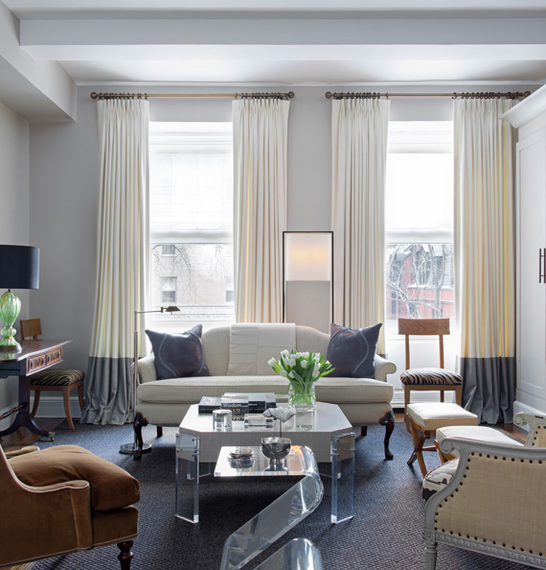
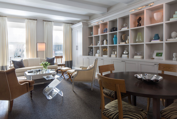
What was once a dark, confined space was given a sophisticated, open look through a soothing palette of cool grays. The homeowner’s pre-owned pieces (the sofa, side chairs, dining set) were offset with modern touches that gave the entire space an effortlessly timeless quality. Metallic accessories and lucite side tables act as light-catchers, imparting some much-needed shimmer into the under-lit space. Built-ins were incorporated along the right wall to maximize storage capacity and to showcase a number of art objects, items that help to lift the space and draw the eye around the room. (Paint color: Elephant’s Breath by Farrow & Ball.)
Color-blocked curtains in gray and ivory combine classic sensibilities with modern aesthetics. The traditionally-styled sofa was upgraded using crocodile-embossed pillows from Ankasa.
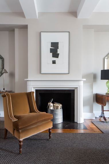
The focal point of the living room, a stunning fireplace with classical fluting and a black marble hearth, was complemented alongside a piece of abstract art from Ethan Allen.
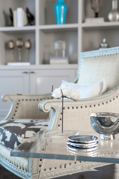
Geologic materials like metal and stone were incorporated into the living room’s decorating scheme, adding visual interest while maintaining a clean, sophisticated look. Here, a silver bowl mingles alongside silvered agate coasters.
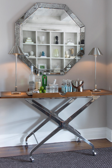
“It was important to us to strike a balance between masculine and feminine elements,” lead designer Alex Caratachea says, citing the clients’ classical, gender-neutral aesthetic. “We did this by pairing warm materials like wood alongside industrial elements and strict geometry.” Here, nickel lamps create a romantic moment atop a bar cart from ABC Carpet & Home. An octagonal mirror from Restoration Hardware adds a touch of charm while bouncing light throughout the room.
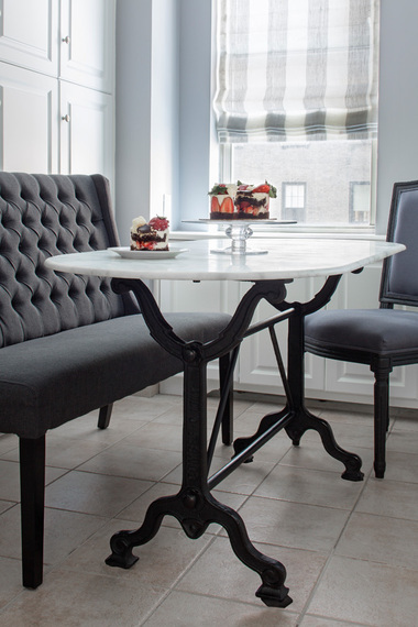
“We wanted the breakfast nook to look upscale, but not too serious,” Caratachea notes. Here, traditional upholstered seating is paired alongside an industrial marble table with a cast-iron base. A striped linen Roman shade from The Shade Store diffuses light and imparts a relaxed tone. By employing a slender table and an upholstered banquette, the designers were able to create a fully-featured seating area within the tight space.
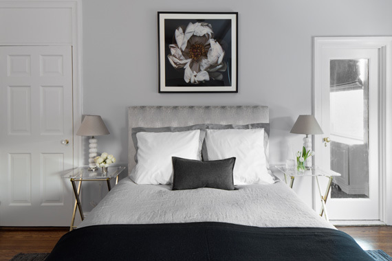
“The master bedroom needed to be relaxing, open, and serene,” Caratachea notes. The gray-toned palette from the rest of the home was brought in with textured bed linens, lampshades, and a headboard upholstered in Robert Allen fabric. Lucite-topped bedside tables allow for bedside storage without weighing down the space.
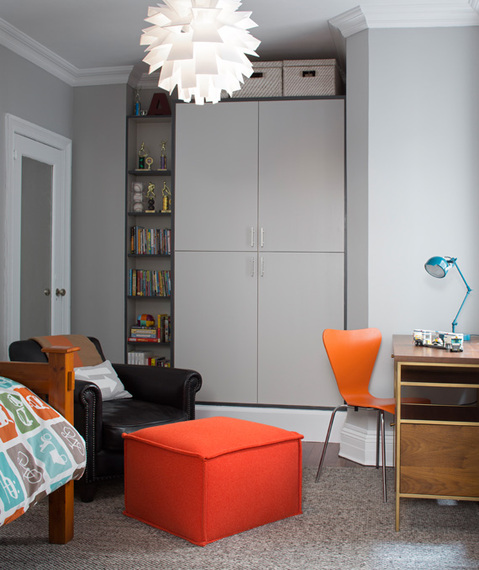
It was important for the clients that the kids’ room be able to “grow” alongside their children, so an emphasis was put on storage and versatility. A heather gray carpet and gray paint color references the rest of the home’s decor, while pops of orange and atomic midcentury styles give the space a fun, yet sophisticated sense of play.
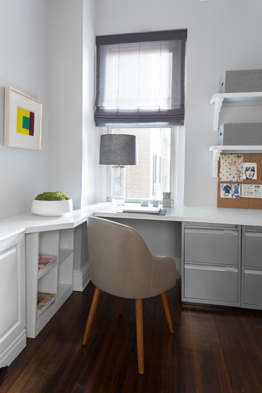
A “his and her” workspace, the designers wanted to make sure that the home office was as versatile and functional as possible. A custom countertop desk was built to maximize usable work surface, while built-in shelving and filing cabinets keep everything tucked away when not in use. The central part of the desk faces a window, allowing whoever is working to benefit from the energizing qualities of natural light.
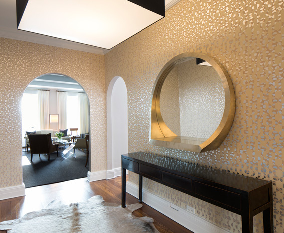
“The main entrance to the apartment was dead and dark,” Caratachea says. “It was just a boring box.” To make the space come alive without overwhelming the space, a minimal scheme of metallics and unusual geometry was chosen. The wallpaper–actually produced by Walt Disney–combines the tonal and chromatic properties of the entire home while imparting just a touch of Pop-Art intrigue. A pendant by Moooi upgraded the overall look of the space, adding an extra focal point alongside a gold-leafed mirror.
Article source: https://www.huffingtonpost.com/entry/this-apartment-overhaul-w_b_7225966.html?utm_hp_ref=bedroom-ideas
