When newlyweds Neal and Stephanie Sterjovski moved into an 800-square-foot condo, the avid travelers were looking to create a space that would make the most sense for their busy lifestyles. Situated in the greater Toronto area, the couple opted for a small space filled with natural light, lots of windows, and tall ceilings. With minimalism in mind, the two set out for a redesign (with the help of designer Jacquelyn Clark of, Lark & Linen) that would best complement their work-at-home lifestyle and laid-back aesthetic. Take a look!
Design Consulting by Jacquelyn Clark, Lark & Linen, Photography by: annawithlove
What was the first step towards the redesign of your home?
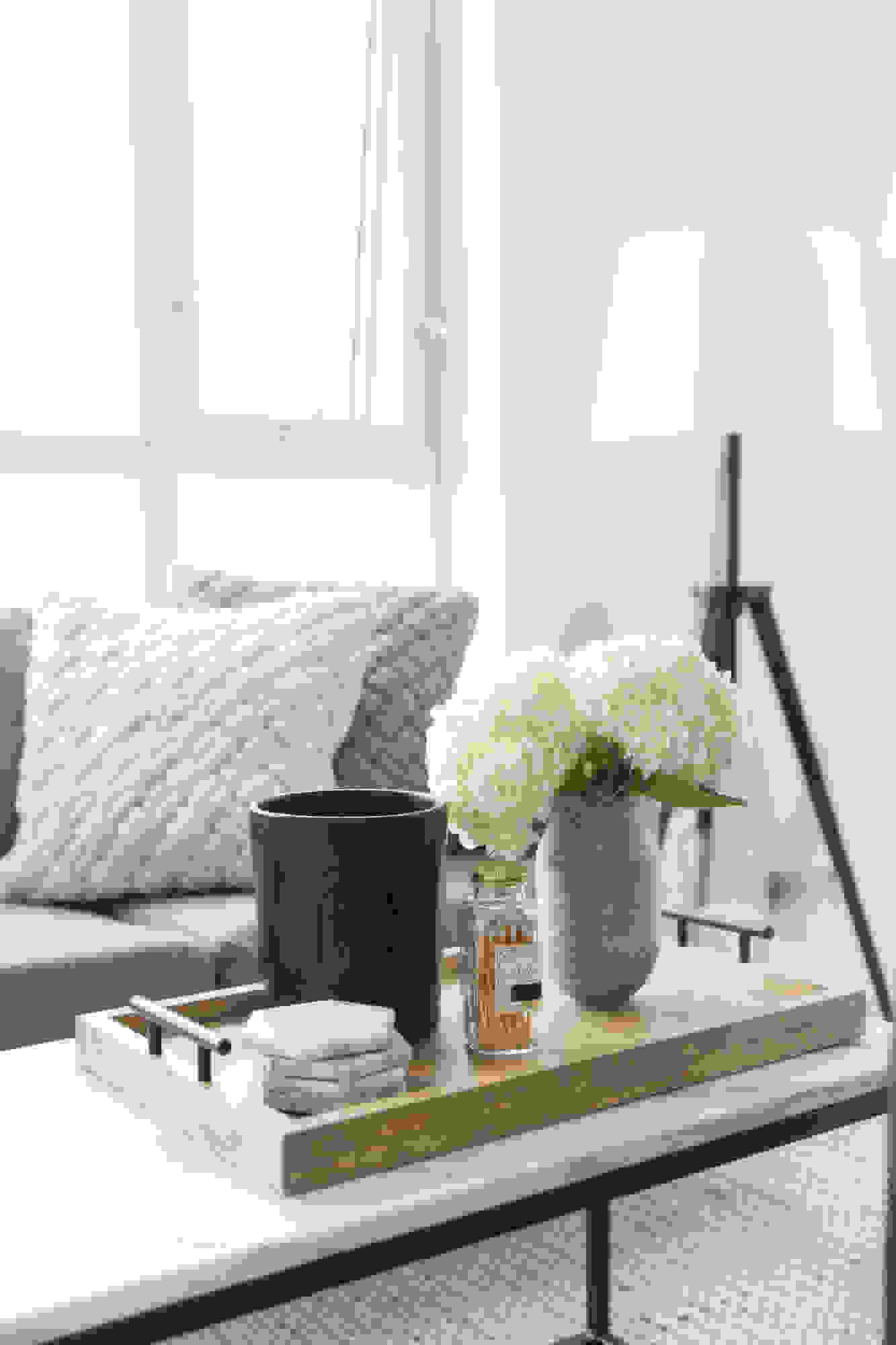
The first thing we did when we moved in was to replace the existing maple wood floors with a light grey laminate, to illuminate the home. Our goal was to create a space that relied heavily on a neutral palette with minimalism in mind. Our designer Jacquelyn suggested we bring in texture to offset the neutrality of the decor. We incorporated a braided rug, pouf, pillows, and throws for added comfort and warmth. We centered the pieces with a marble coffee table that brought in a cool balance.
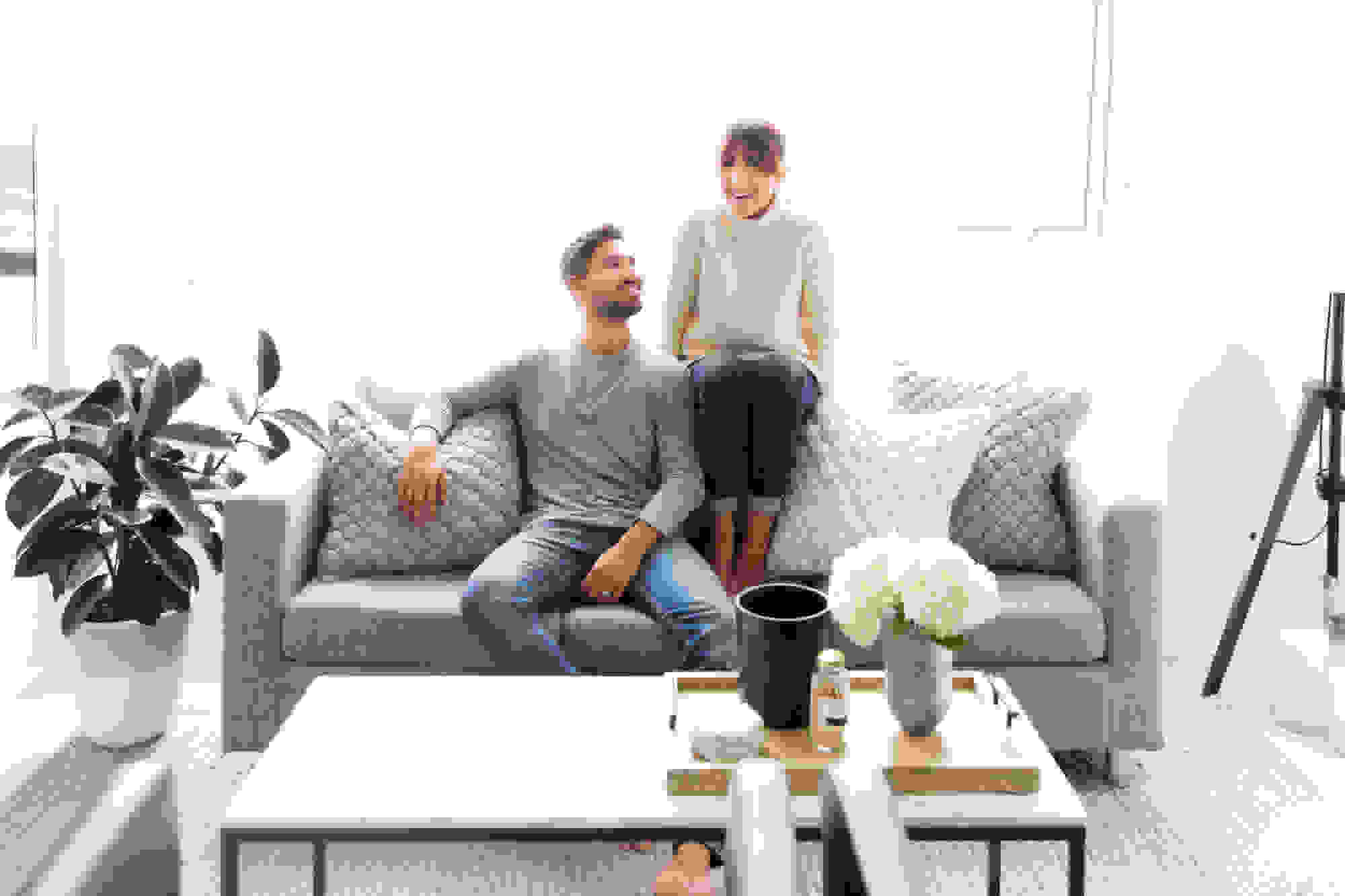

Bookshelf: CB2 | Natural Woven Basket: Etsy | Braided Pouf: Homesense | Floor Lamp: IKEA | Sofa: Wayfair | Pillows: CB2 | Black Chairs: IKEA | Marble Coffee Table: West Elm | Tray: Etsy

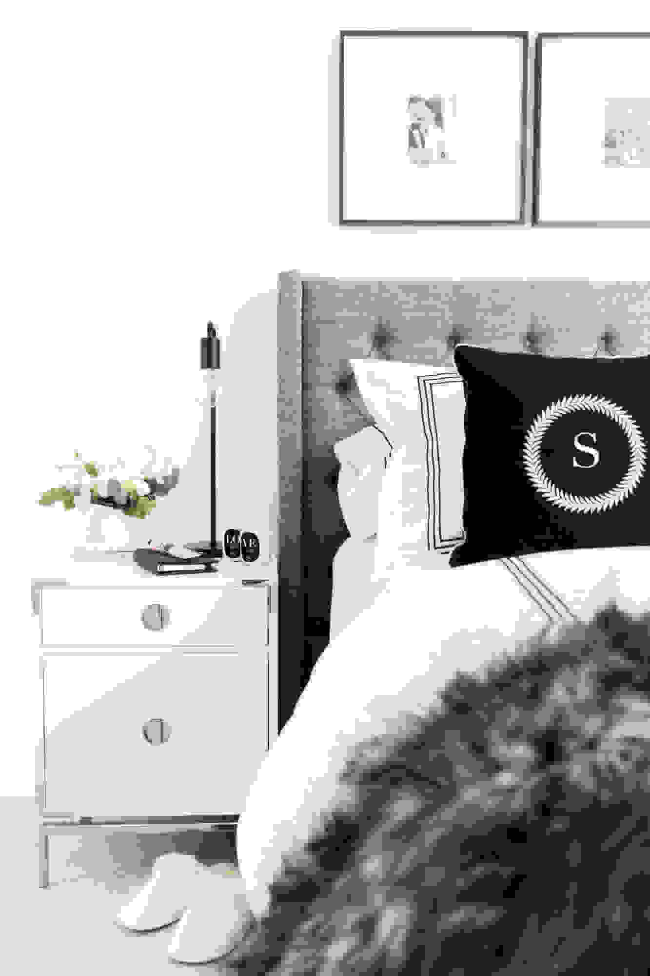
The bedroom looks chic yet serene, what was the driving force behind that?
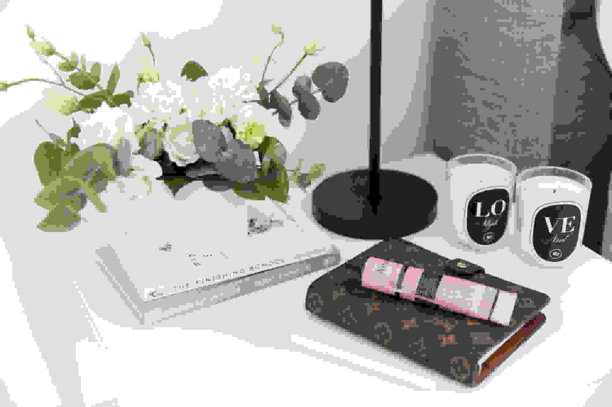
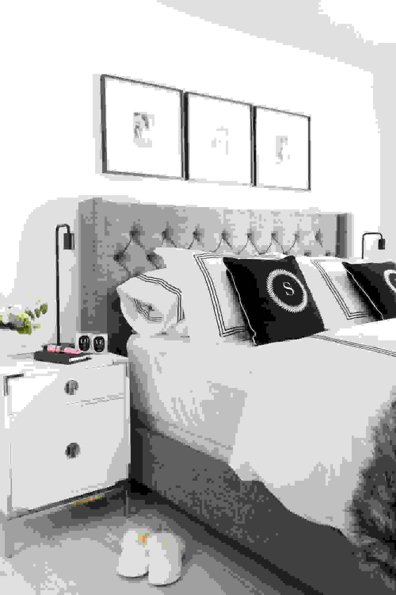
Since my husband and I both work from home, it was important that our bedroom remained clear of any sort of technology, and instead acted as a space for us to relax. Keeping the limited square footage in mind, we opted for nightstands that would offer more storage. A tufted headboard and an exotic, oversized faux fur throw gave the room a little hint of luxury, while the monochromatic color palette extended a more refined feel to the space.


Above our bed, are three intimate photos from our wedding day, which added a nice personal touch to the decor.
Headboard: Wayfair Canada | Nightstands: West Elm | Table Lamps: West Elm | Picture Frames: CB2 | Bedding: Au Lit Fine Linens Toronto | Initial Cushions: Bombardier Designs | Faux Fur Oversized Bed Throw: Restoration Hardware | Acrylic Chandelier: West Elm

How did your job influence the design of your space?
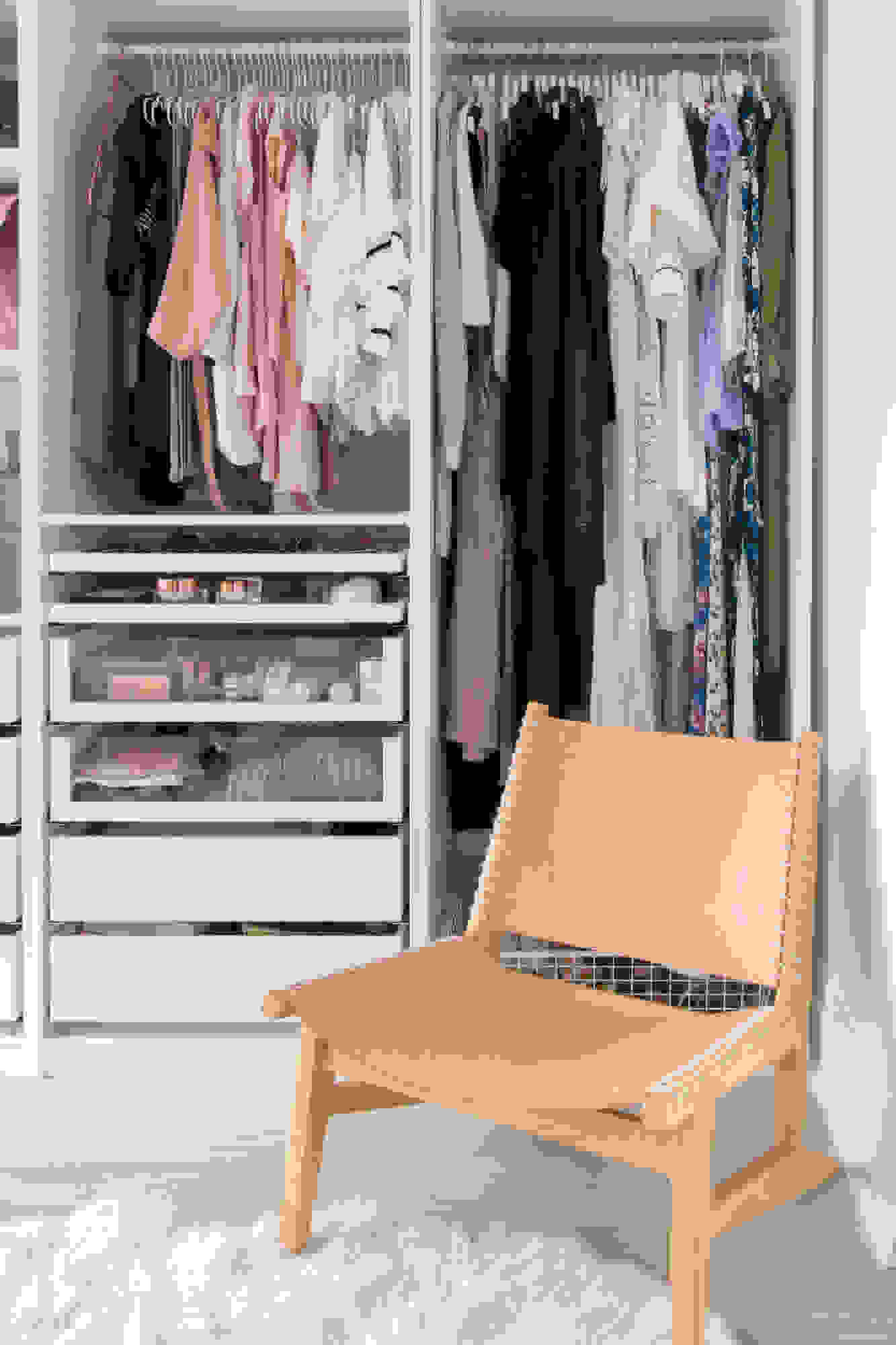
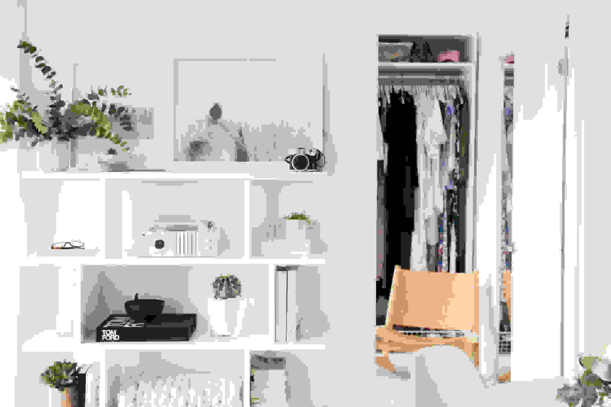
As a fashion blogger, a spacious closet goes without saying. Since I work from home, designing a space that would fuse my office with a walk-in closet was a major goal. We went with a PAX wardrobe, as it would maximize our space in terms of storage, and opted out of adding in the doors – it encourages me to be more tidy and inspires me when I’m looking to create looks for posts. While our main palette was neutral, I wanted to add a hint of blush to the decor, for a subtle pop of contrast. We brought in this great nude chair from West Elm and filtered in florals and delicate planters.
Commune Leather Sling Chair: West Elm



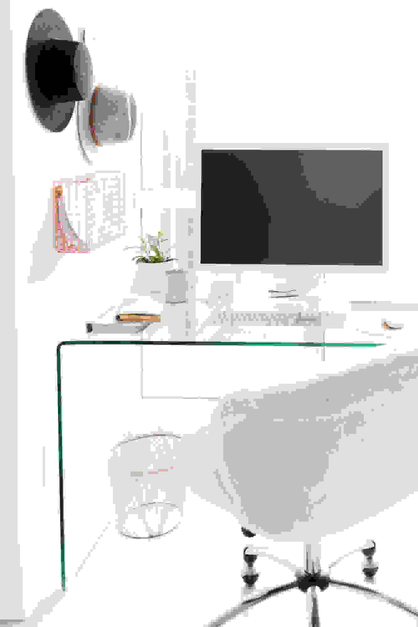
For the office area of the closet, we opted for a clear desk and plenty of mirrors, to create the illusion of a more spacious feel.
Pendant Light: Structube | Office Chair: PB Teen | Glass Desk: Structube | Marble Base Floor Lamp: CB2

How would you describe the overall aesthetic of the home?
It’s definitely a take on the minimalist Scandinavian style, which we love. However, we did want to put our heart into it with certain art work, cozy elements, and personal touches. We want everyone to feel welcome and loved when they enter our condo, and we hope the aesthetic promotes that as well.
What is your favorite part of the redesign?
My favorite part of the redesign was definitely the floors! I feel like once we changed them, it created the foundation for the rest of the design that followed and really opened up our entire condo. I love how different they made the space feel from where we started!
Were there any challenges throughout the remodel?
Being a corner unit in a condo, it was difficult at times to hang certain things in areas because of the concrete walls and so we had to get creative. The kitchen lighting was also something we had to compromise on as we wanted two pendant lights over the bar tools. Unfortunately, we couldn’t make that work because of electrical issues. Sometimes you have to re-jig the plan, but it almost always ends up working out in the end.

How did you tackle the outdated kitchen area?
The kitchen was an area that definitely needed a little sprucing up. When we first moved in, there was a mirror backsplash which seemed to amplify the mess that resulted from cooking. The original dark brown cabinets and beige floor tiles weren’t exactly idyllic either.
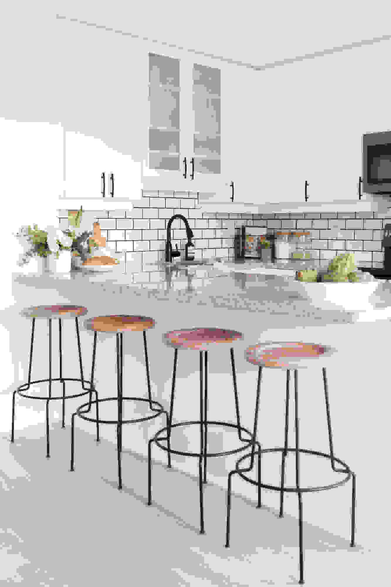
Appliances: GE | Bar Stools: Structube | Round Table: IKEA | Eames Style Chairs: Wayfair
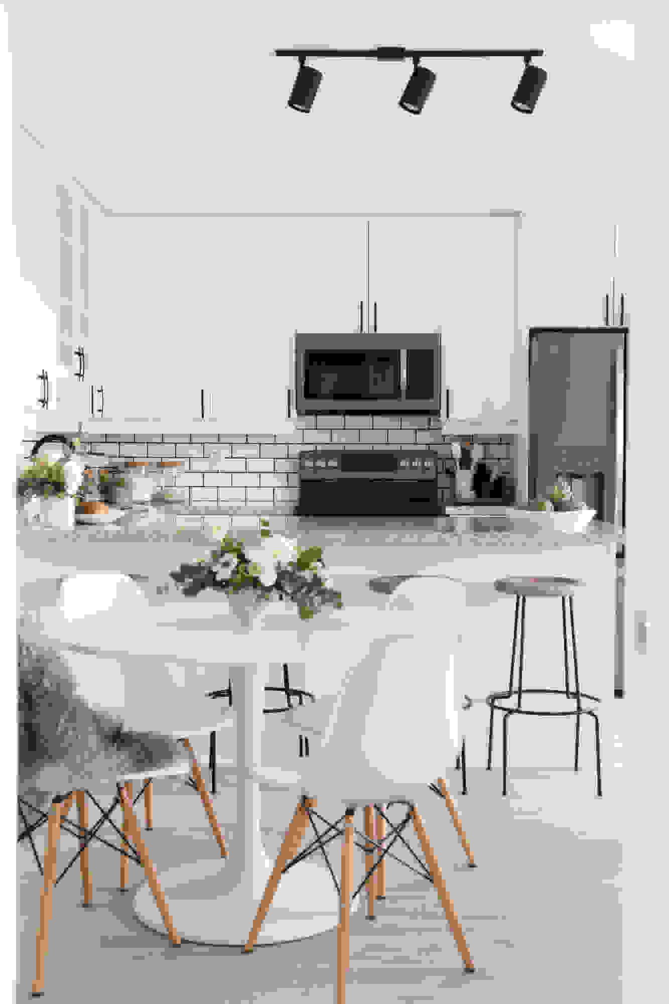

While we didn’t want to commit to a complete overhaul that would require gutting the place, we opted for quick fixes such as whitewashing the cabinets and swapping out the appliances. Bringing in a subway tile backsplash did wonders for the space, giving it a chic, cafe-like feel. For the flooring, we found a peel-and-stick vinyl tile from Home Depot, which came in a light grey color tone, to cover up the existing beige floors.

What is one thing you scrimped and splurged on when it came to the redesign?
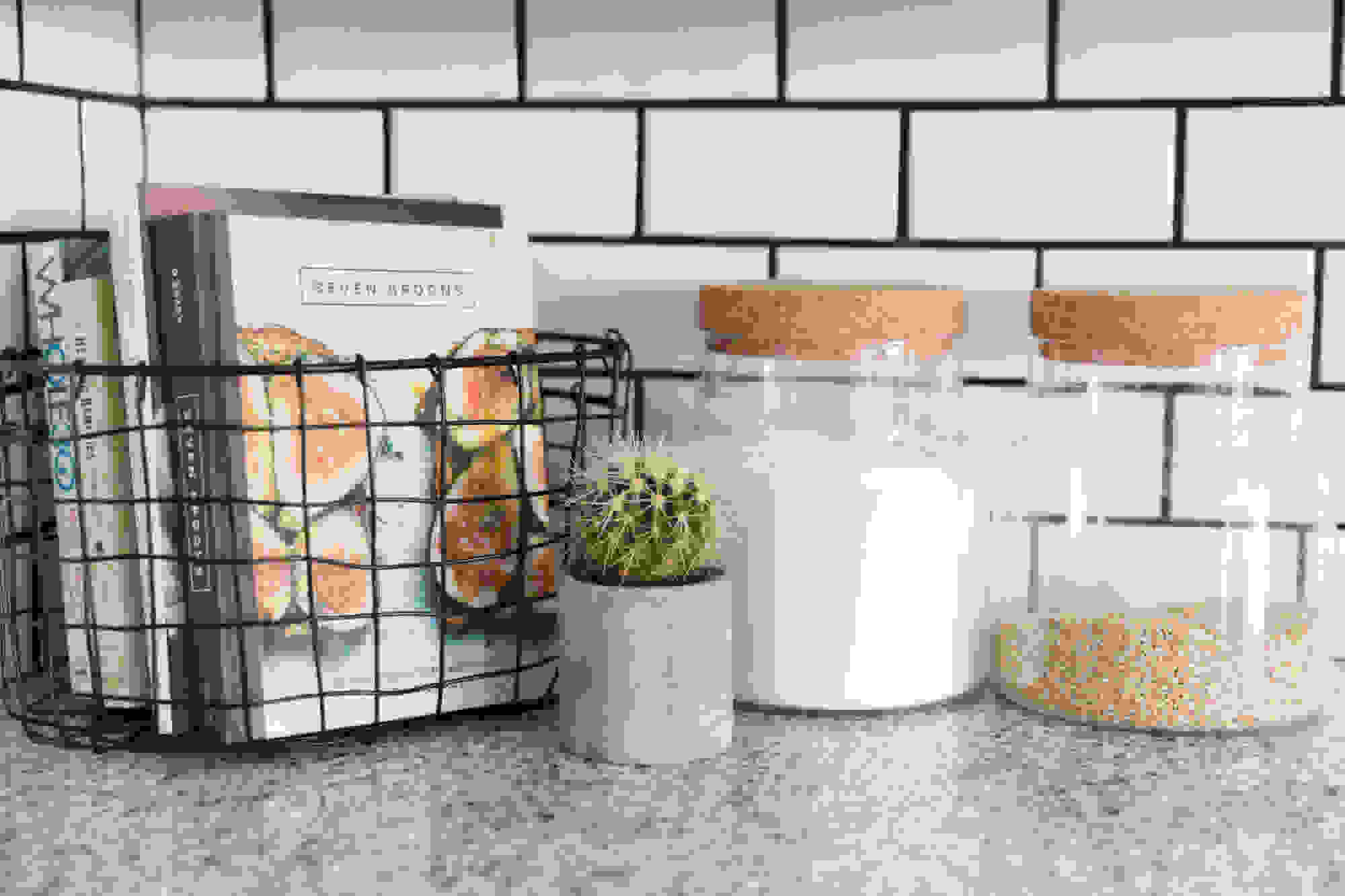
We skipped out on doing a complete kitchen redesign. We definitely had other hopes for it, but painting the cabinets and keeping the granite worked out and saved us the pain of going through a lengthy reno process during a really busy period in our lives. We splurged on accents we could take with us to our next home, and on our bathroom to give it a lift.

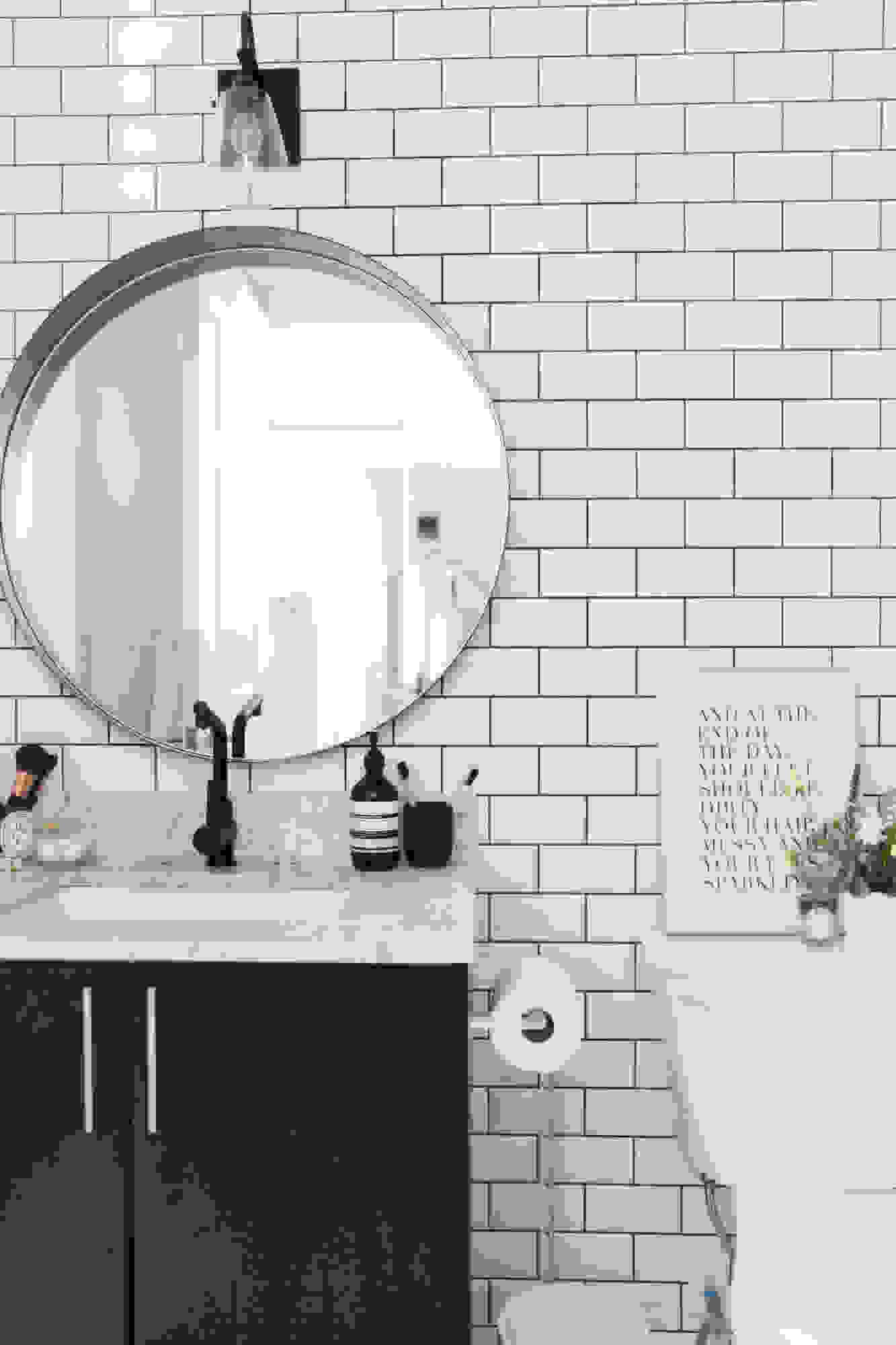
The bathroom definitely needed the most love! As we only have one in the home, we wanted to make the space a little extra special – especially since it lacked natural light or windows. We replicated the white subway tile and black grout combo from the kitchen, to really open the space up. Our designer Jacquelyn had the genius idea of extending our subway tile out of our shower and onto the statement wall. We then layered the lighting and a round mirror on top and it came out so beautifully!
Vanity Light: Sonneman | Mirror: CB2

What is one thing you learned from this project?
We learned so many things over the course of our home project, but I think my favorite takeaway was how well Neal and I work together on a team. We really fused our personalities and tastes to create our first little dream abode where we are starting out our life, and if you can handle renos during wedding planning, I think that’s a great beginning!
We are so happy with how everything turned out and grateful for all of the help and people involved along the way that brought it all to life!

Article source: http://m.domino.com/stephanie-sterjovski-home-tour/image/582b26982df7fb5e658b4d4f
