Designer Ken Fulk isn’t typically one to break with tradition. Especially when it comes to kitchens.
“I try to avoid trends. You want to build something that’s going to last for a while and not something that you are going to grow tired of,” he says. But his latest project isn’t just any kitchen. It’s the House Beautiful Kitchen Of The Year.
For a makeover of this scale (and in a city like New Orleans, where the overhaul is taking place), it’s only right to take a more forward-thinking approach. In fact, Fulk says we can all stand to rethink our approach to kitchen design. “We’ve lived in a trend for nearly a decade of these big beautiful white kitchens that begin to me to feel more and more like one another,” he says. “We use color and fabrics and wallpaper in other rooms of the house, but the kitchen becomes overly sanitized. Adding a living room appeal is really important, giving it a vibe that doesn’t feel like it’s ready to be hosed down.”
In New Orleans, Fulk starts with color. “A wonderful deep coral color that reminded me of boiled shrimp,” he says of the pink kitchen island that has acted as the jumping off point for the rest of the room.
From there, Fulk brings an otherwise mundane space to life with these five fixtures and flourishes:
COLOR
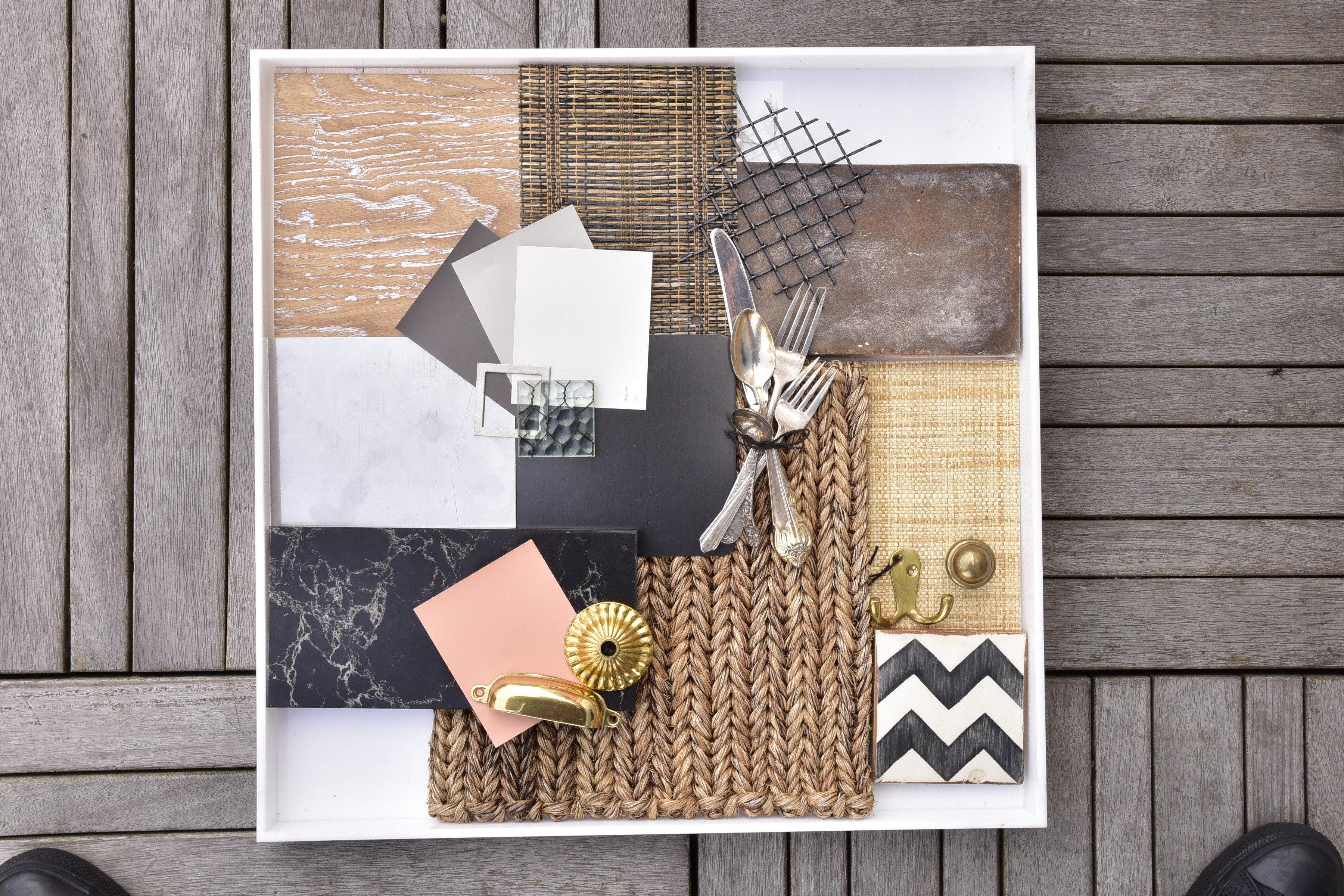
According to a 2014 kitchen trend report from Houzz, white kitchen counters and backsplashes rule. But Fulk makes a pretty convincing case for breaking the mold. “The kitchen island (like a boat floating in this large kitchen) is the color of boiled shrimp; the parameter cabinets are a beautiful oyster gray; counters are crab bisque,” he says. “In the adjacent library, a hand-painted mural of the historical New Orleans riverfront brings the complete tale to life.”
A SEE-THROUGH DISHWASHER
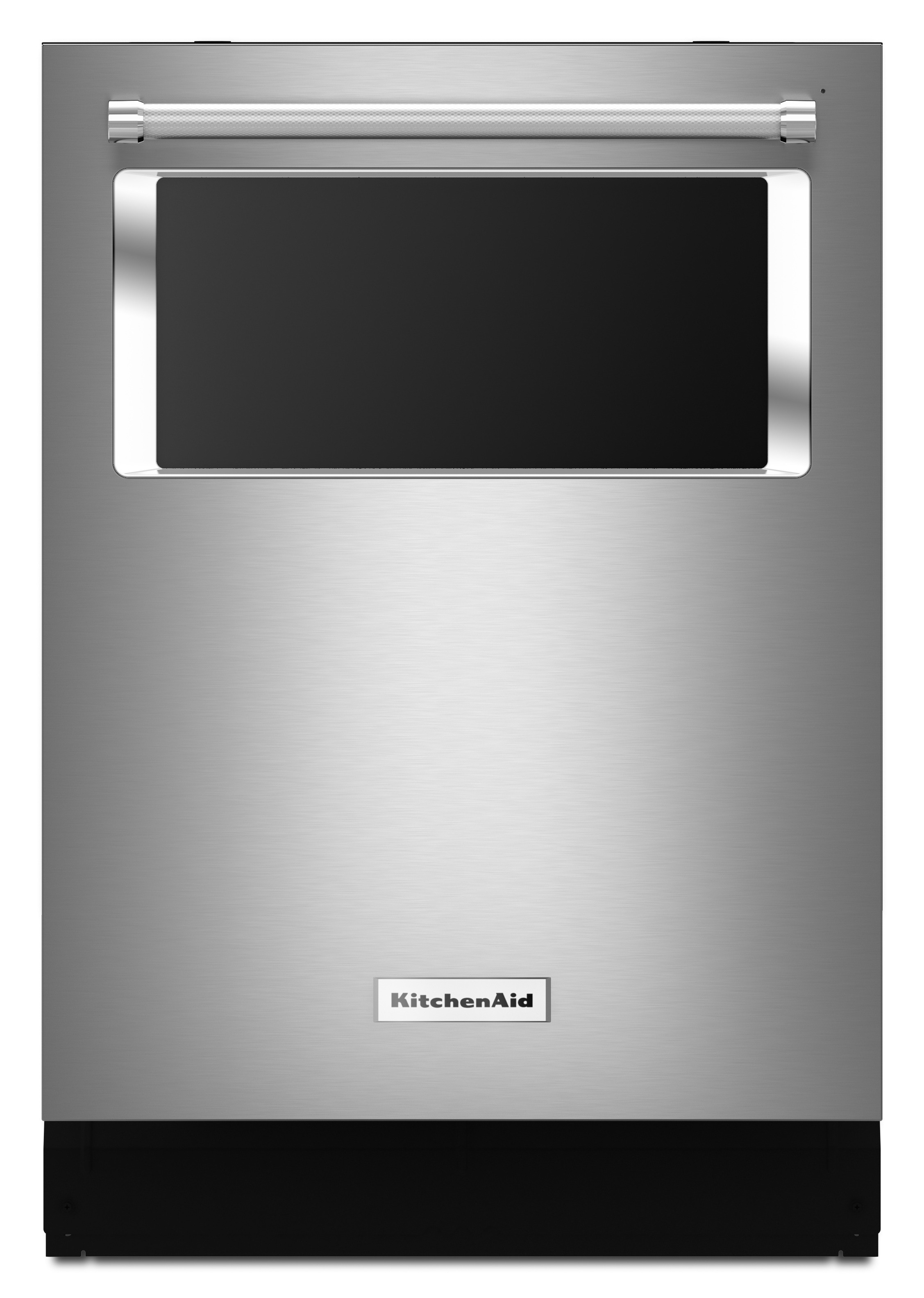
No one wants to intentionally put their dirty dishes on display and luckily, the glass-front dishwasher Fulk chooses for this space doesn’t do that. “It doesn’t light up your dirty dishes, but it does light up when they’re clean,” he says. It’s no GoPro in the dishwasher moment, but a fun feature, nonetheless.
A FAUCET-CUM-SODA MACHINE
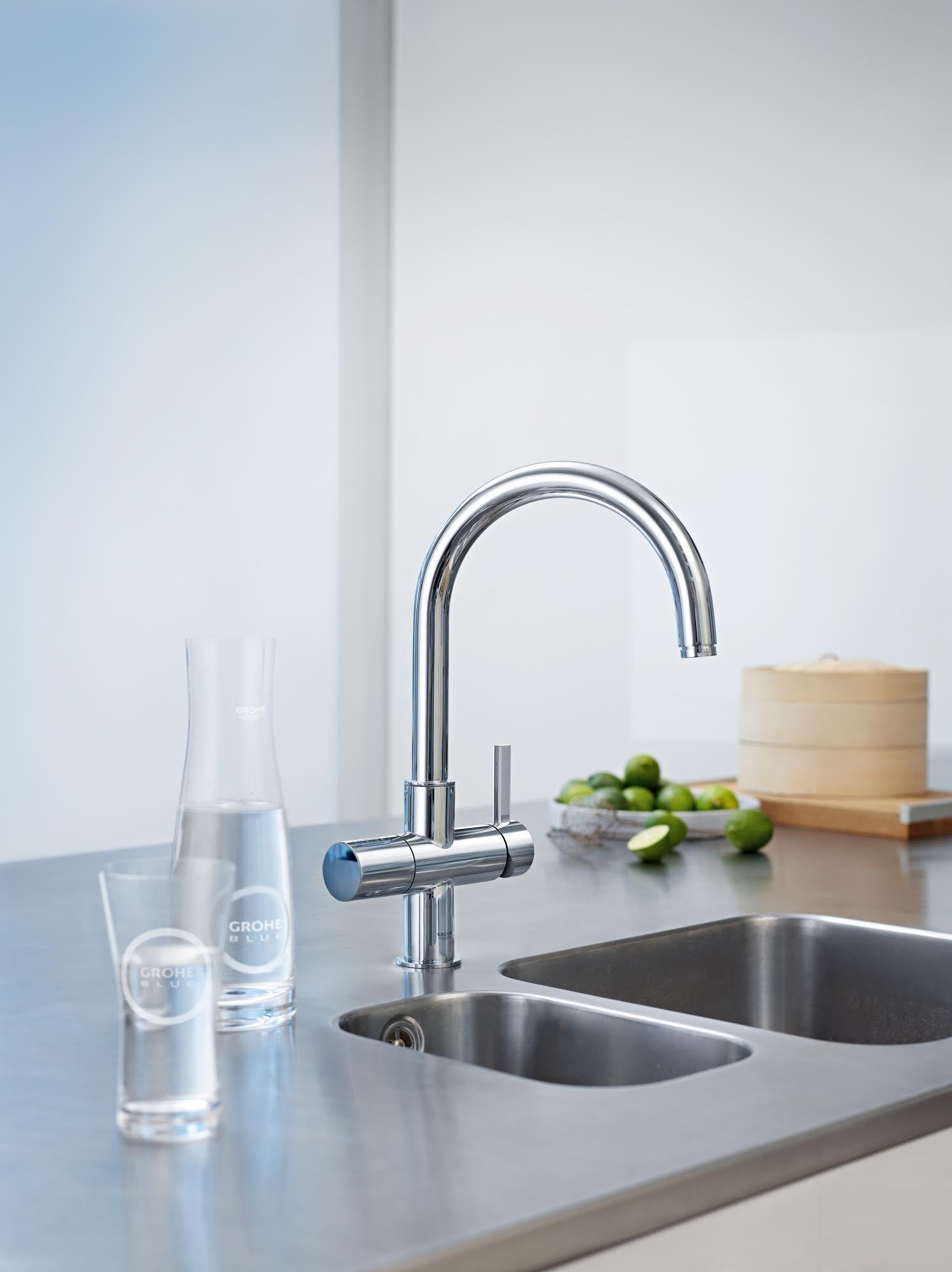
The appeal of this faucet from Grohe isn’t just that it dispenses varying degrees of sparkling water, it’s that it minimizes counter clutter by letting you get rid of that carbonation appliance.
NOT YOUR AVERAGE STAINLESS STEEL
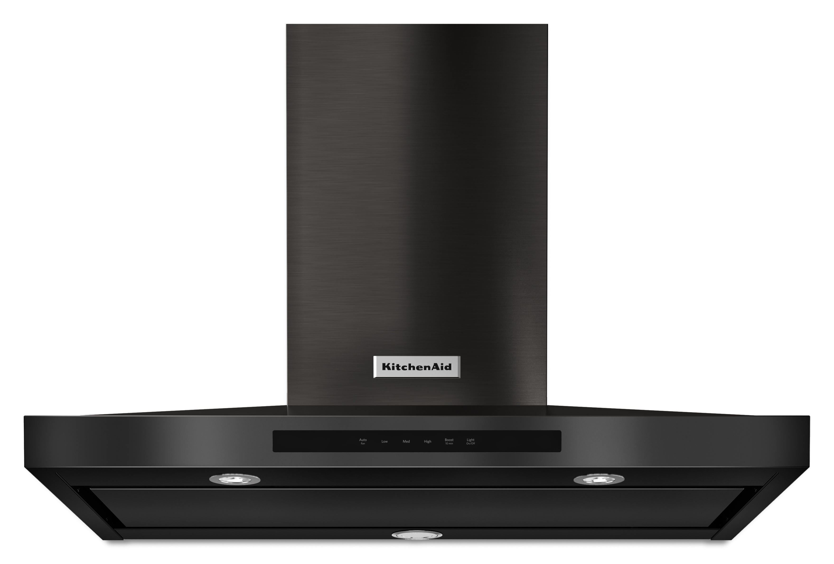
Despite rumors that stainless steel appliances may be on their way out (in favor of finishes like slate and “white ice”), the trend has not cooled just yet. But it is cropping up in new ways, like the blackened stainless steel Fulk is using in the Kitchen of the Year. “It almost has a bronze, dark color to it,” he explains.
MIXED METALS
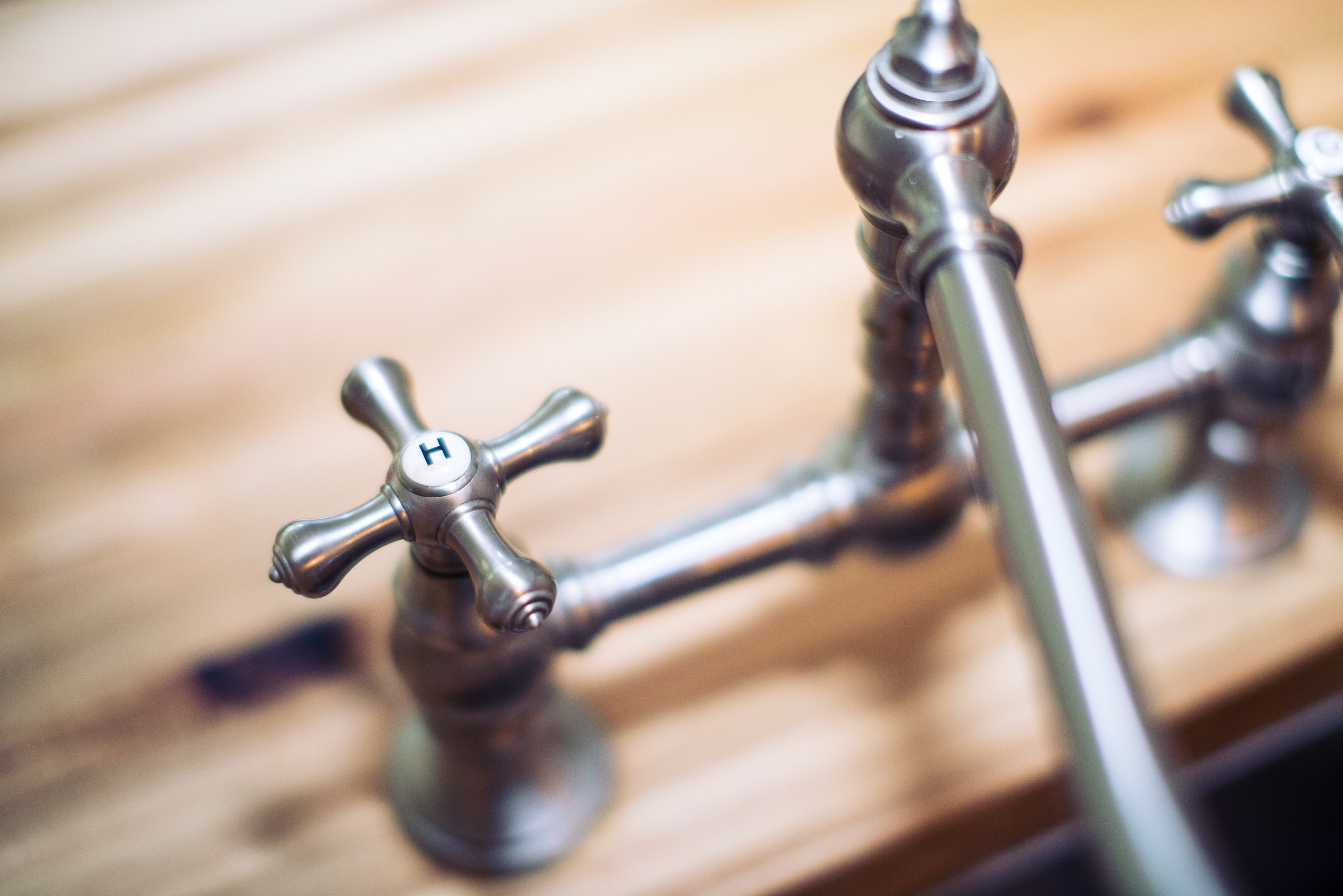
Stainless steel isn’t the only metal to leave its mark in Fulk’s kitchen design. You’ll also find unlacquered brass and chrome working quite well together in the space. “None of this, ‘everything has to match’ philosophy,” Fulk says. “We’re really embracing different metals to give the kitchen less of this perfectly homogenous look.
Article source: https://www.huffingtonpost.com/entry/5-kitchen-ideas-that-arent-boring_n_6987900.html?utm_hp_ref=kitchen-ideas
