Bryan Anthony, Houzz Editorial Staff
The Houzz Room of the Day series offers a wide range of advice and inspiration to help you update or transform rooms in your home. In reverse order, here’s a roundup of 5 of the most popular Rooms of the Days from 2016 as measured by the number of people who viewed the stories
5. Basement Bliss
Design takeaway: Create a playroom that can easily transition as kids grow up.
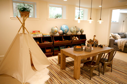
To look at this basement in Seattle’s Capitol Hill neighborhood, with its layered rugs, lived-in furniture and painted wood detailing, you’d never imagine that just two years ago a chimney and a water boiler were the only things down here. “Originally it was one room with a handful of random support beams,” designer Katie Hackworth of H2 Design + Build says.
The new playroom, the central room in the basement redesign, is where the family’s sons can play, work and explore. As the two boys grow, the room will evolve with them. “My clients are planning to replace the playroom’s worktable and toy bins with a pool table when the time is right,” Hackworth says.
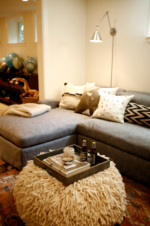
Next to the playroom, Hackworth created a second room for people to gather, relax and watch TV. The homeowners asked her to incorporate the sectional sofa, from Restoration Hardware, into the design. “I spruced it up a bit with a fun selection of pillows and the pouf of all poufs from Calypso Home,” she says.
4. Garden Delights
Design takeaway: Renovate a shed to enjoy outdoor activities all year long.
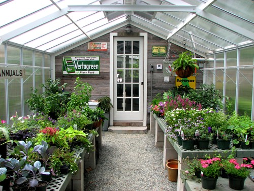
“This project was a real labor of love,” garden designer and landscaper Bob Trainor says. After he married and moved in with his wife, Lisa, the two poured passion into the garden. However, there was one bad apple in the mix: a dilapidated shed in the middle of everything that had become a magnet for junk. The couple saw the potential for a dreamy space. After an extensive renovation, it now serves as a cozy and light room where they soak in the hot tub and catch up on reading. As another part of the project, Bob fulfilled a dream of having a greenhouse, where the couple can enjoy plants all year long.
Weathered boards and vintage garden signs give the exterior and shed character. The couple got the signs, which came from a 100-year-old barn in Pennsylvania, from a local vendor.
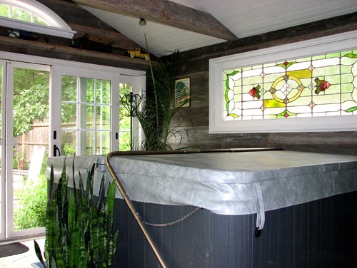
The spa space shares the light from the greenhouse and from two French doors leading to the garden. Two separate heating units allow the couple to keep the spaces at different temperatures.
The couple love to find salvaged architectural pieces. They backlit the stained-glass window so they could enjoy its cozy glow when they’re having a nighttime soak. They found the eyebrow window at an architectural salvage spot in New Hampshire.
3. Freshly Opened
Design takeaway: Consider removing a tub if you want a more open bathroom.
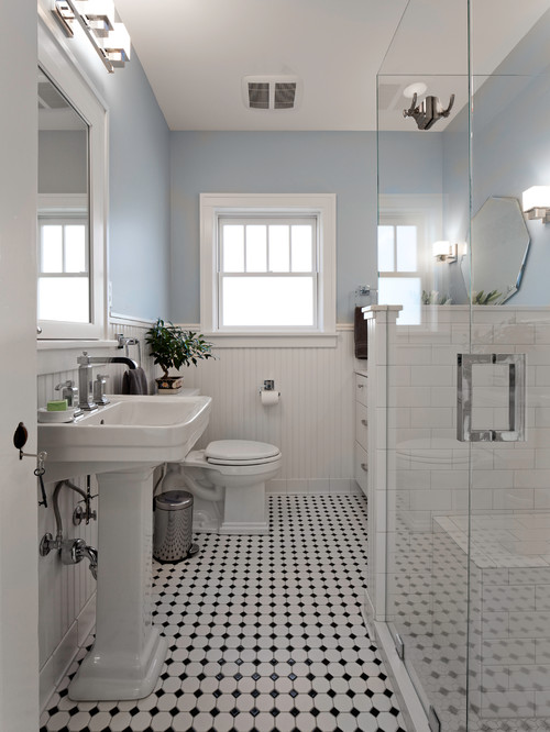
Designer Christa Pirl says two main factors drove the design of this Salt Lake City master bathroom. One: making sure her clients could age in place — they wanted a shower that would be easy to use should they have any mobility problems in the future. Two: creating a space that was light and bright. “The best way to accomplish this was to remove the bulky tub and divider wall and add a larger glass shower stall,” Pirl says. Her clients had no interest in keeping a tub since they already had one in another part of the house.
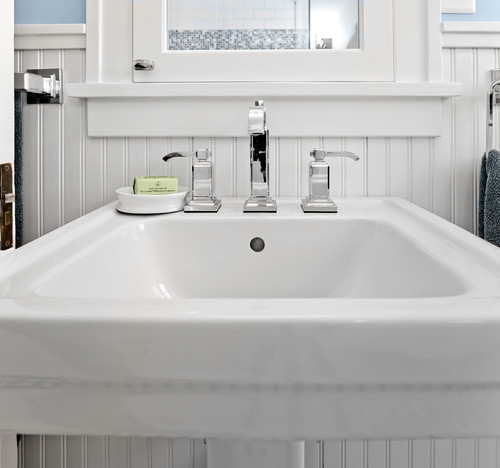
Pirl layered in a mix of elements from the first few decades of the 20th century. “The pedestal sink, black and white floor tile and white subway tile are classic early 20th century; the wood elements, like the wainscot, window mullions and custom built-in medicine cabinet, fit in really well with the Craftsman style of the house, and the vanity mirror and chrome cabinet hardware reference the 1920s and Art Deco style,” she says.
2. Whimsical Laundry Room
Design takeaway: Add color and whimsy to workspaces to lighten the load.
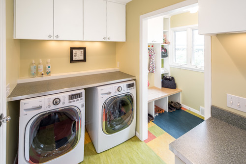
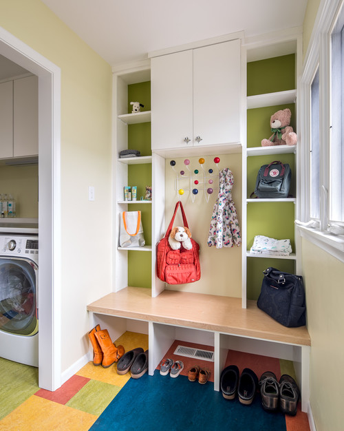
“This is Minnesota! We have a lot of winter gear,” says Tamatha Miller, who helped this family reconfigure several inefficient and disjointed spaces involving an entry, mudroom-laundry area and office. While improving the flow, adding a powder room and providing ample and much-needed storage, she captured the spirit of the midcentury modern home through playful, bright colors and fun details like star-shaped cabinet hardware.
The multicolored floor also nods to the home’s era. “I had fun with that floor — we wanted to be intentional with the desire for color pops and also pull off of the midcentury modern sensibility,” Miller says. White cabinets make the floor stand out, while the bright green paint behind the cubbies ties back into it.
The floor is Marmoleum. “It is made with natural ingredients without any harmful VOCs or other toxic chemicals, and the sheet goods are installed with solvent-free adhesives,” Miller says. This particular floor is Marmoleum Click, which was installed without any adhesive.
1. Studious Style
Design takeaway: Use architectural windows to create a shower enclosure.
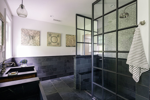
Taking your work home is usually no fun, but for this college administrator, a favorite aspect of her work environment played a key role in her master bathroom remodel. The steel-framed casement windows that line the corridors of her university inspired the design for the shower enclosure that now highlights this bold, spa-like retreat just outside Boston.
The shower enclosure was custom made by a window company that specializes in steel casement windows for colleges and other institutional facilities. It’s similar to the large steel casement windows the homeowner sees every day at work as she walks the hallways of her university administration building.
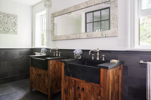
The soapstone sinks topping the reclaimed-barn-wood vanities dictated the color scheme for the entire space. “The white veins in the soapstone make a dramatic contrast against the black; repeating this black and white color combo unified the room,” architect Jonathan Chace says.
Article source: https://www.forbes.com/sites/houzz/2017/01/10/5-inspirational-ideas-from-the-most-popular-rooms-on-houzz/
