Mitchell Parker, Houzz Editorial Staff
Despite the benefits of neutral kitchens, such as enhanced natural light and an emboldened sense of cleanliness, many homeowners find neutral kitchens so boring. Never fear. With a few design tweaks, you can get all the advantages of neutral kitchens with a little added excitement. These six kitchens show you how to do just that.
1. Vary the neutrals. Homeowners enthusiastic about an all-white kitchen sometimes are surprised by just how much white that really is. That’s why designers know to play with a richer mix of hues that offer a bit of interest to the eye while still maintaining neutrality.
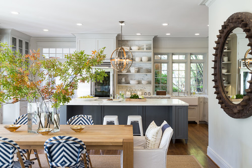
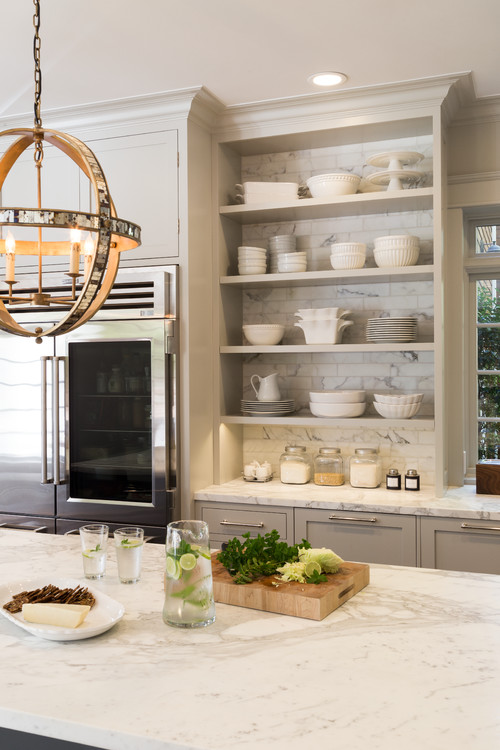
In this kitchen in Mill Valley, California, designer Leigha Heydt brought in varying tones of gray to create a soothing feel. Lighter gray cabinets and walls (both Gray Owl by Benjamin Moore) join a darker gray island (Whale Gray by Benjamin Moore), each playing off gray tones in the Calacatta d’Oro marble backsplash tile and countertop.
This kitchen also incorporates elements that we’ll get to later: brass and wood accents.
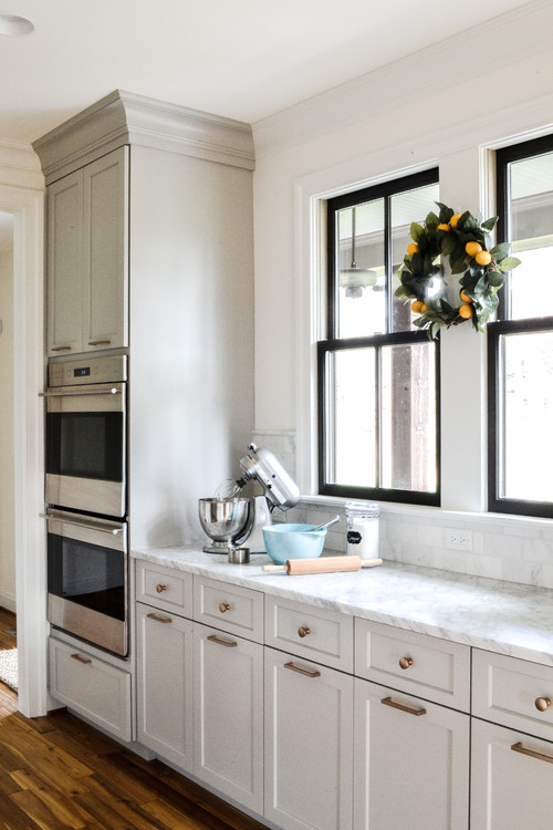
2. Introduce black for contrast. Black is perhaps the best way to break up a white color scheme. It provides contrast that helps the eye rest and lends a classic style.
Here, black window trim (Black Magic by Sherwin-Williams) and dark pendant lights seem to enhance the shadow reveal of the cabinetry — even the dark range top — creating a graphic element that exudes sophistication. One can imagine how this kitchen would almost disappear without these details.
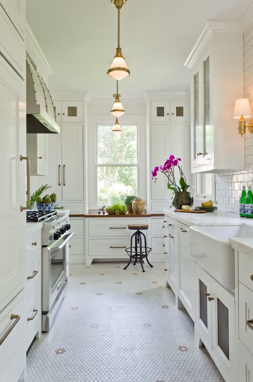
3. Bring in gold and brass accents. After successfully saving the porcelain tile floor with gold florets in this 1920s cottage, designer Julie Bradshaw knew that gold and brass details would be just the thing to make the otherwise white kitchen shine.
Antiqued brass appears in the cabinet hardware, light fixtures, vent hood and woven-wire grills beneath the sink. The finish helps create sunny little dollops amid the stark space as natural light floods in.
4. Let wood add warmth. One of the most common complaints about neutral kitchens is that they appear too sterile. Some even say they feel like hospital rooms.
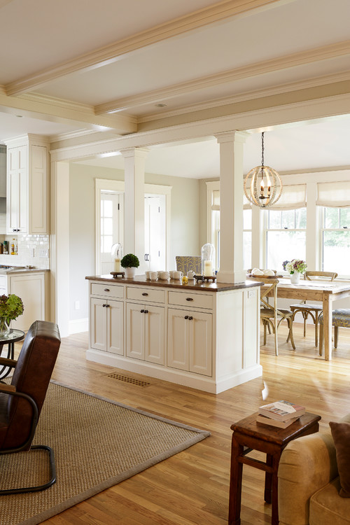
A simple solution is to bring in natural wood accents wherever you can. This Rhode Island kitchen benefits a great deal not just from the midtone wood floors, but also from a trio of midcentury modern-style bar stools. Even the wood cutting board, serving tray and knife block go a long way toward ridding the space of harshness.
Another photo, taken from a living space, shows how the concept extends into other rooms, with a natural wood dining table and chairs, and even a weighty wood side table in the foreground.
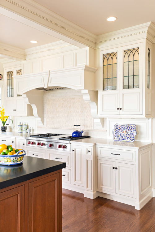
5. Focus on cabinet and millwork details. In such a grand space, these white cabinets could come off as imposing if it weren’t for the attention to detail in the millwork. Matching end panels, cathedral-style glass fronts, a coffered ceiling, crown molding and a wood range hood with oversize corbels pack a lot of character.
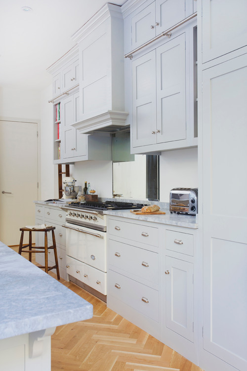
6. Play with the floor pattern. The soothing gray cabinet paint commands attention in this London kitchen, but it’s the herringbone-patterned floor that keeps the gray from overwhelming.
Article source: https://www.huffingtonpost.com/entry/how-to-spice-up-your-neut_b_9859822.html?utm_hp_ref=kitchen-ideas
